Reference pages

Wednesday, October 30, 2013

Evaluating the freight car fleet — an upgrade

In the previous post on this topic, while giving some general comments and a few statistics on my freight car fleet (you can read that post at this link: http://modelingthesp.blogspot.com/2013/10/evaluating-freight-car-fleet.html ), I mentioned that a lot of the change in my fleet of cars has come about as older and less detailed or less accurate models are replaced with better ones.
     Here is just one example of a car replacement which represents an upgrade. For some years, I had rostered a single representative of SP’s Class B-50-22 box cars, a 50-foot single-door car. The old Athearn kit of this type was a stand-in, partly because of the unfortunate Athearn roof, for some reason created with one too few panels (the same is true of the Athearn double-door automobile car). A number of other details are likewise incorrect for SP, such as the pattern of side panels, and the sharp-corner Dreadnaught end, and of course molded-on parts like ladders are a drawback. But with details upgraded, such as wire grab irons, door claws removed, brake step extended, and scale-size Ajax brake wheel, and so on, as I have described in several previous posts about Athearn cars, it looks okay.


This model has now been given away.
     The best replacement is the Proto2000 model of this car type, having a correct roof, door, six side panels on each side of the door, and W-corner-post ends. It also has free-standing details, particularly evident on the car ends. The only evident things needing replacement are the running board, which should be Apex steel grid (I used Detail Associates Part no. 6204 for this), and the hand brake, which should be Klasing. As there is no decent HO scale Klasing hand brake at present, I used a similar-appearing Equipco by Kato.


Note I added one of the Jaeger placards about auto parts to the placard board, from their set #2100.
     The weathering here is fairly severe, as this is a pre-1946 paint scheme for my 1953 layout era. I used my usual acrylic paint technique, outlined previously (you can download the handout from the joint clinic on weathering techniques, written by Richard Hendrickson and me, at the following link: http://modelingthesp.blogspot.com/2011/10/weathering-clinic-handout.html ). 
     This is not a particularly important replacement, and I only show it because it is a recent one. But the same kind of process continues in my freight car fleet, upgrading to more accurate models as the opportunities present themselves.
Tony Thompson

Sunday, October 27, 2013

The Naperville meeting, 2013

The annual meeting known as Naperville (even though this year it was a few hundred yards outside the town boundary of Naperville, Illinois, in the neighboring town of Lisle) was a fine event as always. Held at the Wyndham Hotel on October 17–19 this year, it gathered more than 320 attendees from every corner of the U.S. and Canada, justifying its nickname as “The Freight Car National.” Among my previous posts commenting on Naperville is one which mentions the change in management from Martin and Patricia Lofton of Sunshine Models, to Joe D’Elia, proprietor of A-Line and other products (Here’s a link: http://modelingthesp.blogspot.com/2011/10/meeting-highlights-lisle.html ).
     This year’s meeting, as always, was marked by excellent model displays (perhaps not quite as numerous as some years), fine portable layouts, and a very fine vendor’s room. Talks by a wide range of clinicians are a central part of this meet, and there were a number of fine ones this year. And for some of us, the visit to the Chicago area is an opportunity to operate on some of the fine layouts within range of the hotel.
     The four rooms used for talks this year were a little small, and any popular topic would find not only all seats full and standees around the rear of the room, but a few folks sitting on the floor in front of the rows of chairs. Nevertheless, I found the program good, and I heard the same from a number of other attendees.
     Highlights for me personally were Perry Sugarman’s detailed presentation on “The Role of the Station Agent,” Jim Dick’s clinic entitled “Nelson-Gilbert: Getting Closer to the Railhead,” and John Brown’s talk on “Auto Frame Loads.” There were also good talks by Jim Ruffing on SP&S freight cars, by Bill Welch on pattern-making for resin casting, and not least, the after-dinner talk (the Friends of the Freight Car Dinner) about ExactRail products by Blaine Hadfield, head of product development at ExactRail. With all that in mind, you can appreciate this expectant audience in one of the clinic rooms, right before kickoff.


At left in the front row is Mont Switzer, with Chet French beside him, but I won’t go through the rest of the audience, naming names. Still, the many familiar faces is a reminder of a great value of this meeting — catching up with friends who live far away.
     Here’s an overall view of one table in the model display room, but a single photo naturally can’t begin to do justice to the array of fine modeling.


The gray-bearded fellow across the table is John Spencer.
     The vendor room likewise contained too much to show in a single view, but here is one part of the room, with Sharon Camerlengo visible under the Funaro & Camerlengo banner. Assembled samples of F&C kits are at right.


Probably the most active table among the vendors was Tangent Scale Models, with proprietor David Lehlbach seen here in the orange shirt.


The reason was simple: Tangent released a marvelous tank car model at the meeting, a General American 6,000-gallon car with three compartments, and they sold like hot cakes. For more on that, I can only defer to their web site, where you can see much more of the model than I could show here. Visit them at: http://tangentscalemodels.com/ .
     Lastly, one layout operating opportunity I had was at Bob Hanmer’s fine re-creation of the GN Mesabi Division, and the DM&IR, in Minnesota. Here is fellow operator Andy Sperandeo completing switching in the yard at Grand Rapids. I was yardmaster at Gunn, out of sight just to the right of this view.


I especially liked Bob’s well-thought-out graphics at each switching location. Here is the graphic at Gunn (click to enlarge), placed on the box which holds waybills. Bob’s waybills are the Steve Karas design, 4.25 x 5.5 inches in size (a quarter-sheet of paper), and are the single-use type, no car cards. This is my kind of car distribution!


     All in all, another fine Naperville (well, yeah, Lisle) meeting. Many of us are already looking forward to next year.
Tony Thompson

Friday, October 25, 2013

Model tank car placard decals — an update

In my previous blog post on this topic, I described an idea I had, which was to figure out some way to incorporate the frame of the placard holder into the model placard we apply on tank car placard boards. (It’s available at this link: http://modelingthesp.blogspot.com/2013/10/model-tank-car-placards-refinement.html .) Since then I have been amazed at what I have heard.
     I said in that post that I was going to pass along my idea to decal manufacturers, hoping there might be some interest. I would have been happiest to hear about a one-piece placard decal, which incorporated both frame and placard in one, but certainly could use a decal just representing the frame, to apply over a model placard. To my astonishment, Microscale responded that they already have such a set ready to release. It is tentatively scheduled for November 1 of this year, and is Mini-Cal set MC-5030. With Microscale’s permission, I reproduce the artwork below. (Although this set isn’t released yet, many readers probably know that you can order Microscale decals on line, at: http://www.microscale.com/ .)


     As is evident in this artwork, all frames are shown as white or metallic silver, perhaps all right for highway trucks but certainly not typical of railroad tank cars in most years. But I am told that Microscale will likely revise this artwork to make a fair number of the frames black, as we need for 20th-century eras of tank car use. So  I, at least, will need to wait and see whether there are a goodly number of black frames in the final decal set, before I know how useful set MC-5030 will be for me.
     Other points: about half the frames also include the retainer clip typical of modern Haz-Mat placard holders, but not applicable, I believe, for tank cars prior to the 1970s. These can either be ignored or cut off. There is also a size issue. Even though placards are a standard size and have been for many years, model manufacturers seem not to grasp this, and model tank cars have been produced with a wide range of placard board sizes. You can of course add a thin sheet of styrene of the correct dimensions over a too-small placard board, as I have done in a few cases.
     Lastly, another decal maker has expressed interest in a one-piece version, that is, with both frame and placard all in one decal. This will be a great convenience, assuming it materializes, and I will say more about it if it progresses toward reality.
Tony Thompson

Tuesday, October 22, 2013

Model tank car placards — a refinement

Awhile back, I posted some descriptions of the prototype and model use of placards on tank cars, for my era (1953). Here are links to them: Prototype— http://modelingthesp.blogspot.com/2012/03/tank-car-placards-prototype.html ; Model— http://modelingthesp.blogspot.com/2012/03/tank-car-placards-modeling.html . Subsequently, I described my model placards, at: http://modelingthesp.blogspot.com/2012/12/tank-car-placards-more-on-modeling.html .
     But there is one nagging problem with my model placards. The prototype placard is placed in a holder. Until about 1933, placard boards on tank cars were simply wood squares, mounted “on point” in a diamond configuration, and placards were tacked to them. But about that year, metal placard holders came into use and were soon a de-facto standard. The placard is slipped inside them and is held in place by crossbars. They are in use today, on railcars and (in a similar form) also on highway trucks. Here is what they look like:


This image is taken from a website of a seller of these parts; it’s at: http://www.labelmaster.com/resources/catalogpdfs/G12%20pdfs/Placards%20&%20Placarding%20Systems/G12%20p89.pdf . The product is called the “Rail Slidemaster,” is 12.5 x 14 inches in size, and only costs $15, if you’d like to own one.
     My post about prototype placards, cited at the top of the present post, included a picture of a workman inserting a placard into one of these holders.
     There are lots of in-service photos around, which show these holders clearly. Here is just one example, a detail of a 1971 Frank Szachacz photo. The placard is an “empty” placard, with the right half of the placard all black (for more about that, see my post on prototype placards, cited above).


The message here is that the holder is pretty visible, not just the placard itself. That in turn means that simply applying a decal or printed placard onto a model placard board isn’t correct; the crossbars of the placard holder ought to be visible “in front” of the placard, with the placard “inside” the holder.
     So I think I will try representing this situation by modifying my model placards. Since my placards are just HO-scale images of real placards, printed out on a high-resolution printer, I can modify those HO images by superimposing an image of the placard holder on the placard image. I will report on that in a future post.
     Another way to attack this problem would be to make decals of the holder, with the black placard holder on clear decal film. Then you could place that decal over an existing image of a decal or printed-out placard. I will suggest this to some of the decal makers out there. Of course, an even better arrangement would be if decals of placards included the holder bars across the image. Then only a single decal would have to be applied to a model placard board.
     This is only a refinement, to be sure, in the overall placement of placard boards on model tank cars. But it does add that little additional bit of accuracy and realism to your models.
Tony Thompson

Saturday, October 19, 2013

Planning

Planning. Of course we all plan, for projects and all kinds of other activities. But sometimes planning gets a bad name. One way of putting it is the old saw, “paralysis by analysis.” Certainly that can happen, and I’d be the first to caution against it. But in my experience, planning is usually vital to my own work.
     I know well that when there is a clear plan for anything, I can move ahead and get it done. One of my uncles, who worked for Ma Bell in the old days, used to call it, “work from the book.” Once you have a principle established, whether it’s a repair procedure (as in his work) or any other kind of project, you know what to do and can proceed. And that kind of progress can be very enjoyable, because things come together cleanly and reasonably quickly.
     But the other side of the coin is the planning which doesn’t reach a closure point, the kind of vague or incomplete outline that doesn’t give you a clear direction for work. And as often as not, this kind of gray fog is hard to escape, because you haven’t quite figured out where it should go. This readily leads to “paralysis by analysis,” because you are kind of spinning your wheels without getting any traction.
     I’ve even heard people say, “just get started, and you can work out the details as you go.” Now it’s sometimes true that getting started is a lot of the battle, and things get moving once you begin. And of course, getting snarled up in one of those kinds of projects where a plan just won’t come together can sour you on the whole idea of making a complete plan. Hey, why not just get out there and start work? You can feel your way along, and figure it out as you go.
     An example of doing just that is my Nocturnal Aviation industry. I had an idea of where to go with it, making a longer, one-sided building from the original kit, and in fact that’s what finally happened. I described this project previously: http://modelingthesp.blogspot.com/2013/03/kitbashing-background-structure.html . But that account is misleading, because it sounds like the entire thing was planned in advance, then proceeded smoothly.
     The reality was much different. Not having arrived at a clear idea of how to modify the Heljan kit, I just started cutting and gluing on what I believed were the obvious basic parts, figuring a fuller picture would come to me as I progressed. But that really didn’t happen, and twice I had to disassemble what I was doing and head off in a different direction. But even that wasn’t the worst of it. Every time I hit a dead end, the project would get set aside in frustration, and just sit for weeks. And there kept being issues I couldn’t seem to resolve, like how to detail the roofs.
     Eventually I did stumble up to a reasonable finishing point, and I now think the ultimate result turned out well. Here is how it looked on the layout in Pittsburgh.


But the time span to do the work, and the frustration and annoyance of getting stalled over and over, made me really dislike the structure during the struggle, and even after it was first done. Luckily I didn’t scrap it in the middle.
     The learning point for me was that project planning can be essential, not just helpful, even if it postpones digging into the work for awhile. (And we all find ourselves champing at the bit sometimes to get started on an appealing project.) Today I would not undertake another kitbash without thinking it through, just because of my experience with that one structure, and I would tend to feel the same about most modeling projects.
Tony Thompson

Friday, October 18, 2013

Making sky backdrops more realistic in photographs

I have heard modelers grumble about the results, when taking model photos with plain backdrops, such as light blue sheet of cardboard. It doesn’t really look right, they say.
     The problem is really easy to fix, if you have, or have access to, Adobe Photoshop. The answer is to correct the sky blue to a color you like, then make it more realistic with a gradient. I’ll illustrate. Let’s say you have a “photo bench” shot like this, and the background either was white, or got washed out. It looks a little odd. (Likely you recognize the center car here as a cast-metal Ulrich gondola.)


     Photoshop has a tool called the “magic wand,” which can select all areas of the same color. You can choose contiguous-areas only (often the right choice for sky), or for non-contiguous, that is, all areas throughout the image which are that color. You can also set the “tolerance,” meaning the range of color the wand can select. In the photo above, I just chose the white area at top.
     Once you choose the sky area, select a blue that appeals to you, for example in the Photoshop “Color Picker,” and make it the “foreground color,” as Photoshop calls it. Then fill the selected area with that color. It’s better but still doesn’t look natural, as you can see here.


I haven’t refined this image by blue-converting areas under running boards, etc., as I just want to show the main approach.
     What this sky needs is some fading toward the horizon, as natural skies almost always do. Again, there is an easy way to fix this in Photoshop. First, select a lighter blue as the “background color,” which will be the second fill color. Now select the gradient tool, and simply use the mouse to draw a vertical line in the sky area. This makes a continuous gradient between your foreground and background colors. You can vary where the line starts and stops, so the gradient is in the area you want. Experiment to see how it works. Here is one result.


This is already a much more natural look, especially compared to the almost-white sky I started with.
     The technique isn’t limited to a posterboard kind of sky. Any sort of photo can have its sky area improved with the same tools. Here is an old shot of mine with a commercial backdrop, but with the sky washed out. The SP gondola is a kitbashed Athearn model.


Again, I filled the selected sky area with blue, then used the gradient tool, only within the sky area, to get some fading. Here I only faded just above the hills, because the true line of the horizon is much lower.


This photo, from an old slide, is kind of washed out and doesn’t have great color to start with, but notice how much better it looks with the sky modification.
     This technique is quick and easy, and if you don’t have enough familiarity with Photoshop to know what tools I’m talking about, most any aftermarket book on the application will show you how to do this and many other adjustments.
Tony Thompson

Sunday, October 13, 2013

Building Guadalupe Fruit, Part 2

In my previous post, I showed my initial mockup for the Guadalupe Fruit Company packing house building at Ballard (you can view it at this link: http://modelingthesp.blogspot.com/2013/09/building-guadalupe-fruit-company.html ). I also mentioned some of my concerns about how the mockup looked: whether the platform was too large relative to the building, and whether the platform needed a full-length roof, or any roof at all. In this post, I describe revisions to the mockup.
     My first step was to try enlarging the building, keeping it two stories throughout, and shortening the platform by the same amount as the building was lengthened. This was done with some scrap cardboard. Here is how it looked (depot in background), ignoring for the moment the issue of whether and how much to roof the platform.


The two reefers are spotted here to show that two cars could still be loaded at the shorter platform.
     This immediately convinced me that I did not want the building this big. It is rather prominent in the layout foreground, sort of dwarfs the one-story depot behind it, and is probably too big in proportion to the imagined business of a seasonal fruit packer.
     My next idea was to revert to the original, smaller main building, and use the shorter platform (shown above) with it. This was an easy change, as I just had to un-tape the added pieces of the larger building, and reassemble it in original form. In this view, I tried adding the platform roof, but don’t think I would actually build this tapered roof structure (which would not be entirely fun for a 1:1-scale carpenter either).


The structure here is also moved somewhat to the left, away from Bromela Road at right, which would permit a truck unloading dock at that side of the building. Here is a side view, with the two reefers behind the platform.


     Another possibility surfaced in a search of back issues of model magazines. In the July 1987 issue of Model Railroader (pages 79–81), Eugene S. Martin had an article about the H.M. Young fruit-packing shed in Lodi, California, which was a single-story structure. The building was arranged to receive harvested table grapes on one side, and load refrigerator cars on the other side, and the article even included scale drawings of the prototype. Here is Eugene Martin’s photo of the structure in Lodi in 1971, used with permission from Model Railroader.


     This structure almost goes too far the other way, being a genuinely small building (60 percent of the structure’s length is the open platform) and also was set up for loading lugs of grapes right from field trucks into refrigerator cars, with no “packing house” intervention. That is something that can be done with table grapes, but usually not for stone fruit, the intended product of the packing house I am going to build.
     My interim conclusion is that I do want to build the two-story packing house building as I originally mocked it up, but I like the platform design from the Lodi shed, and can use the Model Railroader drawings for dimensions. My next step is to begin construction, and I will address that in my next post on this topic.
Tony Thompson

Thursday, October 10, 2013

Part Two of my column in Model Railroad Hobbyist

In a previous post, I called attention to Part One of a two-part column I wrote for Model Railroad Hobbyist (MRH), the on-line magazine. View that post at: http://modelingthesp.blogspot.com/2013/09/my-new-column-on-pfe-in-model-railroad.html . Part One is about prototype PFE operations.
     The second part has now been published in the October issue of the magazine. You can download it for free at this site:

http://model-railroad-hobbyist.com/magazine/mrh-2013-10-oct

     Part Two is about modeling the PFE car fleet, with examples of a few of my own models. Some of them have been described as projects in this blog while they were being built or modified; others have not appeared in the blog.
     These two MRH column segments are a written summary of some of what is in my clinic presentation on “PFE Operations,” which has been presented in several versions in recent years, each time emphasizing a different aspect or different region of the country. The summary handout (without the various specialized parts) has also been cited in a recent blog post. You can obtain it at: http://modelingthesp.blogspot.com/2013/10/my-handout-on-pfe-operations.html , which contains a link to the downloadable PDF document on Google Drive.
     As I have said before, practically all this information about PFE is in the PFE book (Pacific Fruit Express, 2nd edition, by A.W. Thompson, R.J. Church, and B.H. Jones, Signature Press, 2000), but that information is scattered throughout and not readily collected by a reader. The book, after all, was not written with modeling in mind, and so the book does not have a summary of operating patterns which is separated out from the general text. But the outline found in my handout, and the written text in my two-part MRH column, do provide the meat of that story.
Tony Thompson

Monday, October 7, 2013

Evaluating the freight car fleet

I have for some time maintained an inventory listing of my unbuilt kits, partly to ensure that I don’t forget what I already have, and repeat a purchase. But this inventory also serves to permit recognition of the outlines of my future fleet, as well as to identify cars no longer needed, and thus discardable.
      My layout in Pittsburgh had about 200 or 225 freight cars in service, with maybe another 25 or so which were serviceable but rarely operated. The latter category might include inaccurate paint schemes, wrong car bodies (at one time I used Athearn box cars to stand in for just about any 40-foot box car), or simply primitive models, such as some old Varney metal box cars. But in total this was none too many cars, and in fact my extensive staging on that layout could have accommodated significantly more cars in service. There was also a stash of unbuilt kits, of which I don’t have records.
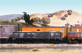
     Since I’ve moved to Berkeley, three different things have been happening with the freight fleet. First, I have sold or given away a lot of the marginal freight cars in the previous fleet, more than 80 of them so far, and more to go. For example, here is a shot of part of the fleet in Pittsburgh. All but the centerpiece car in this photo (a Detail Associates GS gondola) have been superseded by better models.


     My second change is that I’ve been completing a number of stalled projects, either incomplete or barely started (mostly kitbashes), from those days, mostly fairly good quality cars, and adding them to the fleet. Third, I have been building not only those stockpiled kits I mentioned, but also buying new ones. I have also acquired plenty of ready-to-run cars, some of which need correction of detail parts and all of which require weathering. Both these sources of new cars are evident in this photo of my staging table, prior to installation of the track board for Ballard on top of it. (Click to enlarge.)


     So far I have added about 160 new cars to what was on hand in Pittsburgh, many of them replacements for discarded cars.
     How do I know all these numbers? I maintain several roster-related lists. One is the inventory I mentioned at the outset of this post, a list of kits in stock, which I created to have something in hand when traveling, and thus helping to avoid duplicate purchases when at out-of-town hobby shops. But as kits get completed, I just move the entry to the bottom of the list and add the date completed, so now this “inventory” is also providing roster information for completed cars.
     Second, I have long relied on a list of car locations, identifying exact box, and tray in that box, since otherwise I would have to root through storage boxes, layer after layer, for much of the fleet. (I described my box storage, and other off-layout car positioning, in a prior post to this blog; it’s at: http://modelingthesp.blogspot.com/2011/12/operations-car-flow-and-car-storage.html .) But I can readily count the entries in the “locator list” to see how many completed cars are in storage.
     The total fleet is not a great deal larger than when I left Pittsburgh, but I think much better quality overall. It also better meets the needs of my new layout, focused on the particular industries I have or am planning. I can readily examine these changes by means of my car records. There is no real need to track your freight car fleet in as much detail as I have done, but even a simplified version of my system would permit an interesting backward view, once you maintain it for awhie.
Tony Thompson

Thursday, October 3, 2013

My handout on PFE operations

My current talk on Pacific Fruit Express (PFE) covers the company itself (what it was, what it did), along with a summary of car operations (movement of empties; loading cars; movement of loads; icing, ventilation and protective services; and the car fleet). The emphasis is on understanding the prototype, but modeling comments are offered throughout the talk, particularly about modeling PFE cars.
     Since the prototype operations side is often poorly understood, my handout emphasizes that, and gives an outline summary of how this was all done. The two-page PDF version of it is available on Google Drive, at this link:

https://docs.google.com/file/d/0Bz_ctrHrDz4wbnRWd1pkeE5rWHM/edit?usp=sharing

This is available to anyone to read or download, and to print if desired.
     As I have already mentioned in a previous post, the on-line magazine Model Railroad Hobbyist (MRH), for which I am a regular columnist, has just published a two-part article about PFE. The first part, entitled “Operations,” was published in the September 2013 issue, and the second part, about the “Car Fleet,” is about to be in the October 2013 issue. These and any issues of MRH are available free, to read on line, or to download. You will find them at this link: http://model-railroad-hobbyist.com/magazine/ .
     As with all the talks I present at model railroad meetings, this PFE talk is intended to inform, and to deepen understanding of both the prototype and of avenues to model it.
Tony Thompson

Tuesday, October 1, 2013

Setting up an operating session: creating a timetable

My previous post about setting up an operating session (you can see it here: http://modelingthesp.blogspot.com/2013/09/setting-up-operating-session.html ) only addressed a few of the broad issues. Clearly an important issue can be a timetable, should you choose to use one instead of a line-up. But even if you choose a line-up as a simple framework, you can still use a timetable for other purposes, as I will explain here.
     A line-up or sequence of events is a simple way to conduct operations. You would simply write a list of the trains that will run, in time order. Maybe it would say something like, “run the hotshot freight westward; run the mail train eastward; switch local industries in Epsilon and then run the local freight as far as Delta, do needed switching en route, return.” This avoids time pressure, because each train movement only takes place once the previous one has been completed. Of course, if there are a lot of trains, or multiple routes, where closer coordination becomes important, the obvious solution is the prototype one: a timetable.
     Why did I recommend a timetable even if you want to operate informally, with a line-up, or without clock pressure? The prototype employee timetable usually contained a lot of additional information, and this can be helpful to your operators. Let me explain how I made mine, and give some examples of that information.
     If you choose to make a timetable, one approach is to start with the prototype for your area (or a similar prototype, if you are freelancing). This provides some authenticity to what you are doing.
     My timetable is sized as 8.5 x 11 inches, to be folded in half the long way, exactly as SP employee timetables were done. The artwork on the outside cover is entirely stolen from actual SP Coast Division timetables (though I identify it as a Supplement), and I print it on manila card stock, again, like the prototype did. Here it is (you may click to enlarge), folded the long way:

The map, incidentally, only shows the Guadalupe Subdivision part of the Division.
     On the inside front cover and first right-hand page (the former being on the manila stock, and the latter on white paper), I have collected a summary of Freight Train Procedures. These would usually appear in a Manifest Train schedule but I don’t want to multiply documents. I won’t include my summary here, as there is enough background for this topic to make the discussion too lengthy for this post.
     Correspondingly, in the back of the timetable, I included some selected rules, drawn from the actual SP rulebook. Usually on the SP these would be included in a separate Special Instructions document, but again, I compacted everything into one document, and these rules add flavor. They also provide information, permitting operators to reference any specific rule which may affect operation.
     My layout is set within the Guadalupe Subdivision of the SP, so I used schedule information and graphics for that Subdivision in my timetable (see: http://modelingthesp.blogspot.com/2012/04/coast-line-operations-1953-for-my.html ). That timetable construction forms the middle or center pages of my layout’s timetable document.
     Another item which can be useful is a schematic diagram (not a map) of any towns or other complex trackage, complete with track names. Railroaders give names to every feature which might be of importance, and certainly to every track they might need to use (or direct someone else to use). Many might be obvious (team track, warehouse spur), but others may be more obscure. Richard Hendrickson tells the story of visiting Jerry Stewart when he was a tower operator, and overhearing Jerry tell an approaching train crew to hold short of “the oil track.” Looking down the line from the tower, he could see no oil facilities. So he asked Jerry, who of course replied, “Oh, the oil stuff has been gone for years, but that’s the name of the track.” Your operators need to know all these names.
     Here is an example of a simple, hand-drawn schematic, from when I planned to include Lompoc on my layout. The interchange was with the freelance short line, Lompoc & Cuyama.


     These are only examples of some of the considerations that may be of interest or value in creating a timetable for a layout. I have taken pleasure in reproducing the look and feel of the actual SP employee timetable of the era, but of course there can be deviations from this as well, if appropriate to a particular layout. But I believe a timetable like this can add interest and value to your operating session.
Tony Thompson