Reference pages

Tuesday, April 28, 2015

Interchangeable billboards

One feature of many layouts is roadside billboards, and especially prior to the 1970s, these were very familiar sights along roads and highways. They can be especially useful to the modeler who has chosen a particular era, because they very much help identify that time. There may be billboards with very specific time reference, such as an automobile model year, but even advertising of a general nature had a “look” in a particular era. The viewer, even someone too young to remember a particular era, may well have a sense of the era portrayed, because of that “look.” I am planning a broader column for a forthcoming issue of the “Getting Real” series in Model Railroad Hobbyist (see: http://model-railroad-hobbyist.com/magazine) but will develop one aspect of the topic here.
     There are many ways to build the structure of a billboard, and I won’t go into that, just because it can be pretty simple, but one shortcut is the Walthers kit, their number 933-3116, 933-3103, etc. A recent check showed that these are not currently in stock at Walthers, but of course may be on shelves at some hobby shops, and like many Walthers structure items, is likely to be re-manufactured in the future. I will use a billboard from that kit to illustrate my idea (the kit gives you three billboards).
     The core of my idea is that placing two or three billboards around the layout, with glued images on the signboards, limits you to display just those three images. I suppose you could build a whole bunch of billboards, and then rotate them off and on the layout. I wanted to do something simpler, and hit on the idea of simply changing the advertisements, which of course is what happened on the prototype too. Since I did find a good number of intriguing advertisements, I was happy not to have to choose just two or three, but could contemplate exhibiting them all in rotation.
     Here is an assembled Walthers billboard, a quick and simple project. But note the added white styrene strips. These are scale 1 x 6-inch Evergreen strip, and they overlap the ends of the image space recessed in the front of the board.


In this view I have not yet added the kit’s simulated floodlights.
     The Walthers signboard has an image space, in HO scale, which accepts a billboard image of 10 x 22 feet. Their 3116 “Petroleum” kit does supply six billboard images, but most are Eastern oil companies, and are all from later eras than the 1950s. Accordingly, I searched on the Internet for some time, finding all kinds of varied billboard and other advertising images. One of course need some historical knowledge of what is era-appropriate, and many on-line resources do provide the year or years when the image was used. Though many of the on-line images are copyrighted, you are permitted to download and print them for your own personal use.
     Here are a few examples, all adjusted to 10 x 22 feet in size, and printed out on glossy stock with a high-resolution color printer at my local copy shop.  As mentioned, some of these are subject to copyright. (You can click on the image to enlarge it.)


The gasoline images in the left column are especially valuable for regional reference. Everyone will also recognize the period Ford and Chevrolet automobile ads, as well as the Coca-Cola image. The two beer brands, Lucky Lager and Acme, were familiar California beers in the 1950s, and Levi’s was and is an iconic Western image.
     These images are readily inserted into the Walthers billboard, with the modification shown above of the side strips. I have left these strips unpainted in this view, to illustrate their use, though when placed on the layout they will be painted to match the dark green of the rest of the billboard. In the photo below, I am inserting an ad into the billboard, deliberately at an angle so you can see how the printed ad slides into place under the side strips.


    Once in place, the side strips hold the image nicely, if they have been printed on heavy glossy paper or even card stock. In the next photo I’m adjusting the final position. Friction seems to hold these well.


     To conclude, below is the same billboard, painted green, and shown in place on the layout. Just beneath it, a couple of people are enjoying a beer at the outdoor tables next to the tavern, and in the foreground, a train is returning from Ballard. (Click to enlarge.)


     This interchangeable ad idea really works for me. I can rotate among the dozen or so ads shown in the group above, and even if visitors may not appreciate the feature, it’s fun for me.
Tony Thompson

Saturday, April 25, 2015

A practice operating session

I am preparing to host an operating session at the spring meeting of the Pacific Coast Region (NMRA) next month. Since not only have some of my siding arrangements changed, but I have somewhat modified my waybills, modified the communications between agent and crew, and even created a more complete timetable with town maps, as described in my article in Model Railroad Hobbyist, the “Getting Real” column for October 2014 (you can download this or any issue of MRH for free, at: http://model-railroad-hobbyist.com/magazine ), I decided I ought to put everything into service, and do a trial operation of the layout with all these changes together.
     My friend Ray DeBlieck was available for a couple of hours at a time when I could host the session, so I invited him to come over and give it a try. I was not even sure how many things I would need to explain in advance, since Ray is a very experienced operator and has visited the layout before. So I kept my briefing to a minimum and observed carefully to see what issues might arise, such as directions that weren’t clear. That was one of the objectives of the session, after all.
     In this photo at Shumala, you can see the various freight cars on hand, most of which would have to be switched, and in front of the yard office in the middle distance, the switcher is idling, ready for work. (It’s a Broadway Limited NW-2.)


     The first materials I handed Ray were the new timetable and all the waybills for the cars he would switch. I also handed him something new (for me): a message from the Shumala agent. I discussed internal SP communications of this general type in a prior blog post (you can read it at the following link: http://modelingthesp.blogspot.com/2012/08/internal-sp-communications.html ). As I said in that post, blank telegram forms were often used on the SP for all kinds of messages other than telegrams.
     What sort of message might this be? I showed several examples of agent messages in my post about bill boxes, to show what a crew might find in a box (it’s at: http://modelingthesp.blogspot.com/2012/03/bill-box.html ). Here is another example, provided by Chet French; it’s directed to the “Dixon Way Freight” and describes work at Dixon, Illinois. It tells the crew which cars to pull or re-spot, and is pretty specific. In fact, this is only part of the entire message page, but it clearly shows the kind of thing that might be provided.


     I used the SP telegram blank, from the post cited two paragraphs above, and gave Ray the following agent’s message at Shumala. Among other things, it directs car icing, information not available on waybills since empty cars being pre-iced do not yet have a waybill.(Hopkins is a prototype name; he once worked at nearby Oceano.)


     Once Ray absorbed what was in the paperwork, he got to work, and having plenty of experience switching, quickly got things sorted out with only a couple of false moves. Here he is sorting cars by destination.


     Once he completed work at Shumala, the train to Ballard could be made up. Here it is departing Shumala, using the NW-2 to shove up the hill. The caboose is behind the engine.


     Once in Ballard, he stopped alongside the depot to collect another message, this one from the Ballard agent, and his local waybills. In the photo below, he is well along with switching Ballard, and is about to spot that foreground gondola of pipe on the team track.


     This session went pretty well, and though I did have some issues with electrical contact in a few turnouts, the switching plan generally worked all right. I do need to make refinements in my agents’ messages, and will also make a small modification in the layout description. But this practice session with new arrangements served its purpose, showing me what worked all right and what needed more development.
Tony Thompson

Wednesday, April 22, 2015

Waybills, Part 40: more Empty Car Bills

I have posted several times about the prototype movement of empty freight cars using a simplified paperwork item called an Empty Car Bill, Slip Bill, Card Bill, or Empty Bill on various roads (and likely many more names as well). I list below some of these prior posts, with links provided, and the railroad or roads whose bills were shown.

Erie: http://modelingthesp.blogspot.com/2011/06/waybills-8.html
Wabash: http://modelingthesp.blogspot.com/2012/02/waybills-19-confiscation.html
New York Central: http://modelingthesp.blogspot.com/2012/04/waybills-22-handling-empties.html
ACL, MKT: http://modelingthesp.blogspot.com/2014/10/waybills-36-empty-car-waybills.html

     I have been receiving more examples of these kinds of bills, provided by a variety of generous modelers around the country, and wanted to show the additional items. These continue to demonstrate that there were no two alike, though there are recognizable types, and of course this was in no way a “standard form” as was, for example, the AAR waybill.
     I will begin with the Reading, which used at least two kinds of Empty Car Bills. One type was red and used for empties of assigned service, specially equipped cars and cars like heavy-duty flat cars, or for any other reason not to be confiscated. The other was a manila type of color, as was used for empty cars which could be confiscated if needed. (You can click to enlarge any of these images.)


     Another version, fairly simple in design, is this Card Waybill from the Illinois Terminal.


     The C&O also had a good form, and this example is interesting because a rubber stamp was used for the location from which the car was sent, avoiding writing the same words over and over. Note that, like several other prototype forms of this kind, the form provides separate sections to accommodate cars that are either empties to be moved somewhere else, or empties routed homeward.


     Finally, the Nickel Plate had a form like this too, though as I understand it, there are reports it was not used everywhere on the railroad. This form too has been rubber stamped with an origin location.


The two examples above which are filled out are handwritten, though I have also seen examples obviously done on a billing typewriter (capital letters only), which most agents had.
     In particular, these interesting examples show the diversity of Empty Car Bills, which certainly frees up anyone wishing to freelance such a form, and for those wishing to reproduce their prototype’s form, it will be worth seeking out an example of what may well be a distinctive piece of paperwork.
Tony Thompson

Sunday, April 19, 2015

Installing a utility shelf

At the conclusion of a previous post about building a drawer to store open-top car loads (that post is at: http://modelingthesp.blogspot.com/2015/04/a-drawer-to-store-open-car-loads.html ), I mentioned that I also planned to build a utility shelf, also located beneath my staging table at Ballard. Here’s why.
     Both from my own layout operating sessions in the past, and experience with operating on many other people’s layouts, I know the value of having shelf space arranged around the layout edges. This can accommodate paperwork, track cleaner blocks, uncoupling picks, tools, even snacks and soft drinks, thereby keeping all those items off the layout surface. I showed part of the large shelf at Shumala on my present layout in a blog post about my layout fascia (see it at: http://modelingthesp.blogspot.com/2013/02/layout-fascia-my-approach.html ). Here is a photo of one end of that shelf, repeated from the earlier post. My agent’s Bill Box is at right.


The entire shelf looks like this. The left part of the shelf still needs a backing strip, of the kind described below.


     I wanted to add a shelf of some kind on the other side of my layout peninsula, and decided to attach it under the staging table at Ballard. The simplest kind of shelf to build is just a couple of pieces of L-girder, with a piece of plywood glued and screwed to the bottom. The completed shelf unit can then be screwed to the underside of the table through the short legs of the L-girders. That’s what I built.


Note the strip of molding at the back of the shelf. Without something like this, tools, paperwork and other objects can glide right off the shelf and onto the floor (don’t ask how I know). Another strip of the same molding will be added at the front, likewise to keep items on the shelf.
     The L-girder flanges are easy to screw to the plywood above. Here is the installed shelf, prior to attachment of the surrounding fascia, which I only show at this point because fascia will conceal most of the shelf edges.


Above the shelf are, as mentioned, the staging tracks on my staging table.
     Fascia was placed in separate pieces to frame the shelf, rather than cut a hole nearly as tall as the fascia itself. The screw heads were painted to match the Masonite  (I described my mixes from acrylic tube paint in order to match the color of each Masonite strip, in a previous post, which you can read at this link: http://modelingthesp.blogspot.com/2015/02/layout-fascia-additions.html ). Once that was complete, I recoated the entire fascia of the staging table with shellac. Here is the finished shelf. The fascia within which the shelf is placed is attached to the staging table, and thus moves with the table, while the fascia just below is fixed to layout supports.


Molding strips front and back in the shelf are evident here.
     This utility shelf serves a valuable purpose in giving operators (and me) a place to put objects that shouldn’t be on the layout surface, especially tools. I am glad to have it in place, so that this purpose can be served on the Ballard side of the layout.
Tony Thompson

Thursday, April 16, 2015

Waybills, Part 39: SP typography

I’ve recently received what are to me some fascinating Southern Pacific paperwork examples. They date from the late 1950s (more on that in a moment) but are very revealing of the way many railroads, including SP, managed paperwork. And yes, I will touch on typography. I introduced the foundations of this topic a few years ago, including commentary about the uses of typography on the layout (you can read that post at this link: http://modelingthesp.blogspot.com/2011/11/type-and-typography-on-layout.html ).
     The documents were part of the course materials from an SP employee course on “Functions of the Freight Traffic Department, and Related Departments.” Pretty dull stuff, I hear you mutter, and much of it is indeed fairly boring. But there is a clear description of the rules for waybill preparation (entirely consonant with what I have described elsewhere), and included are examples of blank forms. In this post I discuss those forms.
     One interesting feature of many SP forms is that in the upper left corner is printed the date of printing the form, and the amount printed. For example, it might read “1-51-50M.” That means January 1951, and 50,000 copies printed. Accordingly, one can readily date any SP form which contains this notation. Also, the official SP number of that form is printed in the upper right corner. Here is the upper left corner of such a form, and you can see the corner notation, “11-59-10M” (you can click to enlarge). The same form is shown in full just below.


     I will begin with two examples of a Memorandum Bill of Lading. This is not the original Bill, but is intended to contain the information of an original, and can be used as a file record. This one is for normal shipper-billed cargo. It was originally green, though edges have faded toward yellow.

The companion one is for COD freight, and the parts relating to the COD are printed in red.


These two documents, both copy no. 3 of the complete document, are typographically interesting in that both include an SP emblem (the circle-and-bar at upper left) and the road name in a distinctive typeface. Being something of a typeface geek, I was pretty sure I recognized it, and it turned out I was right. It’s a face very popular in the 1920s and 1930s, called Cheltenham, affectionately known among job printers as “Chelt” because it could be used effectively for most any task.
     Since both these forms have 1959 printing dates, and because former SP employees have told me that they were directed to use up all of an old form before starting on the new batch, I believe there may well have been SP waybills in use in my modeling year of 1953, still with Chelt headers. I plan to have some examples among my model waybills.
     But in the 1950s, SP was changing many parts of its public image, including the substitution of sans-serif for serif typefaces. Here, for example, is a Damaged Freight Inspection form, dated 1957.

This is a quite different typeface for the road name than Chelt.
     And here is an actual waybill with a 1958 printing date.


Here the road name and number is a much lighter sans-serif face than on the Damaged Freight form. I will use these sans-serif headers on some of my waybills also.
     These examples are of course mostly of interest to SP enthusiasts. But they do illustrate that before the days of “corporate image” created by graphics consultants, in which typography throughout a corporation would be squeezed into a single mold, different forms even in the same department could have different looks. This is a cautionary tale for those hunting waybill headers, because it reminds us that they could and did change from time to time, and at any one time, a freight form other than a waybill might well not have the same typography as would a waybill.
Tony Thompson

Monday, April 13, 2015

SP depot, Santa Rosalia, Part 3

I began this series of posts with some information about the background of the Southern Pacific’s Common Standard No. 22 depot design (for much more, see Henry Bender’s book, Southern Pacific Lines Standard-Design Depots, Signature Press, 2013), and showed the first steps in building the American Model Builders (AMB) laser-cut wood kit for this structure in HO scale (see it at: http://modelingthesp.blogspot.com/2015/03/an-sp-depot-for-santa-rosalia.html ). I followed with more specifics on building the kit, including identification of some errors in the original kit directions, which are corrected in directions supplied with more recent kits (my post is at this link: http://modelingthesp.blogspot.com/2015/03/sp-depot-santa-rosalia-part-2.html ).
     In the last post, I was ready to add the cleverly-designed “peel-and-stick” trim boards to the depot, and here is how the structure looked with them added:


     In the view above, you can see that kit provides a cross wall, from the right edge of the bay (as seen in this view), extending to the back wall. This is about the location of a corresponding wall in the prototype. But the prototype also had longitudinal walls in the second story. Here is a sketch floor plan of the second story of a “right-handed” depot (adopted from Bender’s book, page 132). The areas with small white circles are chimney ducts, so this sketch also shows the approximate chimney locations; the ones at right vent the stove in the waiting room below.


At the least. it seemed to me that a view block should be added to represent these walls (if desired, the doorway locations could be left open). Further, as mentioned in the previous post, I wanted to add the second floor itself.
     The simplest way to do this seemed to be the addition of styrene strips which would support a floor. As the floor would carry no weight, these strips need not be massive. I used canopy glue to attach them (you can read about this glue at: http://modelingthesp.blogspot.com/2013/05/a-few-words-in-praise-of-canopy-glue.html ), and used reversed clothes pins as clamps. These effectively have a deep jaw, as you can see here.


     I simply cut pieces of 0.020-inch sheet styrene to fit for the floors, which were not glued in place but rest by gravity on the supports shown above. If I make the roof of the two-story section removable, that would permit me to go back later and furnish interior details on either floor, and perhaps lighting. And I think I need to take pity on the upstairs occupants and replace the institutional green with cream or some other color easier on the eyes <grin>.


These floors, as mentioned, are loose in the structure, and remain to be painted. I will also add the longitudinal walls, using styrene sheet, to make the prototype’s four rooms.
     I was also building at the same time the freight dock which goes with the depot; here it is in assembled form. The untrimmed side wall at right will be against the depot wall and thus not visible in the completed structure.


The dock surface was painted with Star Brand “seasoned brown wood” color, their number STR-11. It remains to be weathered.
     Roof construction came next. Here I chose to diverge from the kit instructions. With any kind of “stick-on” shingles, I feel strongly that they have to be well pressed down to avoid the raggedy “abandoned shack” look, and since the kit suggests adding all rafter tails before the shingles, I decided the reverse the order. That way I can press the shingle surface while the underside of the roof is still flat. More on that when this series continues.
Tony Thompson

Friday, April 10, 2015

A drawer to store open-car loads

One problem with removable loads for open-top cars is convenient storage. I have written several blog posts about open-car loads (for example, see: http://modelingthesp.blogspot.com/2012/03/open-car-loads-lumber-in-gondolas.html , or for the pipe loads I especially like to build and operate, see: http://modelingthesp.blogspot.com/2012/01/open-car-loads-pipe-in-gondolas.html , or the always-popular, and deservedly so, because of their versatility, crates: http://modelingthesp.blogspot.com/2012/03/open-car-loads-crates-and-machinery.html ), and each of these load types needs to be stored.
     A solution I devised on my layout when it was in Pittsburgh, PA was a homemade drawer, set into the fascia, so that loads were available right at the layout. When I moved, all that fascia material was dismantled, but the drawer was saved. I thought it might be interesting to show how I have re-installed it in my present layout.
     My basic design is elementary, simply using lengths of L-girder as sides, with a pair of pieces of molding on each side for sliding support. The basic arrangement is shown in this crude sketch, to identify major features.


     First, here is the drawer I had built earlier. It is really just a box made from wood scraps, with an open top, and Masonite on the front to match the fascia. My wife scrounged in her fabric odds and ends and came up with the piece of yellow felt that’s in the bottom. The key mechanical detail is the piece of molding you see glued along the edge of the box. This molding is the drawer half of the support arrangement (see sketch above), and slides on another piece of molding on the fixed support.


     For this installation, I had to make new side supports, and repeated my use of pieces of L-girder, a fair amount of which I salvaged  from the Pittsburgh layout. I just cut some slices longer than the drawer. Then careful measurement determined how far below the top of the drawer opening I should locate the side molding, which in turn was the depth at which I had to attach the support molding to the L-girder. Here you see a support being glued to one of the L-girder pieces.


     The L-girder sections were then attached to the bottom of my staging drawer, with screws through the short leg of the “L,” as is done in layout construction also. It was naturally essential to install these pieces perpendicular to the front of the layout, and correctly spaced to support the drawer, and also allow it to move freely. This design, however, is not dimensionally critical, because there can be some slop in the width of the support spacing. Here are the supports, installed below the table surface.


Above the drawer supports you can see the tracks of my staging table. I described the idea for this table, and its construction, in an earlier post (at: http://modelingthesp.blogspot.com/2010/12/staging-trackage-installation.html ).
     At this point, I could design the fascia for the staging table. I followed my usual practice here, which was to tape up a couple of sheets of newsprint and cut out a paper pattern, which would then be used to locate cuts on the Masonite fascia piece. Here is the paper pattern, as cut, taped in place where the fascia will go.


In this photo, the drawer is in place in the left cutout, while the cutout to the right encloses the electrical controls for the staging tracks. Next, of course, the pattern was transferred to a Masonite strip.
     The installed fascia is shown below, with the staging table pulled out a ways. At the top of the drawer opening, you can see a short piece of wood installed as a drawer stop (don’t want the drawer slipping out and dumping loads onto the floor!). A number of loads are in the drawer.


     I am also in the process of putting together a “utility shelf” for crews to use for whatever should not be on the layout (tools, track cleaning blocks, uncoupling picks, etc.). It will be located off to the right of the area you have seen in this post. The utility shelf will be covered in a separate post.
Tony Thompson

Tuesday, April 7, 2015

Building a California tankhouse

In early California, many farms and even homes in small towns had their own well. To obtain the convenience of indoor plumbing, an elevated water tank was built to provide water pressure in the house. Many of these structures naturally had open framing below the tank, but over the years it was common to enclose the support structure, and even the tank itself. The result was a distinctive structure, readily recognized once one knows what it is; they are named “tankhouses.”
     These structures were built in California from the 1860s to the 1930s. Eventually the development of centralized and town domestic water systems made them obsolete, though a fair number remain standing today. The photo below is from the Wikipedia entry on “tankhouses,” and was photographed in Sonoma County. (The entry is at: http://en.wikipedia.org/wiki/Tankhouse .) This one still has its windmill to pump water into the tank, rarely seen today.


The presence of windows is fairly common but not universal, often added when the support structure area was put to some other use. We take weekend trips to nearby Mendocino, California from time to time, and there are many different versions of these tankhouses throughout town.
     Because these are distinctive California structures, I wanted to build one somewhere on my layout, and decided that it would be appropriate as the water supply for my stock pen. The nice thing for modelbuilding is that there is no visible framing, so it can be made entirely of siding, adding only corner trim boards.
     I had some leftover scribed basswood from a laser kit, and the board size seemed all right for one of these structures. The space I have for it has a base about 10 scale feet square. For the first story, I cut trapezoidal pieces 10 feet wide at the bottom, 7.5 feet wide at the top, and 11.5 feet high. These were airbrushed the SP depot color, Colonial Yellow, using Tru-Color paint no. 153.
     I assembled these in my usual procedure, using a square piece inside the corners to give  more gluing surface. Note that although the side pieces are trapezoids, the horizontal cross-section of this part of the building is square at each level. This means that square corner pieces work perfectly. I used Evergreen styrene strip, 1/8-inch square, for these corners, and clamped each pair of sides in turn with reversed clothes pins, as you see here; the horizontal-positioned pins in this photo hold the styrene to one of the sides, the other pin holds the other side. This worked quite well.


     When all four sides were assembled, it looked like the photo below. Although the four sides are of identically dimensions, the final building is not square, because two of the sides overlap the other two. The slightly rectangular building that results is not inaccurate; I have seen a number of these structures whose base was not square.


Trim boards will be applied to the four corners to conceal edges.
     At this point the upper story can be added, merely a small house-shape, usually with a protruding floor of heavy planks (which support the bottom of the water tank). I will show the completed structure in a future post.
Tony Thompson

Saturday, April 4, 2015

Building an SP pile trestle

A month or so ago, I posted a first description of my modeling efforts to create a creek as a scene divider between Ballard and the town at the end of the branch, Santa Rosalia. This will be Oso Flaco Creek. I described the history behind the creek’s name in that post, and showed the beginning of modeling (you can read it at: http://modelingthesp.blogspot.com/2015/01/modeling-oso-flaco-creek.html ). I also mentioned that one great feature of adding a watercourse to your scenery is that you get to build a railroad bridge. This post is about that bridge.
     Southern Pacific, like most railroads, used pile trestles in many locations over the years. Naturally there were standard drawings for these structures, and there were a number of variations on the basic design. Since my trackage over this creek is a branch line, it seemed logical to use the lighter-duty design (Cooper loading E50) shown in SPMW Common Standard drawing CS 1605. The drawing is reproduced in Southern Pacific Lines Common Standard Drawings, Volume 1 (Steam Age Equipment Company, Dunsmuir, CA, 1992), page 65. This drawing is immensely helpful. It shows how wide such a trestle was (16 feet), that its ballasted deck was retained by 4 x 12-inch boards along the sides, that it had 8-inch thick stringers under the ballast, and 12-inch thick caps set atop the piles, and that bents were 10 feet apart. Piles and posts in this drawing are not dimensioned but are drawn at about 12 inches diameter. (You can click on the drawing to enlarge it.)


Other details of interest can be found here too.
     The other part of a trestle like this is the bulkhead at each end of the trestle. Here again, SP had a standard design for such bulkheads, shown in the same Volume 1 of Southern Pacific Lines Common Standard Drawings, page 62. It shows that there should a bent of piles against the bulkhead. I know from seeing many such bridges in the prototype that bulkheads varied widely, doubtless to accommodate local conditions, so I did not intend to duplicate the drawing exactly. Indeed, the drawing is likely intended as a starting point for field engineers.


     The way I wanted to build the bridge over Oso Flaco Creek is to span the gap with sheet styrene, with track atop it, which later will be ballasted, and add all piles and other details underneath, attached to the sheet. The bridge should of course have straight edges, as seen here in the form of the styrene “deck.”


      Before going further, I considered the total thickness of the structure from a side view. The ballast retainer board above the floor is 4 x 12 inches, but its bottom is 8 inches below the bottom of ties. Model track has sub-thickness ties, and these ties will lie directly on the bridge floor, so the net height of the ballast retainer as it will be viewed is at most 4 inches. I chose to use a styrene scale 4 x 4-inch strip atop the floor.
     The prototype stringers below the ballast are set solid and are 10 inches deep, and they are supported on 12-inch deep caps atop the piles. I wanted to cut this down so as to leave some height to my piles. I decided my best strategy was to cut the stringer thickness way down, and to use caps of close to the right size.
    The layout of piles is given in the uppermost drawing in this post, and I used that drawing to make a paper template for laying out the arrangement. I simply measured the desired dimension on the drawing with an HO-scale ruler to obtain a conversion factor, then reduced the scan accordingly to bring the original drawing to HO, then printed out the reduced version as a template.
     I decided to use Evergreen styrene tubing for piles. Evergreen offers 1/8-inch and 3/16-inch tubes. The diameter of the former is about 10 inches in HO scale, the latter about 15 inches. I decided to go with the bigger size. Note there is a spread of these against each bulkhead (see second drawing at top), and one in the center of the creek, since I have a 20-foot span.
     I began by making bulkhead faces using Evergreen V-groove styrene sheet with 0.100-inch plank width (about 9 inches in HO). I then glued a pile cap against it to determine the height of each pile, and cut the piles from the styrene tubing, filed a slight flat on the back, and glued them on. Then they were airbrushed the “seasoned brown wood” color from Star Paint (STR-11). Here you see one painted, one unpainted.


     I am now ready for these to be glued into place. I will continue with the installation and final appearance of the trestle in a future post.
Tony Thompson

Wednesday, April 1, 2015

Getting Down to Basics

Some years ago, in 1991 to be exact, Richard Hendrickson and I set out to write one of those modeling articles, which becomes increasingly improbable as you read through it, and culminates in a reference to today’s date. I’ve reproduced the result (with permission from Bill Schaumburg), a “Perspective” column from Railroad Model Craftsman in the April 1991 issue, on Google Drive, for those who might never have seen it, or would like to see it again.

https://drive.google.com/file/d/0Bz_ctrHrDz4wQW1wR2xqRUNMUGs/view?usp=sharing

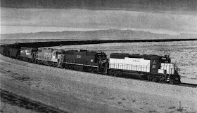
I would just correct one detail in the RMC version: the photograph was credited to me, but in fact was supplied by the Association of American Railroads. Here is the photo for reference.


Notice that all four locomotives are now “fallen flags.”
     So what’s it about? Here’s a kind of reprise of the article. Our premise could be regarded as the idea that you may not have enough space to build the model empire of your dreams (Pennsy’s Horseshoe Curve, St. Louis Union Station complete with train shed, SP’s Donner Pass), but you can always simplify down to the elements, even if all you have is part of a small room. In fact, you might be able to simplify all the way to one of those layouts that is only erected at one particular time of year, with a small, decorated conifer in the middle.
     What were we talking about? The Federal Railroad Administration test track in Pueblo, Colorado, built in 1971 for testing of high-speed rail concepts, and still very much in use, though with more track than when we described it in 1991. You can see the current track plan at: http://www.aar.com/tracks.php .
     The test track has the special attraction for modelers seeking simplicity that it is, indeed, just a loop of track (or a couple of loops today). Trains run around it at fixed speed, around and around, to generate miles of use on whatever is being tested, whether track, locomotives, cars, trucks, track-train dynamics, or whatever, and often several of these at the same time. Equipment borrowed from many railroads leaves you free to choose the road names you like, and DCC definitely is not a requirement.
     We also pointed out that scenery can be minimal (see photo). There is little vegetation at the site, few structures near the track, and in the eastward direction toward the Great Plains, there is only a flat horizon line, simplifying any backdrop needs.
     When we were writing this little piece, Richard and I were endlessly amused with ourselves, and thought the article was screamingly funny. But after it was published, editor Bill Schaumburg told us that not only did few readers find it amusing, but some actually complained, and in hindsight, there is a certain snarky tone to be detected. Obviously neither of us was cut out for comedy writing. But it was fun while we were thinking it up.
Tony Thompson