Many modelers think of the sky portion of a backdrop as just a blue color of some kind, which then receives a skyline of mountains, hills, forests, dwellings, and so on. But the sky is an important component. It is a kind of background, to be sure, but should still look realistic. My opinion is that except on very clear and bright days, the sky blue lightens toward the horizon, due to haze and dust, and the backdrop should reflect this. Clouds, if any, are an additional topic. California skies in much of the year are close to cloud-free, though near-coastal areas can have a marine layer of low clouds from spring to fall.
This post follows on from the prior posts, first about blending an old backdrop onto the wall above my layout extension at Shumala (see: http://modelingthesp.blogspot.com/2013/03/the-shumala-extension-part-3-backdrop.html ), and then about softening a room corner by giving it a radius (see: http://modelingthesp.blogspot.com/2013/03/shumalas-extension-part-4-handling.html ).
One can reproduce a sky color gradient with a single blue, with increasing additions of white at lower levels. Alternatively, one can choose a range of blue colors from a commercial palette. I chose to use three Pratt & Lambert colors to blend vertically in my sky painting. That paint company was not chosen for some particular paint quality, but because they offer small sample containers, so that paint colors can be tried out. My darkest blue, for the uppermost part of the backdrop, was “Capri Grotto,” their number 25-7. The medium blue, next down form the top, was “October Sky,” number 25-4, and the lightest was “Andover,” number 25-1. That these are all in the P&L “25” series shows that they have a base color in common, but become lighter with lower numbers. This is common in paint company palettes, and is worth looking for in selecting paint.
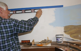
My first step was to use blue painter’s tape to set the edges of what I wanted to paint above the extension. These were checked with a level to make sure they would be vertical at one edge, and elsewhere parallel to the base and to the existing backdrop. Of course these could be aligned however you want, but I wanted a level top.
Once that was done, I painted a primer coat using the medium blue of my three colors, as you can see here.
When the blue primer was complete, it looked like this.
Next I needed to do the blending, top to bottom. I not only used my three shades of blue, listed above, but also mixed in old coffee cans, mixtures of half and half dark and medium blue, and medium and light blue. Using five colors total may be overkill, especially since this latex paint dries fairly quickly and the idea of “blending while wet” really can’t be accomplished. Anyway, here is how the blended sky looked, after removing the painter’s tape but before doing any clouds or land profiles.
That should be enough to describe my basic sky. I will probably work to blend a little better once all the paint is thoroughly dry and has attained its final darkness of color (these three blues do change quite a bit between wet and dry). Adding any clouds, perhaps a marine fog layer, and profiles of background hills is more of an “art” challenge, and I will describe that in a future post.
Tony Thompson


No comments:
Post a Comment