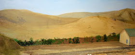
This is a challenging topic of long standing in designing layout scenery, and many books and talks about scenery present approaches to it. I just want to show one simple method I was able to use in a few places.
Re-erection of my layout segments in California, after moving them from Pennsylvania, did not always result in a tidy fit between the pieces. In particular, I made an adjustment in table height (to raise the entire layout a little), and in the process ended up with my backdrop even higher, leaving an actual vertical gap between the bottom of the backdrop and the layout surface. But once in place, lowering the backdrop would not have been simple. So I set out to disguise the gap.
Naturally hills or other terrain features, such as dense woods, could readily hide this gap. But those features did not make sense in some of my affected areas. Instead, I chose a really simple procedure to hide the gap. I just used pieces of manila folder, glued only to the layout, folded to extend upwards and cover the gap. Here is a view of a number of these manila pieces, and you can see how they are folded just high enough to cover the gap, which in this part of Ballard was about one inch.
Once these were in place, I painted them my usual “ground” color, Rust-Oleum Nutmeg, which of course made them a lot less obvious. Here at Shumala, you may note some cut-outs of distant houses on the backdrop, and I have also glued some Woodland Scenics Foliage material to the backdrop to add some three-dimensionality to the area.
In most places there will be structures or other “foreground” features in front of these manila areas, so I mainly wanted to indicate some kind of foliage back there. In my opinion, the last thing you want in this situation is an accurate or detailed or artistic piece of vegetation. Instead, I think you want just the suggestion that vegetation is what is there.
I used acrylic paints, mostly Chromium Green, darkened in places with a little Black, and some Light Green and Ochre Yellow for highlights. Here is how my vegetation looks on the Ballard side. Remember, little if any of this will be directly visible.
Most of the space visible here will be occupied by the Peerless wholesale food warehouse, which is displaced at right to make room to paint. But if you manage to see over the warehouse, there will be something there.
Behind part of Shumala, I did the same thing, although the gap was not as large. Here is the finished version. That’s a propane tank for the future bulk oil depot, an industry which will occupy most of the space you see in front of the backdrop.
Simple but, I think, effective. That would be my summary on this little trick for hiding any gap between scenery and backdrop. Maybe it will give you some ideas, even if you can’t use it the way I did.
Tony Thompson


No comments:
Post a Comment