This same kind of PFE lettering correction was also featured in my “Hindsight 20/20”talk, the handout for which was supplied as a blog post, containing numerous links to prior lettering correction posts (you can see the post of the handout at: https://modelingthesp.blogspot.com/2020/09/handout-pfe-models.html ).
One source of poor PFE lettering has been, in past years, Microscale decal sets. Back in the 1980s and 1990s, their PFE decals were, frankly, not close to the prototype. Indeed, their reputation in those days was that they just selected commercial typefaces that more or less resembled railroad lettering. Today, thankfully, that is ancient history and many Microscale sets are superb, particularly the PFE revisions using Dick Harley’s research and digital artwork.
I will show one example, from a 1990s version of Microscale set 87-414. (Side note: Microscale unfortunately continues to use the original set numbers, through revision after revision, so you need to examine a particular set to see if it’s the newest version.) Here it’s the numerals in the car number that are most glaringly wrong.
The model is an upgraded Athearn “Blue Box” steel reefer, with all Microscale lettering.
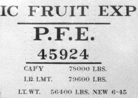
For comparison, below is a detail from a prototype photo. The numerals, as stated, are the biggest issue, though you may note that the PFE initials are also too thin in the model example above. The numerals are distinctly more condensed in the prototype lettering.
For such a problem, I simply paint over the numerals with Daylight Orange (an exact match for PFE orange), and re-letter. For this, I prefer Star Brand Paint’s STR-27, “S.P./P.F.E. Daylight Orange.” You can go so far as to use a very fine brush and carefully paint out only the numerals themselves, though often a rectangular paint patch works just fine, especially when seen at layout viewing distances.
Shown below is the same car as in the top photo in this post (though the other side of the car), with the current Microscale 414 numerals substituted. Comparing to the prototype numerals shown just above, you can see that this is a considerable improvement.
See the prototype example two photos above to see the condensed appearance that these digits
should have. Again, one can simply paint out numerals, or the
entire capacity data block can be painted out, like this: (You can click on the image to enlarge it if you wish.)
Then of course one replaces both the data block and car number, again, Microscale set 87-414, producing this improved appearance (that’s a route card at the right of the image):
Yes, I realize this is real “lettering geekery” and I confess to some typographic fixations on my part. But correct lettering is correct lettering, and if you care, getting “sorta close” is not going to be good enough. Every older modeler has at one time used the older Champ sets and winced a bit at the lettering, but it was all we had. Today, thank goodness, that is less true all the time.
Tony Thompson


No comments:
Post a Comment