I confess to suffering from an advanced case of “type geek” disease, which manifests itself, among other ways, in noticing when lettering is the wrong shape or proportion. Of course it also snaps its head up when wrong fonts are used, but that’s a different rant. In the present post, I will address freight car lettering, specifically Pacific Fruit Express.
As regular readers of this blog will know, this is not a new topic for me. Some time back, I posted an illustration of lettering on a Challenger brass model of a PFE Class R-40-26 car, emphasizing how wide of the mark — to state it tactfully — the lettering was, and I included a photo of the Challenger lettering (that post is at this link: http://modelingthesp.blogspot.com/2013/05/correcting-brass-model-of-pfe-car.html ).
When I phoned my contact at Challenger, he admitted that the lettering has been turned over to the Korean producer, who had been directed to “match” a prototype photo. Obviously their understanding of “match” was not informed by any typographic knowledge. My solution to the problem was, as described in the post just cited, to repaint and entirely reletter that model.
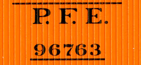
To show what we are aiming at, I show below a segment of a prototype photo of a PFE car’s initials and car number (it happens to be a steel car). The details of this Roman-style lettering were a Common Standard used by both UP and SP, and were constant with PFE for decades.
Allow me to call your attention to the proportions of the letters and the numerals, specifically the contrast of thick and thin strokes in the letters, and the somewhat condensed numerals. Sadly, manufacturers continue to ignore this kind of information.
Today, thanks to the painstaking and meticulous work of Dick Harley, we have superbly accurate PFE decal lettering. I reviewed one of the sets with the new Harley artwork, the set for black-and-white Union Pacific emblems, Microscale set 87-501, at this link: https://modelingthesp.blogspot.com/2013/07/the-new-microscale-pfe-decal-set.html .
Another set, the one for lettering with the red-white-blue Union Pacific emblem, Microscale set 87-414, has been similarly upgraded, and I used it in replacing some old Microscale car numbers, from a 414 set of the 1990s, to have more correct car numerals (I showed those lettering comparisons here: https://modelingthesp.blogspot.com/2016/05/replacing-bad-decals.html ).
Subsequently, that project was extended to a number of the older PFE reefers in my fleet, to bring them all up to “snuff” (see those projects at: https://modelingthesp.blogspot.com/2016/05/that-bad-decal-project-part-2.html ).
Despite Harley’s fine work on PFE lettering, manufacturers apparently continue to “wing it” for PFE lettering on models. Here is a recent Red Caboose (now part of InterMountain) lettering area, which you can compare to the lettering shown above.
The numerals are too short in comparison to their width, that is, they are not accurately condensed. The number “9” shows this clearly. And the serifs on the letters P, F and E do not match the prototype.
For an additional comparison, I show below the PFE lettering from current Microscale set 501, and you can readily see that it agrees well with the prototype photo at the top of the page, while further showing the poor qualities of the Red Caboose lettering immediately above. Again, look at the numbers 9, 7 and 6 in these two photos.
The current purveyor of both its own steel-car models of PFE classes, and of the Red Caboose wood-body cars, InterMountain, does not do much better on its steel cars. Here again, comparing their lettering to either the prototype photo at the top of this post, or to the Microscale 501 lettering immediately above this paragraph, clearly shows the shortcomings of the letters, though numerals are much closer to prototype than the letters.
I want to emphasize also that there should be no lack of sufficient information on this topic, including copious photographic coverage of PFE, both in the “PFE book,” as it is often called (Pacific Fruit Express, 2nd edition, Thompson, Church and Jones, Signature Press, 2000), and also in the Southern Pacific Historical & Technical Society book, Southern Pacific Freight Car Painting and Lettering Guide (Harley and Thompson, SPH&TS, Upland, California, 2016), which contains an extensive section, nearly half the book, about PFE, with Harley’s excellent lettering research.
Luckily, all the problems mentioned above are readily corrected with the outstanding recent Microscale sets I have mentioned in this post. But beware, if you have some elderly Microscale 414 or 501 sets stashed away. The old ones do not have the excellent Harley artwork, which is more recent. If you are thinking of doing some PFE lettering, don’t scrimp. Plunk down the price of the new 414 and 501 PFE decal sets, and find a new home for those old sets . . . perhaps in the round file.
Tony Thompson


The issue with inaccurate lettering from a supplier is typical of problems that crop up when the buyer is seeking the lowest possible price but does not follow through with quality control. Quality control is expensive and time-consuming, and stretches out "time to market". The issue is rife in fashion garment manufacturing, but model railroading is not immune.
ReplyDeleteWell said, Dan. You omitted, perhaps for politeness, that some manufacturers, to paraphrase the Clark Gable line, "frankly don't give a damn." Some have even told me so.
ReplyDeleteTony Thompson
I'm also a fan of typography. It is interesting that with today's technology, it should be easy to reproduce highly accurate fonts on models, but it is also time consuming.
ReplyDeleteWith the manufacturers that "don't give a damn", do they pay close attention to other details that are perhaps more important to a larger majority of modellers? Or do the models suffer in other respects?