Reference pages

Saturday, May 31, 2025

The Richard Hendrickson gondola, Part 2

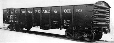
Recently I showed the partially completed gondola that was rescued from Richard Hendrickson’s workbench after he passed away. The body of the model was the Model Die Casting white-metal 40-foot car. As I illustrated, Richard clearly intended it to be a C&O gondola from their 44000 series cars with the high, rounded ends. That first post is at this link: https://modelingthesp.blogspot.com/2025/01/a-richard-hendrickson-freight-car.html

The model needed some detail work, namely the grab irons and hand brake on the B end of the car, but before doing that, I wanted to solve the coupler box problem. The original MDC cast underbody has a nearly scale width coupler box, but this is too narrow for a Kadee coupler. Rather that try to cut off and remove this coupler box, I hunted around in my scrap box and found a pair of Chinese knock-off copies of the Kadee design, which work all right even if not as well as an actual Kadee coupler. Then I could add styrene coupler box covers.

Next I needed to complete the B end detailing. I added grab irons with brass wire, a brake step, and an Ajax brake wheel and gearbox(see the prototype end photo in the preceding post, linked in the top paragraph, above).

With that work completed, I painted the model. I have been wanting to try a Tamiya color I hadn’t used before, “Rubber Black,” (TS-82), a slightly grayed black. Since this is a flat finish, as soon as it had dried, I added a coat of Tamiya “Semi Gloss Clear” (TS-79) on the outside of sides and ends, for decal application. I have found this semi-gloss to be fine for decaling, while avoiding that “mirror gloss” which can be hard to reverse.

For lettering, I dived into Richard’s decal stash, and used Champ set SHS-276. I followed the prototype photo from the preceding post in this series, which I’ll repeat below (a C&O photo). The decals didn’t have the exact size and spacing shown in this photo, so I got as close as I could with what I had.

When the decals were all applied and given a protective coat of clear flat, the model looked like this. It still needs to be weathered inside and out, but that’s a separate topic, to which I’ll return.

 I’ve enjoyed completing this project of Richard’s, and soon it will be at work on my layout.

 Tony Thompson

Wednesday, May 28, 2025

SP piggyback: Part 6, trailers

This is part of an ongoing series about the beginnings of Southern Pacific piggyback service. That service on the SP began in 1953, the year I model, so I am interested in the characteristics of the operation at its outset. In previous posts, I have discussed both the highway equipment, owned by SP subsidiary Pacific Motor Trucking, and the SP flat cars that carried the trailers. The most recent of these posts, Part 5, can be found here: https://modelingthesp.blogspot.com/2025/02/sp-piggyback-part-5-3d-printed-flat-cars.html

In a previous post, I showed the model trailers that had received a coat of white primer (Tamiya “Fine Surface Primer”). That post is at this link: https://modelingthesp.blogspot.com/2024/10/sp-piggyback-part-4-progress-on-3d.html . My next step was to airbrush them with Daylight Orange, using the excellent Star Brand version of this color, STR-27 (I have discussed this color: https://modelingthesp.blogspot.com/2022/06/pfe-orange-one-more-time.html ). 

Since in the final paint scheme this color is only on the upper parts of the trailer, most care was taken with coverage in those areas, but each entire model truck body was painted. Otherwise there could be risk of uneven color in the coat of Daylight Red to follow, on the lower parts.  

The next step was to mask off the upper part of the trailer, using the excellent 18-mm Tamiya tape. This tape performs beautifully on the glossy surface of the orange coat, above. Then I could paint the lower body, and the underbody, Daylight Red, using Star Brand STR-34. Here the masking line will be in the upper part, above the “belt rail” on the trailer, because it will be hidden by the black stripe, as is visible seen in the prototype photo, below.

This image is repeated from a PMT history post, which can be found at: https://modelingthesp.blogspot.com/2024/09/sp-piggyback-part-1-pacific-motor.html . Background: this is a 1940s publicity photo, posed to emphasize the truck–rail connection, shown here as a box car at a freight platform (SP photo, courtesy Steve Peery). The tractor here is a GMC, typical of SP’s long closeness with Chevrolet and GMC motor vehicles, pulling a 22-foot trailer.

The lower trailer bodies, and underbodies, were airbrushed red, and of course the tires will subsequently be painted black by hand as a final painting step. Here are the trailers at this point:

I might mention that there has been some disagreement over the years as to whether the underbodies were black or red. It is a minor point, since one can’t really see the underbody of a trailer on a flat car or on the highway. But SP photos of the trailer tie-down process, several of them reproduced in Chapter 13 of my book, “Automobile Cars and  Flat Cars,” Volume 3 in the series, Southern Pacific Freight Cars (Signature Press, 2004), seem to me to show a color like the bottom section of the trailer sides. 

Lettering follows the prototype photo shown above. Luckily, a Microscale Decals set of some years ago remains in production and in stock, set MC-4027. I used those sets (each of which can do one trailer) for these models. By the way, I should mention that examination of about a dozen photos of these trailers shows all PMT 22-ft. trailer numbers in the 3100 and 3200 number series.

My decaling approach has been to first stand the trailer on its flat end, and drape over the front a piece of stripe, containing the PMT initials at center front. Once that’s well dried, I start adding all the other lettering, along with a second length of stripe around the back, and the back end lettering. Here is a prototype rear view to illustrate (SP photo). And I should mention that locations of some of the lettering varied over time and for slightly different trailer bodies.

With the entire lettering applied, one can see what an attractive paint scheme this is.

I can hardly wait to finish the flat cars and start putting these trailers onto them! Thanks one more time to A.J. Chier for creating these fine 3D-printed models.

Tony Thompson

Sunday, May 25, 2025

More SP advertising

In a previous post, I showed a number of examples of Southern Pacific’s “institutional advertising” of the 1950s, meaning promoting the company itself to a general audience, not its specific products or services. Many were striking and colorful ads, produced by Foote, Cone and Belding, SP’s ad agency then and for some time afterward. That post is here: https://modelingthesp.blogspot.com/2025/05/sps-public-advertising.html .

Another in a substantial series of these ads is the one below, simply promoting the idea that SP was a progressive railroad, and as usual, including the “Golden Empire” graphic. You can tell when these ads were from the latter part of the 1950s, because they then included a Cotton Belt “add on” to the Golden Empire. (You can click on the image to enlarge it, if you wish to read the text.)

Another example, this one touting the railroad’s progress in dieselization, interestingly notes that dieselization should be complete by 1958. In fact, the last steam operations were in the fall of 1956. The emphasis on horsepower is interesting too.

An additional interesting example promotes SP’s perishable shipping, including a refrigerator car, though not mentioning Pacific Fruit Express or PFE’s co-owner, Union Pacific (the same as a PFE brochure I showed previously; see it at: https://modelingthesp.blogspot.com/2025/05/other-sp-advertising.html ). The paint scheme on the car chosen for illustration is actually imaginary, since PFE mechanical reefers were never painted this way, but instead had both SP and UP railroad emblems. And I find the ice block combined with the mechanical reefer amusing too.

But not all these ads were entirely institutional. SP also advertised in business publications, such as Fortune and Business Week, promoting the “Golden Empire” for plant locations. In the 1950s, there was substantial growth in on-line industries in SP territory. (Again, you can click on the image to enlarge it.) Inclusion of both steam and diesel power shows the ad dates from the late 1940s.


Last, occasionally one of the colorful Foote, Cone & Belding ads did promote passenger trains. The one below, in fact, promotes West Coast routes, and specifically the overnight trains, Lark and Cascade.

I find it quite interesting to see what aspects of itself the railroad wished to publicize, to the public readership of general circulation magazines. And the striking quality of the advertisements is certainly noteworthy. One of many characteristics of a vanished era.

Tony Thompson

Thursday, May 22, 2025

Small project: a Sunshine “mini-kit”

Back when Sunshine Models was in business, at the annual Naperville meeting (then conducted by Sunshine’s Martin Lofton), Martin would not only have the year’s new kits for sale, but would also offer what he called “mini-kits.” These were, in some ways, the predecessor of the Cocoa Beach “Shake ’n’ Take projects:” essentially simple kitbashes or kit modifications to achieve other prototype cars. 

I’ll confess these mini-kits didn’t greatly interest me at the time, as they often were aimed at particular prototype cars or railroad fleets in which I had little interest. But my good friend Richard Hendrickson did like them, and usually bought all of them on offer in a particular year. When Richard passed away, back in 2014, most of them were auctioned off, along with his resin and styrene kits. (For those who don’t know or have forgotten who Richard was, you might enjoy reading my tribute to him, which is at: https://modelingthesp.blogspot.com/2014/07/in-memoriam-richard-hendrickson.html .)

But I did keep a few that I thought might be interesting. These were carefully put away “in a safe place,” about which I naturally soon forgot, and it was only recently that I re-discovered the stash of mini-kits. I decided to build one of them recently, for a 1937 AAR box car built for the Gulf, Mobile & Ohio. Below is an American Car & Foundry builder photo of a car from the 5000–5683 series, built in 1942, and truncated that year at 684 cars by the War Production Board.

The photo is from Railway Prototype Cyclopedia Volume 35, by Pat Wider, one of two impressive and complete volumes about the 1937 AAR box cars.  (For more about these volumes, see my post discussing them at: https://modelingthesp.blogspot.com/2025/02/an-appreciation-railway-prototype.html ). The photo happens to show a short-lived GM&O paint scheme with the “Rebel Route” banner, which was dropped a few years later.

The kit directions called for an undecorated Red Caboose 1937 box car kit, which I didn’t have, but I did have an Innovative Model Works (IMWX) kit for the same car, tooling for which formed the basis for the Red Caboose kit, so I used that. I assembled the kit,adding a bit more underbody brake rigging and painting the roof black before installing it. Here is the car at this point (riding on “shop trucks”):

Next came the issue of paint scheme. The Sunshine decals included with the mini-kit were for the scheme with the banner, but I decided to model the subsequent scheme, which omitted the banner. Below is a Paul Dunn photo, taken in 1952, showing the later scheme. I confess to liking these simpler schemes.

At this point I applied the decals from the mini-kit, the usual excellent RailGraphics product supplied by Sunshine. In addition, I installed Kadee #158 couplers and suitable trucks with InterMountain wheelsets. The car then looked like this:

Weathering was next. I followed my usual procedures, using washes made with acrylic tube paints, as described and illustrated in the “Reference pages” linked at the top right of this post. A protective coat of clear flat followed. Then I could add chalk marks, route cards, and patched reweigh numbers and date.

This was an interesting small project, and a chance to use the old, undecorated IMWX boxcar kit that I have had in my stash for years. This GM&O box car now ready for service on the layout.

Tony Thompson

Monday, May 19, 2025

Freight car bogosity

This post may, I suppose, be seen as not entirely serious, but I hope it does contain a serious point buried somewhere within it. It was occasioned by a slide I found, taken on my old layout in Pittsburgh quite a number of years ago. The photo showed a mainline train operating on my modeled segment of Southern Pacific’s Coast Division, and though the photo isn’t very sharp or well-lit, I noticed something in the shot that made me smile — maybe in a rueful way.

What I noticed in that train was a piggyback flat car, a model that has mostly been in “dead storage“ in the intervening years, an old Ulrich flat car for piggyback service. Why was it bogus?

First of all, the flat car: it’s a steel fishbelly sidesill design, but different from any actual SP flat car. I did number it within an SP 40-foot flat car class (Class F-50-10, cars built at Sacramento General Shops in 1927), but those cars had straight side sills, not the fishbelly of the Ulrich model. More importantly, SP’s Pacific Lines, which I model, never had any 40-foot piggyback flats. To be sure, the T&NO did operate such cars, but they would not have operated in California in the earliest days of SP piggyback, 1953, the year I model.

Moreover, the Ulrich model has a trailer support “post” that works well with the Ulrich 35-foot trailers, such as you see above. But without the trailer, the appearance is, shall we say, less than realistic, despite the nicely rendered bridge plates and rub rails.

But there are even more important reasons than the above for concluding that this model is bogus. SP began its piggyback service handling its own Pacific Motor Trucking (PMT) trailers exclusively, and in the 1950s did not accept anyone else’s trailers for movement. So the very idea of a Pacific Intermountain Express (PIE) trailer on an SP flat car in 1953 (as in the upper photo, above) is completely incorrect.

All this history and more is contained in Volume 3 of my series, Southern Pacific Freight Cars (Signature Press, 2004). Further history that places SP operations in context with the rest of North American railroads is David DeBoer’s Piggyback and Containers (Golden West Books, 1992). It was not until late 1959 that SP gave up on its “in-house” piggyback with PMT only, began to purchase conventional 85-foot piggyback flat cars, joined Trailer-Train in 1960, and began handling trucking company trailers. So it’s clear that a commercial trailer on an SP flat car on my 1953 layout is way wrong.

But I have a confession to make. Every now and then, I have slipped this car into a mainline freight during an operating session, and wait to see if anyone notices. So far, no one ever has. Or maybe was too polite to comment . . .

Tony Thompson

Friday, May 16, 2025

Other SP advertising

 In the preceding post to this one, I showed a number of examples of Southern Pacific’s versions of “institutional advertising,” which is advertising of the company rather than creating demand for its products (since only a rather small fraction of the audience in mass-circulation magazines is in a position to select the service). Here’s a link: https://modelingthesp.blogspot.com/2025/05/sps-public-advertising.html .

In the present post I want to give some examples of much more directed advertising, that is, directed at customers. I will start with examples from the introduction of SP’s new piggyback service, which though graphically resembling the institutional ads shown in the preceding post, nevertheless certainly pitched SP’s ability to move freight on the road and on the rails.

SP also distributed brochures to actual customers, presumably a far more relevant and potentially responsive audience. Below is the cover of one such brochure. The interior described train times and delivery service via the SP subsidiary, Pacific Motor Trucking (PMT). This brochure, obviously, does not show the creative handiwork of Foote, Cone & Belding, SP’s ad agency in the 1950s, who did make the ad shown above. You can click on the image below to enlarge it if you wish.

Another component of the SP service was its perishable shipping via Pacific Fruit Express. PFE distributed brochures at various times, publicizing newsworthy events like the delivery of a new class of refrigerator cars. They also distributed brochures about service. I show one such brochure below, which though it publicizes a PFE service, carries only the emblem of SP, since the El Paso facility was on SP rails, though of course PFE was jointly owned by SP and UP.

Below is the outside of the brochure; it was folded along the vertical center line to make the brochure. Thus what you see below is the brochure front at right, and the back at left.

The interior likewise would have shown the vertical fold, with the photo of the El Paso ice deck extending the full width of the brochure inside pages. There is additional interesting material in this brochure, that I would like to discuss in a future post. For now, it’s advertising by an SP subsidiary.

Both these brochures, about piggyback and icing service, inform customers, but they are quite different than the “institutional” ad at the top of this post, and those shown in the preceding post. Obviously SP, like any railroad, needed to keep its customer, present and possible future ones, informed about capabilities, and like the institutional ones, clearly show railroad priorities.

Tony Thompson


Wednesday, May 14, 2025

More on chalk marks

In the previous post, I showed prototype examples of chalk marks on freight cars, marks made by switchmen as directions for movements in yard or industrial switching. That post can be found at this link: https://modelingthesp.blogspot.com/2025/05/a-few-comments-on-chalk-marks.html .

Prototype chalk marks vary widely, sometimes being fairly complete in the message presented, other times as little as a single number or letter. Here’s an example of a meaningful single letter, E (likely meaning “eastward’), toward the right end of the car side, on a UP 40-ft. automobile car (from Culotta’s Volume 7, page 20). This is UP Class A-50-7, rebuilt from a double-sheathed car in 1935. An auto rack is visible in the open door.

Sometimes you can read a message and guess at its interpretation. Railroaders always say, however, that every yard and to some extent even every clerk had their own codes, and there was little uniformity or consistency to what a particular word or number or symbol might mean. Here’s an example, from Volume 4, page 32; you can click on the image to enlarge it if you wish. The steel box car was built in 1930 and has a Creco door.

The message nearest the door seems to say “MAGS,” possibly meaning “magazines,” and then what look like dates. Underneath is the word RUSH with three underlines. and to the right of that message is a presumably older one that is lined out. 

Here’s another case of a readable message, taken from Volum 7, page 65, an ACL rebuild of a 40-ton USRA car, ACL 46943. Note that it’s located high on the car, thus probably written by someone standing on a loading dock, not standing at trackside. It says “3 Box Shook HQN 17 Door.“ Box shook is the wood component parts for shipping boxes or crates, and “17 Door” may be the desired unloading point, or else the door from which the car was loaded.

As I mentioned in the previous post (see link in top paragraph, above), often the chalk mark is a number or a date. These are very easy to add to models using a white or light gray pencil Here’s further examples, from Volume 4, page 35, with simple number marks on both cars.

In contrast to the frequently very brief marks, there are also examples of extensive chalk marking, and some modelers have attempted to recreate this look with very fine pencil points (or certain commercial offerings). This is one of the ACL rebuilt USRA cars, taken from Volume 7, page 64.

Last, I want to point out that these kinds of chalk marks were also seen on light-colored cars like refrigerator cars, legible because of the underlying dirt and grime before the chalk was applied. This example is a Union Refrigerator car,  URTX 81824 in Volume 8, page 92.


These examples should be helpful for those choosing commercial chalk marks to apply, and of course to those writing their own with white pencils. I will return to these matters in a future post.

Tony Thompson

Saturday, May 10, 2025

SP’s public advertising

In the 1950s, Southern Pacific, like a number of major U.S. corporations, undertook to publish what is called “institutional advertising.” This means advertising on behalf of the company, not to prospective customers or purchasers so much as to increase reputation with the general public. Accordingly, such ads appeared in general circulation magazines such as Time Magazine or the Saturday Evening Post.

One example, likely intended to publicize the American West and California in particular, using SP’s new “Golden Empire” graphic,emphasized the major categories of crops and products produced there. The SP’s ad agency at this time was Foote, Cone & Belding, an agency well known in the 1950s for creative advertising. Note the inclusion of the diesel locomotive, indicating modernity.

Similarly using recognizable railroad components, a message like the one shown above was rendered using track elements and, again, bright colors.

Another example, this one using the popular “flipper” toy of the time, emphasized the railroad’s capability and modernization, again with the white background and uncluttered look:

Note here that the new streamlined passenger trains were mentioned. Another ad with this aspect included is this one: 

Another ad which trumpeted modern thinking at SP, again in colorful graphics:

Finally, some ads did focus on freight transportation, and note the major role stated for SP’s relatively new piggyback service, as well as its Pacific Motor Trucking subsidiary:

All these ads may well have appealed to freight shippers or passenger train travelers, and perhaps more importantly to those looking for new plant locations, But clearly they are largely aimed at the visibility and reputation of the advertiser. 

To me, this is an interesting sidelight to SP in the 1950s, revealing the way it wanted to be viewed by the public, and of course emphasizing what it saw as its strengths. Institutional as it may be, it is still an insight into the how the railroad viewed itself.

Tony Thompson


Wednesday, May 7, 2025

A few comments on chalk marks

Most modelers of freight casrs from earlier times are ware of the chalk marks that could be found on car sides. For the most part, these were switchmen’s marks and were not, nor should they be referred to as, graffiti. A photo I have shown several times, taken at Englewood Yard on the T&NO, depicts a yard clerk applying such a mark.

In the photo, he is writing with what is still known as “railroad chalk,” roughly an inch in diameter. White and yellow were widely used, but other colors, including blue, were available. Below I show a couple of sticks of this chalk. It is quite sturdy and unlike blackboard chalk, not easily broken. And the large diameter means that chalk marks made with this chalk were relatively broad, not like what we associate with blackboard chalk.

I have written about this topic in two previous posts, one from way back in 2011 (see it at: https://modelingthesp.blogspot.com/2011/11/chalk-marks-and-route-cards.html ).  The second one was a couple of years later and included a number of model photos with chalk marks applied. That post is here: https://modelingthesp.blogspot.com/2013/04/more-on-chalk-marks.html .

Since many if not most prototype freight car photos do show at least a few chalk marks, we need to include them on our models. For years, there have been commercial offerings, both dry transfers (Clover House) and decals (Sunshine, Champ, Speedwitch Media and others), and these may meet your needs. But it is simple to write them yourself. A sharp artist’s pencil in white, gray or other color makes this simple.

But then comes the issue of what to write. You can just make something up, or a better option is consulting good, clear prototype photos, such as the photos in the superb series of books prepared by Ted Culotta, entitled Focus on Freight Cars (Speedwitch Media); Volumes 4, 5, 7 and 9 remain available (go to: https://speedwitchmedia.com/ ). Here’s one example, taken from the series Vol. 4, page 82. The car shown is SP 38017, part of SP Class B-50-19, a 1937 AAR box car.

Note that the message being conveyed is by no means evident, but swirls or slashes of chalk like this, and one or more numbers like this “17,” are very common in prototype photos. Note also two previous messages that are lined out, presumably superseded. Sometimes writing is fairly large, as in this photo of CCC&StL (NYC) 58392, from page 17 of Volume 4; this would be easy to imitate.

And as mentioned, it is quite common to find older chalk markings lined out, crossed out, or X-ed out. That’s well shown in this example from Volume 1, page 61, showing one end of SP 29889, a member of SP Class B-50-14. It was common for the chalk marks to be concentrated at either end of the car side, as you see here.


And sometimes it’s just a squiggle, maybe the clerk warming up his wrist, as in this photo of Seaboard 18735 from Volume 4, page 48. This was one of Seaboard’s 1932 ARA box cars. That’s a defect card holder right above the chalk mark.

All these prototype examples should provide lots of ideas about “what to write” when adding chalk marks to a model. As a single model example, below is a gondola on which I used a blue pencil (the classic editor’s “sky blue” pencil). This is an Ertl model I have posted about (see this link: https://modelingthesp.blogspot.com/2024/10/small-project-maine-central-gondola.html ).

Tony Thompson

Sunday, May 4, 2025

An SP steam switcher, Part 4

I began this series of posts with prototype information and photos, focusing on later classes of Southern Pacific 0-6-0 switchers, and discussed some related points, such as tenders. You can find that post at this link: https://modelingthesp.blogspot.com/2025/02/southern-pacific-steam-switchers.html

I followed that with describing the mechanism work on the M.B. Austin HO scale brass model I have, along with a couple more prototype photos. (That second post is here: https://modelingthesp.blogspot.com/2025/04/an-sp-steam-switcher-part-2.html ). The work was done by Mark Schutzer.

Finally, I showed the remainder of Mark’s work on the model, the new, much larger boiler weight and the sound decoder and speaker in the tender. The post describing and illustrating those steps is located here: https://modelingthesp.blogspot.com/2025/04/an-sp-steam-switcher-part-3.html ). Next I touched up the paint, which was quickly completed, and then turned to lettering.

As most SP modelers know, we have a superb reference document for painting and lettering of SP locomotives, in the Southern Pacific Painting and Lettering Guide, Locomotives and Passenger Cars, by Jeff Cauthen and John Signor, 2nd edition, SP Historical & Technical Society, Upland, CA, 2019. I have relied on the information in this book in lettering my 0-6-0 model.

The overall locomotive and tender were black, with an aluminum-painted boiler front. In 1947, SP adopted a gray enamel, Lettering Gray, for all locomotive lettering (except Daylight steam locomotives). Any model lettering for non-Daylight locomotives that is white or silver is incorrect from 1947 onwards. This has been well understood by decal makers, including Microscale, Foothill Model Works, and California Locomotive Works.

Here is a prototype photo which illustrates the locations of lettering elements (photographer unknown, Bob Brown collection, courtesy Clark Bauer). This is a Class S-10 engine at Bayshore, but lettering was the same on the Class S-12 engine that I am modeling. You can see the tender capacity data at the lower front of the tender, and engine class data under the cabside numbers. As was usually done, the road name on the tender is on the water compartment.

The points to be recognized in lettering a locomotive like this with a relatively small tender (7000 gallons of water) is that the road name on the tender after 1946 was only 9 inches high. Cab numerals, however, were to be 15 inches for all locomotives (again, except for Daylight schemes), and tender rear numerals 12 inches. I have used a mix of Microscale (set 87-105, SP Light Steam), and Foothill Model Works (sheet FMW-600, SP Steam), the latter using the excellent artwork of Charles H. Givens. 

Here is a front view of the model, showing the engine number lettering on the front number plate and on the (illuminated) sides of the headlight casing. Here the model has a coat of clear flat but is not yet weathered.

In addition to lettering, there is also some detail painting that is needed. Most SP steam locomotives had injectors and certain hot water and steam line valve handles painted some kind of red, which typically oxidized to a brownish-red color. I used Tamiya “Hull Red” (XF-9) for this. 

Smokebox sides and stacks were painted with a graphite mixture, which gradually darkened and got dirty in service, but is usually evident in photos, as in the example above. I used Floquil “Graphite” for this. Smokebox fronts were painted aluminum, and number plates were black with aluminum numbers.

Cab window shades were canvas on an adjustable steel rod frame. When new, they were a khaki color, but of course got dirtier and dirtier until replaced. I used Tamiya “Deck Tan” (XF-78) for the base color, then used Pan Pastels to dirty it.

I also installed a cab apron in the model. What’s a cab apron? Prototype background and modeling techniques were described in a previous blog post (consult it at: https://modelingthesp.blogspot.com/2022/07/modeling-cab-aprons.html ). My first step in adding this part was to add a cab floor. The model had none, because the original mechanism had the open-frame motor extending back into the cab, with an appearance something like this (not my model).

 With the new mechanism (see my “Part 2” post, linked in the top paragraph, above), this space is empty. I made a new floor from cardstock, and used the same material for a new apron (I have used styrene here in other locomotives). This effectively conceals the relatively large gap between engine and tender that is conventional in model locomotives. 

Here is a rear view of the engine, switching on my layout at Shumala, showing the tender lettering, including the “7000 gallons” legend at the bottom rear of the tank and the capacity data at lower front corner of the tank. 

The model was lightly weathered using acrylic washes (see the “Reference pages” linked at the top right of the present post). But as that is a somewhat separate topic, I will conclude this post here.

Tony Thompson