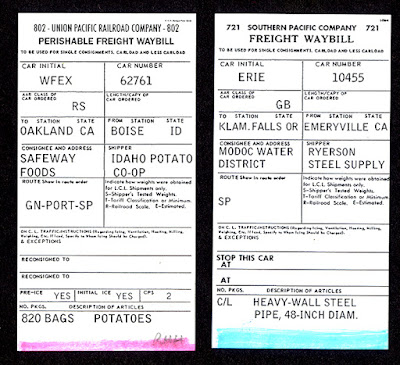
In the previous post in this (long) series about waybills, I took up the topic of the various roles that waybills may play in operation of model railroads. In my view. such roles ought to mimic, at least to some degree, the role that waybills play in prototype operation. You can read that preceding post at: https://modelingthesp.blogspot.com/2022/04/waybills-part-95-role-in-operation.html .
One can route freight cars in a layout operating session in a number of ways, of which waybills are only one. I personally think that some form of waybill, in model usage, captures an aspect of the prototype that is useful and appropriate to include in layout operations, for any era before the 1970s. But if some see it as too complex, what ways can simplify it s help to the reluctant? I mentioned color coding, with stripes or dots on the waybill, in the previous post.
(Below is an experiment I did for the late Otis McGee to consider for his layout. This was to label through cars with a blue stripe for eastward destinations, pink for westward — this idea was rejected by both of us in favor of just training operators. I will say more about that training presently.) But if not color stripes or dots, what else might be done?
One possibility is to code waybills for destinations, particular trains, or even just direction of movement. For example, you could add a code as well as a color block it to use the block at the top left of a prototype waybill (which is labeled “Place Special Service Pasters here). Such a “service paster” might well be in color, so this location could be used very flexibly, as Frank Hodina
did in the example below. Note that this form closely follows the AAR
prototype.
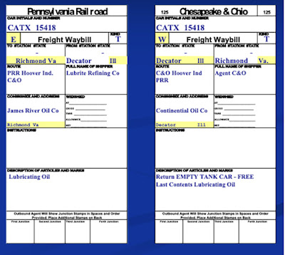
Another possibility is to use a code on the waybill, and to highlight such codes to make it even easier
for an operator to find. Below are two examples from Ted Pamperin’s Chesapeake
& Ohio layout, with codes at top left for through trains eastward
and westward (E and W, in the yellow blocks). This approach has the advantage of using soft colors, thus minimizing any intrusion.
These are only a few examples of ways layout owners have chosen a prototype-looking waybill design, but with some “help” addition, often in color, to make it easier to use. I personally admire Frank Hodina’s clever use of the “service paster,” and commend any approach that is similarly of minimal intrusion on the prototype appearance.
But my personal preference is to avoid color codes — I would rather figure out how to make the waybill more comprehensible — and I will take up further possibilities in a future post.
Tony Thompson


Tony
ReplyDeleteHow about fashioning ‘inked’ stamps similar to what you have discussed and shown for weighing and inspection bureaus, etc.? You could have several or more different stamps, but the ink color would be the routing key - say for example red ink for west and blue ink for east.
re: Wayills, Part 97? Really? 🤭
ReplyDeleteAnd your point is?
DeleteHi Tony. I just delivered a clinic to RMMBC on Thursday about adopting more prototypical waybills, and legibility and acceptance by operators was a consideration that came up. I like Frank's idea as well as it retains the feel for the prototype bills. Obviously there is a feeling that this is an obstacle for operators in using these bills, but is there really resistance once folks have been shown how to read them? Is it that there's a learning curve at the start, or have any of you (Ted, Frank, yourself, etc.) found that legibility was an issue that persisted even after an individual had been trained in how to read the waybills? Cheers!
ReplyDelete