In that first post, I placed a blank waybill which did not have the description of the articles of cargo as the bottom item on the bill, which is effectively how the prototype bill is laid out. The way that bill should look is shown here, with the “description” area properly located (subsequent posts on waybills did have this correct arrangement):
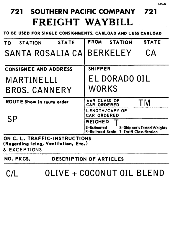
As I’ve stated previously, I fill out the waybills using a variety of digital typefaces which look like prototype billing typewriter fonts (always completely in upper case). The font I’ve found which looks close to the SP’s billing typewriter is called Bell Gothic. Here is an example of it, for a load to my fish cannery:
I also use two typefaces which nicely suggest worn and dirty keys in a typewriter. One is called “Mom’s Typewriter” (literally digitized from the output of an old typewriter), available free at www.fontspace.com/christoph-mueller/moms-typewriter, and the other is called “Typenoksidi,” which Jeff Aley told me about originally, available free for personal use at www.dafont.com/typenoksidi.font. Here’s an example of the latter face, an inbound load directed to a team track:

These waybills are working well. What I plan next on this topic is to describe the procedure I use in “pulling” waybills for a forthcoming operating session, and then managing waybills and Empty Car bills in the process.
Tony Thompson
Tony,
ReplyDeleteYou mention in the DO article that you decided to put the car mark/number at the bottom of the waybill to eliminate the fuss of precise label application on the car sleeve. If the large white space at the bottom of the bill were pasted into your form between the header and the TO | FROM line, would it require that precise of a label location? If you tried that and it did not work, I would like to hear a little more...
I am beginning my own waybill creation for my layout, and am planning to use a similar system to your's (from Bill Neale's original concept). But in my experience with car cards, I want the car information to be at the top instead of the bottom.
You make a good point, Andy, and I described the experiments on page 6 of the corrected DO article, shown in my post entitled "Waybills 2;" that article is available through Google Docs at this link (unfortunately you will have to copy and paste it, as these Comments don't seem to allow identifying text as a link): https://docs.google.com/viewer?a=v&pid=explorer&chrome=true&srcid=0Bz_ctrHrDz4wMDhmMDk1N2MtNzY2MS00Y2RlLWI4MGMtMGJjODBiNGRhZWIy&hl=en&authkey=COyo7MQN
ReplyDeleteYou will see that I did try both a large and a small area at the top of the waybill form, in order to put car initials and numbers there. I didn't like the very large space which I believed was needed to get the Avery label to locate there reproducibly. I have since seen a version of the Bill Neale sleeve, made by Jeff Aley, which works better.
At this point, with over 350 car sleeves made and almost 1000 waybills, I don't think I will try and change my system. Maybe if we have a REALLY rainy week or two or three next winter (grin) . . . but I think the option is open to improve upon the way I do this system.
Tony Thompson