Friday, November 18, 2011

Upgrading old models, Part 4: an update

In a previous post, I described the first part of the work I did to upgrade an old Athearn metal box car in HO scale. The idea was not to claim any special significance to this particular model, but to show the kind of process needed with older models to sustain consistency with modern freight car models and, of course, modeling standards. Here’s a link to that previous post on the model work: http://modelingthesp.blogspot.com/2011/09/upgrading-old-models-4.html .
     The Athearn model represents a 1937 AAR standard box car, but as shown in the previous post, was  numbered and lettered as an Illinois Central postwar car, which should have had different ends, among other things. So to make the car number consistent with the prewar model car body, it needed to be renumbered. I chose IC 18545 as its new number.
     I had used a decal set from Jerry Glow to renumber the car, and corrected its built date to 1940 (consistent with the car number). If you’d like to get one of these sets, it’s the 10'4" IH set for IC; scroll down on Jerry’s web page ( http://home.comcast.net/~jerryglow/decals/full.html ). Then with all model work done, I weathered it. I used my usual acrylic weathering method, which is essentially a wash (see the joint clinic handout prepared by Richard Hendrickson and me for a clinic at the Lisle 2011 meeting, available at: http://modelingthesp.blogspot.com/2011/10/weathering-clinic-handout.html ). Since the car is being modeled as a prewar car, it can be presented as pretty dirty.
     Upon completing the weathering coat, I covered the old capacity data and reweigh date with rectangles of boxcar-red decal sheet, included in the Sunshine decal sets for reweigh data, and added fresh capacity numbers, using the ones in the Jerry Glow set. This particular group of Illinois Central box cars had 80,000 pounds capacity, not the 100,000 pounds that is typical of most 1937 AAR box cars, so the Jerry Glow set is essential in providing those data. The set also includes a reweigh symbol of JSTN, for Johnston Yard in South Memphis, a busy place on the IC and a likely candidate for a reweigh symbol.
     Here is a snapshot of the completed car, including a few chalk marks made with a Prismacolor white pencil and both placard and route card on the door.


     This has been an interesting challenge of a project, and though there are no doubt easier ways to arrive at this final result, I have enjoyed solving the various problems associated with this upgrade. I’m pleased to have this veteran model now suitable for service on my layout.
Tony Thompson

Thursday, November 17, 2011

Operations: demand-based car flow-3

There are several ways in which computer techniques can be applied to a waybill system. I’ve already written about the computer applications I use for my waybill preparation. But this post is about computer usage in car flow management. I will just describe a couple of examples, rather than try to be comprehensive.
     One issue sometimes raised is the waybill selection process. Simply drawing the next waybill for a particular industry from the front of a stack, and returning used ones to the rear of the stack, strikes some as too much of a fixed sequence. One can of course shuffle the waybill stack from time to time, but there are those to whom the resulting overtones of a card game are bothersome. I experimented with a computer method to select upcoming waybills. Here is how it works.
     For a particular industry, say a packing shed, a certain number of waybills has been created, let’s say 22. These are all outbound loads of produce and so are essentially interchangeable. We now want to select one of those 22. In Microsoft Excel, one can set up to do this with random numbers. For this simple example, this is pretty easy to do. Excel contains a random number generator, and if you don’t have an Excel manual or after-market guidebook, there are on-line directions for how to set it up. Here is a link to one example:  http://www.mariasguides.com/2007/06/28/random-number-generator-for-excel/ . You can readily Google others.
     This method delivers a number, between 1 and 22 in this example, which corresponds to one of the 22 waybills. This of course implies that the waybills are numbered for each industry, and for convenience in use, would need to be filed in numerical order. Then locating bill 17, if that number is selected, is a quick process.
     But this example, the 22 waybills for outbound produce loads at a packing shed, is pretty simple. Most industries, including packing sheds, do have other traffic (such as shipping boxes inbound at a packing shed), and so waybill stacks may have to be sorted by car type or by inbound vs. outbound. Those kinds of details are present in the tables I show below, and in fact I have separated inbound and outbound traffic waybills for a couple of my larger industries. That means that the Excel method has to be refined a little further.
     To illustrate the coding I used, I show a table from the prior post on waybill scheduling (at: http://modelingthesp.blogspot.com/2011/11/operations-demand-based-car-flow-2.html ). This contains 10 days of inbound car movements for two towns, each having three or four industries and a line for “random” or unusual waybills


     The first step is to code the industries and car movements. Here’s what I did. I gave the industries arbitrary numbers (510 series for Shumala, 520 series for Ballard), and for each car requirement, created a two-digit code. The first digit has the values of either zero, one or two, denoting no move, an empty car, or a loaded car. The second digit has values 1 to 9, denoting car types. I won’t list them because they are indicated in a footnote to the following table. Then the exact same table as shown above looks like this:


Though presented as a text table, these are the entries in my Excel file, with each cell shown as presented. With the foregoing descriptions of codes, you can see that this is the same as the table shown above. The one thing that may appear different is that in the upper table, “random” entries are present for a third town, Santa Rosalia (SR), and those are omitted in the Excel table.
     I ran a number of experiments with this Excel set-up, and was pleased to find the random-number-generator approach worked fine and did deliver waybill numbers in a satisfying and varied way. But it’s worth mentioning that a relatively random selection of waybills can be accomplished just by grabbing a waybill from somewhere within a filed stack. For limited numbers of waybills, this may be less effort than formally generating random numbers.
     I should further emphasize that the Excel technique described above is only a method of randomizing the selection of waybills, not a waybill creation method nor a scheduling method. Waybill creation directly in the computer is being explored by a number of modelers around the U.S. In most cases I’m aware of, they are using Excel. A serious limitation (to my way of thinking) is that the scanned railroad graphics I use at the head of my waybills can’t readily be inserted into Excel waybills. I very much like the effect of the actual railroad graphics and it’s become a feature I especially value about my system.
     I know of at least one person who is using the random-number generator in Excel to do scheduling, that is, to identify industry car demand by a random number. To me, this misses the entire purpose of a demand-based car flow approach: to duplicate the regular or periodic patterns in car movement as well as the relatively random ones.
     This Excel experiment was only intended to illustrate how a very large layout, with large numbers of waybills and industries, might go about pulling the waybills to fulfill a schedule. On my relatively small layout, I don’t have any difficulty or delay in simply consulting a paper copy of my distribution schedule.
Tony Thompson

Monday, November 14, 2011

Route cards — 3

I have received a very pertinent question via email, namely, where were route cards posted when the board for them isn’t obvious? Particularly for older models, on which these details were often omitted, it might not be very clear where they should go.
     When there was a placard board on the car door (on a box car) or next to it (on a steel reefer), the route card board is usually not far away. And on a wood-sheathed car, it was often assumed that car clerks would staple onto the wood somewhere, and no route card board might be provided.
     But there are exceptions, which I’ll now describe. First, railroads had the option to locate the route card board wherever they wished, and that choice might not be the usual one. For example, several classes of Union Pacific steel box cars had the usual placard boards on the doors, but located the route card board at the left bolster, as shown in this Wilbur Whittaker photo:


Models of some UP box cars have faithfully omitted the route card board on the car door, but have not provided it at the bolster location, so it needs to be added.
     In most cases, these boards were eight inches high and 12 inches long, but sometimes they were different sizes or different proportions. A prototype photo is your best guide.
     A second point to recognize is that on open-top cars, it was very common to put a route card board near or at the left bolster location, near the bottom of the car side, as in the UP box car above. But many exceptions can be found. Here is an SP gondola, in an SP photo, which despite its wood sheathing does have a route card board, two side panels to the right of the bolster:


But note that the car clerk has ignored the board and tacked the card near the bolster!
     And sometimes SP chose to put the route card board all the way to the right end of the car (shown here in another SP photo). This was done on some classes of SP ballast hoppers too. You may click on either of these photos to enlarge them to see details.


Again, prototype photos are essential to correctly locate route card boards on cars other than house cars, and even on house cars like the UP box car shown above.
     On models which don’t have a route card board, or which have one located incorrectly, I just use styrene strip, of scale 1 x 8-inch size, and cut off 12-inch lengths. Of course when a prototype photo shows a route card board of different size or proportion, I try to approximate it by appropriate trimming of the same strip styrene.
     I added such a styrene route card board to an Ulrich metal GS gondola model, modified for SP’s Class G-50-12 with two-level Dalman trucks (from Tahoe Model Works). The load in the car is a Chooch product. As you can see, I located the board in accord with the prototype photo shown above.


As is obvious in the photo, I have not chosen to replace the cast-on grab iron representations with wire grabs. That Ulrich white metal is hard stuff!
     I will mention in passing that the most common car types to lack route cards in prototype photos are open-top cars, so my recommendation would be to “card” most house cars, but maybe only half or so of your open-top cars: gondolas, hoppers, and flat cars.
     Lastly, I should mention a usage seen even on cars which did have route card boards: car clerks just stapled the route cards to any exposed wood on the car, such as the edge of tank car walkway (as long as the walkway was wood), or the edge of a flat car deck. Here’s an SP tank car example, in a George Sisk photo taken at Kansas City in 1959:


Note that the car does have a route card board, just to the right of the ladder, above the walkway, but the clerk ignored it and placed the route card where he thought it would do the most good. Here is my version of it, using a W.A. Drake brass model of the same SP tank car class as the prototype photo (O-50-14):


 I used yellow paper for this one.
    Route cards add visual interest to freight cars, even though they are quite small, because they are light colors and are eye-catching. And I believe it is interesting to model both standard route card locations (on the board provided), and also the different kinds of route card locations which are not on the boards. If you haven’t applied any route cards yet, give it a try and I think you’ll like the effect.
Tony Thompson

Route cards — 2

The question has arisen as to what route cards looked like. I don’t have any collection of them, but can provide two examples. The general size was mentioned in the prior post on this topic, at: http://modelingthesp.blogspot.com/2011/11/chalk-marks-and-route-cards.html .
     Both these examples are from the book by E.W. Coughlin, entitled Freight Car Distribution and Car Handling and in the United States (AAR: 1956), an extremely helpful and informative book for those interested in car movements. For anyone who wants a copy, they have been readily available used on the Internet.
     This Missouri Pacific form was printed in triplicate, the bottom copy of which was a  manila card to be attached to the route card board on the freight car. Its first two copies were for clerks’ use.


Like many kinds of Empty Car Bills, this can serve for moving foreign empties homeward, or directing cars to locations which needed empty cars.
     Coughlin also discussed the use of “switching cards,” which could be applied in a terminal yard to direct cars to local industries, or could be applied to cars being picked up at those industries. The example I’m showing would be to direct a card to a switching “zone,” Zone 300, and to industry 313 in that zone. He doesn’t state the origin of the example, but note that it identifies Portland Terminal on the card.


Again, this is stated as a manila card, but can be any color of card stock which the railroad may have felt achieved a useful color coding. I mentioned in the prior post that careful examination of color photos shows white, yellow, blue and pink examples along with the classic manila color, and light green examples are also known. These are still conventional colors today, for colored paper and card stock, so are readily available at any stationery store.
     The ambitious modeler might use switching cards with even bigger numerals than the one shown above, and rely on operating crews to read them--but personally I doubt that’s practical in HO scale with indoor lighting. It might be a practical idea in S or O scales.
     So in HO scale, which I model, since I consider any card as small as this to be unreadable, I simply use small blank pieces of colored paper, in the area of 6 scale inches square. Photos show that many route cards were rectangular, so most of mine are that shape.
Tony Thompson

Friday, November 11, 2011

Chalk marks and route cards

Among the minor details which add to the realistic appearance of freight cars are chalk marks and route cards (and sometimes placards). This topic was touched on in the clinic handout for the joint weathering clinic by Richard Hendrickson and me, and you can read it through this link: http://modelingthesp.blogspot.com/2011/10/weathering-clinic-handout.html
     In this post I want to expand on the subject a bit. First, route cards. Many railroads, in at least some of their terminals, used small cards, roughly 4 to 6 inches square or nearly square, to help switchmen correctly route cars. These were tacked or stapled to what was called a route card board on a steel car, or simply to the sheathing on a wood-sheathed car. Prototype photos show that most cars carried these cards, though not all.
     Here is a photo of a clerk attaching a route card to the placard board on the car door. This lowered location for door tack boards was adopted in 1954. Just visible at left, behind the clerk’s head, is the actual route card board. The photo was taken by a Cotton Belt company photographer at Pine Bluff, Arkansas.


The clerk is using a “hammer stapler,” which can be swung like a hammer to deliver a staple on impact. The staple sticks out a little, so the route card can be impaled on the staple ends before stapling, as you see here. Note that some older cards remain on both boards.
     These cards are easily added to any freight car with small squares or rectangles of paper. The most common color was manila, but color photos do show white, blue, yellow and pink cards in some cases.
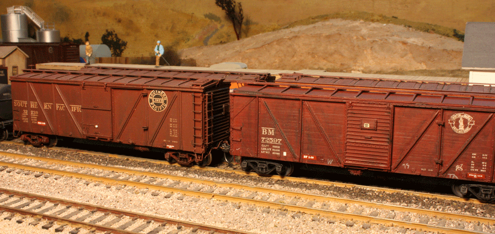
     Here are two model freight cars with route cards. The foreground Boston & Maine car also has visible paint patches for reweigh and repack data, as I’ve discussed elsewhere (for example, the corrected version of my article in Railroad Model Craftsman, available here: http://modelingthesp.blogspot.com/2011/03/reweigh-article-from-rmc.html ), and has chalk marks, which I will discuss in a moment.


There is also a placard on the placard board of the box car, high on the car door, which is a decal from a Sunshine decal set for placards. This B&M car is from a Sunshine kit, while the PFE car is from InterMountain.
     That same box car can be compared to the box car adjoining it, in this additional view. Here the SP box car has a route card board on the car door, while the B&M car has had a route card applied to its sheathing in a convenient place for the car clerk.


The SP car is a Challenger brass model.
     These cards were of course applied to all types of cars, not just house cars. Here is an example for a gondola:


The location, near the lower left corner of the car side, was a common one for route card boards on open-top cars. The gondola is a recent Tangent model.
     I have commented in earlier posts on chalk marks. Modelers sometimes call them “graffiti,” but nearly all of them were in fact no such thing. Most were notations applied by car clerks about the track to which the car should be switched, or its outgoing train number, or the industry and car spot to which it was destined, or any of a great number of other bits of information needed by switch crews. The codes varied from yard to yard and railroad to railroad (and likely era to era), and today would be nearly impossible to decode, so simply copying what you see in prototype photos is probably the best way to select these.
     Here is a photo of a car clerk, armed with the usual one-inch diameter “railroad chalk,” noting something on a car side. This is a T&NO company photo, taken at the road’s large Englewood yard at Houston, Texas.


     In model form, these can be added with Clover House dry transfers, or with any of several Sunshine decal sets (available in white, gray and yellow). They can also be readily added with a colored pencil, with as sharp a point as you can make, in white, gray, or yellow. Most of mine in these photos were done with a pencil. My own preference is for the Prismacolor brand of these pencils, available in any art supply store, as they seem to perform best for me.
     Here is another freight car, with reweigh and repack data, as well as a route card, and with added chalk marks. They are a mixture of Clover House transfers and the white pencil technique.


The model is from a Sunshine kit of a C&NW rebuild of that road’s USRA double-sheathed box cars.
     The route cards and chalk marks are minor details but I believe they add greatly to the realistic appearance of model freight cars, following what one sees in prototype photos.
Tony Thompson

Monday, November 7, 2011

Operations: demand-based car flow-2

My approach to layout operations begins with realistic paperwork (as I’ve discussed in several posts with the series title “Waybills”). That paperwork is used as part of a system of realistic and flexible car movements. This post continues description of my car movement system. In my previous post on car flow, available at: http://modelingthesp.blogspot.com/2011/11/operations-demand-based-car-flow.html , I described the creation of a list of inbound and outbound car movements for each industry. In the present post, I describe the combining of information from this list into a schedule. Such schedules can be used as a shipper-demand system of waybill selection for operation.
     The goals of this process are as follows. First, I want to represent regular, periodic car movements. For example, a manufacturer may load an empty box car every day of the work week. Second, I want to represent periodic movements which are not quite so regular. For example, a fuel dealer may get a tank car of LPG at longer intervals in the summer than in the winter. Or a wholesale grocer may get reefer loads of dairy products at irregular intervals. Third, there are cases in which a car delivery may be at either regular or irregular intervals, but it is usually the same car. This can happen, for example, with a bulk oil facility which repeatedly receives the same exact car, unloads it, and sends it back for another load of, say, diesel fuel. Fourth and finally, there are rare or unusual movements. Though these may be a small fraction of total car movements, they provide important variety and realism.
     I begin with a simple example of a regular movement. Imagine a packing shed which needs an empty refrigerator car to load, every other day. (This need may have been developed as part of the list of car movements at this industry.) Then I would make a schedule line that looks like this. The “open” letters denote empty cars; “filled” or solid letters would denote loaded cars.


 The 10-day span of this example schedule line was selected as a simple example, not for any particular significance of 10 days.
     It is reasonable to expect these empties to be loaded promptly with a perishable type of load, so the loads would need to be picked up late the same day, or the next day. If the next day, it might be expected that the table would then look like this:


Again, the filled letters denote loaded cars.
     But in fact, my system would not show these outbound loads, because the waybill assignment to these cars will “automatically” result in their outbound movement. In other words, the role of the schedule is to initiate car flow through waybill selection, and once initiated, the flow continues under the guidance of waybills.
     Thus for each industry, only the cars directed to that industry are in the schedule, whether loads or empties, and subsequent movement is via waybill or Empty Car Bill information. So if I were to have four locations of car spots--the same produce shed which was just shown, plus a team track, an oil dealer, and a warehouse of some kind--my town schedule might look like this:


The frequencies of delivery of loads or empties are those developed in the prior exercise of listing car movement needs at each industry. Note that the team track receives only a loaded box car and a loaded flat car in these ten days (these are irregular car flows), the oil dealer a pair of loaded tank cars, and the warehouse two empty box cars to be loaded with outbound cargoes. The latter two cases are periodic but less frequent than the produce shed’s needs, every fourth or fifth day instead of every other day.
     Already in this example, it can be seen that no two days of the ten are alike, yet each car spot is receiving a plausible amount of traffic (and remember, that this schedule only shows half the traffic, because the subsequent movement of cars, after they are delivered according to this schedule, need not be shown but occurs entirely by waybill or Empty Car Bill).
     Let’s call the town just outlined “Shumala” and then let’s add a second town, again with four industries for illustration purposes. The second town might be called “Ballard,” having a wholesale grocer (Peerless Foods), a winery (Zaca Mesa), a team track, and a produce shed (Guadalupe Fruit). The distribution schedule might look like this:

The four “Shumala” industries are the same as shown in the prior figure. Now with eight car spot locations, traffic is fairly diverse, and it remains true that no two days are alike (and again, this shows only car deliveries, omitting pickups). Note also that both regular and irregular car deliveries are shown here.
     These two towns are of course towns on my layout, and the industries are in fact ones I already have or plan to add in those towns, but the illustration could be constructed for any combination of industries and towns that might be desired. For more about my actual Ballard, for example, see the description in an earlier post (http://modelingthesp.blogspot.com/2011/01/layout-design-ballard.html ).
     This kind of scheduling works well for fairly frequent car arrivals, or ones which are predictably periodic. What it does not do well is include the rare or truly occasional car flows. Here is how I have added those car flows.
     My first step, listing all car movements at an industry, even the rather uncommon ones, along with a few much smaller consignees which might use the team track or freight house in a town, resulted in a considerable list of such car movements for each town.
     I then made up waybills for all these movements, and filed them by town, in a fully shuffled or “randomized” pack for each town. I select these by simply drawing the appropriate number of bills from the front of the pack, and when movement is completed, return them to the back of the pack. Occasionally shuffling the pack can be done if desired. How do I know the “appropriate number” to draw? It is shown in a line on the schedule, called “random,” like this:


Here the initials refer to each town: B = Ballard, S = Shumala, SR = Santa Rosalia. For each operating day, I would draw the number of bills shown. Given the large number of total “occasional” bills for each town, repetition is again not an issue. More can be said about what kinds of waybills represent these “rare” or infrequent flows, but that discussion is sufficiently complex that I will defer it to a future post.
     Now my total schedule for the two towns, three or four industries each, has an added line for these infrequent flows:


This is of course only illustrative, and as mentioned, need not be restricted to a 10-day span but could extend as far as desired. Obviously longer time spans can be used for more complex patterns, and will increase diversity of operating days still further.
     When my layout was in Pittsburgh, and had a somewhat different operating rationale, my version of this car flow system had a 31-day schedule. Here it is, with somewhat different industry names and locations from the present arrangement (Jalama is now called Shumala, and Los Olivos is now Santa Rosalia). You can click on the image to enlarge it.


My idea had been that whatever calendar day happened to be the day we operated, I would just use that day in the schedule. If we operated on October 18, we would use Day 18 in this schedule. But I quickly discovered that the periodic cycles fell apart this way, as operating days were scattered through the month in no particular order. I then simply used the 31 days in the schedule as sequential operating days. So if the last time we operated was Day 18, the next session would be Day 19. This worked fine.
     Even in the 10-day version shown earlier in this post for illustration, there is no repetition of identical days within the ten-day span, nor can there be with the presence of the “random” draws of unusual flows. That statement can be made even more strongly for a longer span of days, such as the 31-day schedule shown immediately above. Thus this approach does accomplish the goals I stated at the outset, of reproducing regular, irregular, repeating, and rare car flows, without significant repetition of operating cycles.
     I am occasionally asked how to implement a system like this on a large layout such as a club. To that end, I have experimented with a computer approach to generate the schedule. I have also tried a “permanent waybill” approach. But those both require enough explanation, that I will need to postpone description of them to a future post.
Tony Thompson

Friday, November 4, 2011

Type and typography on the layout

This is potentially a very broad subject, and I only want to offer a few comments here. Most of this topic has to do with signs, both of industries and otherwise on the layout. With regard to things like automobile license plates, you might wish to read my earlier post on the subject, at:  http://modelingthesp.blogspot.com/2011/04/choosing-and-modeling-era.html , in which I commented on how license plates are one way to define your modeled era.
     What is meant by “type and typography?” By type I mean type faces, nowadays often called fonts. The word “typography” simply refers to the arranging of type to communicate an entire message, whether it’s a billboard, a business name, or a directional sign. But to deal with this topic, there’s no need to worry about the principles of typographic design. It will probably suffice to keep your eyes open to look at signs, especially period signs visible in many photographs. The goal is to create signs which look realistic. (But if you do find the idea of understanding design to be interesting, I strongly recommend a basic book, The Non-Designer’s Design Book, by Robin Williams, from Peachpit Press. The book is still in print, and moreover is readily available used on the Internet.)
     Here I suppose I should fully disclose my own interest. I do find typography interesting, and I practice it in designing and laying out books for Signature Press. I’ve even taken college classes in it. And I might qualify as a “type geek,” since I not only enjoy books on type design but tend to collect electronic fonts for a variety of uses. But there is certainly no need to go that far, when it comes to realistic layout signs. A few simple precautions should be all you need.
     Convincing signage requires the same attention to prototype appearance as do other scenic details. The most common errors in model signs are typeface choices which are not realistic on signs (more on this in a moment), and use of anachronistic type faces. By far the most anachronistic are the familiar computer faces, such as Helvetica. These may be fine faces in their own right, but may not have been in use at the time modeled.
     A pet peeve of the very few who can recognize type faces is the use of ones which are historically anachronistic. For example, the Helvetica font was introduced in 1957, and didn’t become widely used until about a decade later. (There’s an excellent film about this, actually entitled Helvetica. Netflix among other sources has it.) A movie about the Victorian era which showed buildings with signs in Helvetica would be anachronistic--and so would a 1940s layout with such signs. As I said, very few could name that font, but it won’t look right, perhaps at some subliminal level. Avoiding such conflicts is just one more way to maximize the look of realism on a layout. On the other hand, of course, if you model the 1980s, Helvetica signs are almost required.
     A better choice for pre-1960 signage, using lettering of the same kind as Helvetica, would be something like Franklin Gothic. Introduced early in the 20th century, it has been widely used ever since, and avoids era specificity or anachronism. Examples can easily be added of both appropriate and inappropriate sign fonts, but if in doubt, feel free to Google the name of the font you just discovered in your computer, and see when it was introduced. And as I said, do examine period photos of signage to get a feel for how these things actually looked.
     Further help in making good choices, particularly to avoid anachronism, can come from a little typeface history, and there are many on-line resources which can be consulted. Among them are these fine websites: http://websitetips.com/fonts/foundries/ (there are even tutorials on the site); http://typophile.com/http://www.fonts.com/http://www.fontshop.com/fonts/category/; and http://www.fontbureau.com/.
     But even a superficial look at period photographs will show that signage is dominated by sans serif lettering. Notice the term “lettering” and not “typeface.” It is still true today, and was even more dominant before the 1960s, that plenty of signs are painted by signpainters, not printed from type. Luckily there are many signpainter-styled typefaces available today, so this look can be achieved relatively easily in model signs, with careful typeface choices.
     Below is a comparison of serif and sans-serif type. The little brackets at the end of the letter strokes are the serifs (pronounced “seh-riff,” not “seh-reef”). The word “sans” is French for “without,” so sans-serif type is without serifs. The serif type here is Adobe’s digital version of Caslon (Caslon dates from the 1720s; among other distinctions, it is the typeface in which the Declaration of Independence was printed), and the sans example is Franklin Gothic, described above.


     Next is a comparison of signpainter lettering vs. type. The upper example is Caslon again, the lower one is a typeface called Showcard Moderne, based on an actual signpainter’s lettering from the early 20th century. The rounded serifs, slightly slanting letter strokes, and other details are typical of brush-painted lettering.


     The dominance of sans serif signage does not exclude serif lettering, but the need for signs to be easily and promptly read means that such lettering tends to be fairly bold and simple in design. Even company logos may have bolder lettering in signage than in, say, letterheads for correspondence.
     Let’s look at an example. Perhaps you have a rail-truck transfer at a company called Acme Fast Freight. Assuming it’s not a real company, you have to choose a “look” for its name and signage. Here are some possibilities:


The uppermost of the four examples is Cheltenham, introduced circa 1900 and a very popular advertising face in the 1920s. The second one is Copperplate Gothic, created by the great American typographer Fred Goudy about 1905, and also popular for advertising in the 1920s. Either of these, then, would be suitable for a pre-World War II layout, or even for a later era if Acme is imagined to be a company with a traditional image.
     The third example above is a typeface called Eccentric, with a very Art Nouveau look and indeed dating from the 1880s. Only a very retro company would choose such a typeface in the 1950s, although it does have a certain elegance. And finally, the fourth example is a 1908 sans typeface called News Gothic, and like Franklin Gothic, it has been in use from that day to this.
     Now let’s say you’ve been running barefoot through the font catalogs, and have found one you really like for your 1950s company. Here’s how it looks.


I would say this choice has a couple of problems. The typeface is Optima, a beautiful face but introduced in 1958, so a little unlikely for 1950s signage. Second, the relatively thin strokes of the letters don’t convey an image of strength or dependability, things a freight company might want to project. Looking at actual signs will show you that this kind of type for this kind of use is rare, and whenever possible, I advocate modeling typical things, not rare ones.
     I will show a couple of examples from my layout of signs I think meet the criteria I’m describing. First, the winery at Ballard. The typeface is Hadriano, also created by Fred Goudy, from the 1920s:


This is a serif typeface with old-fashioned look, which could well be a style that a winery would choose. Here’s something quite different, also a Ballard industry, using Franklin Gothic:


This is the look you might expect for a machine shop, so I think it feels appropriate as a sign.
     Finally, here is one done in a classic face already mentioned, Cheltenham. It includes the products handled at this warehouse.


     The last thing I will mention is that some signage is painted directly onto structures, and for this decal or dry-transfer lettering is the best approach. Here is the sans lettering I used on my lemon shipping building:


The lettering is from an old Champ set called “Railroad Gothic.” Remember that the real goal of most signage is readability from a distance, so, as I mentioned, it is often fairly bold in appearance.
     A prototype example of a company name painted directly on the building is this one from Oakland, California, and an industry I will have on my layout, using this wall-painted graphic. This is a commonly seen practice and worth modeling.


     Luckily, many suitable typefaces are available on the Internet today for minimal prices or free, at sites like fontspace (www.fontspace.com). Once a particular style has been chosen, one can readily find typefaces of that general character through sites such as Identifont, at http://www.identifont.com.
     The content of signs is beyond the scope of this post, but I will just suggest that names need to be appropriate to what is being modeled. A very small building with a one-car siding, named “Consolidated Chemical,” might not be very realistic (unless it is a distribution center or something similar). In the same way, “Fred’s Cafe” is quite believable, but “Fred’s Steel Mill” much less so. Alternatively, “Amalgamated Steel” would make sense for a steel plant name, whereas eyebrows would be raised by an “Amalgamated Cafe.” These examples may seem exaggerated, but next time you’re on a layout tour, look over the industry names and see what you think. Of course, actual business names for the place and era you are modeling are always a good idea (again, provided that your structures look all right with those names on them).
     Whether or not you find typefaces interesting, appropriate choices to use on your layout do matter, if you aim at a realistic appearance in your modeling.
Tony Thompson