Tuesday, November 28, 2017

Layouts at the Great Lakes Getaway

One of the many fine operating weekends held all around the country is the Great Lakes Getaway, held in the Detroit area and featuring some superb layouts. I was very much pleased to attend this year.
     One of the layouts I had the pleasure of operating was Doug Tagsold’s Colorado & Southern. It is essentially in 1:72 scale, kind of halfway between HO at 1:87 and S scale at 1:64. Doug uses HO track and many HO structures, but also uses some S scale figures.  An advantage of 1:72 is that it is a military modeling scale and accordingly has really a lot of accessories available. But the scale complication fades into insignificance when you look at the stunning scenic job Doug has done. I will show a few of my snapshots but for anyone wanting a deeper look, there is video on Marshall Stull’s blog, which can be found at: http://smallmr.com/wordpress/doug-tagsolds-colorado-southern-narrowgauge-modelrailroad-modelrail-train/ . Doug’s era is 1925.
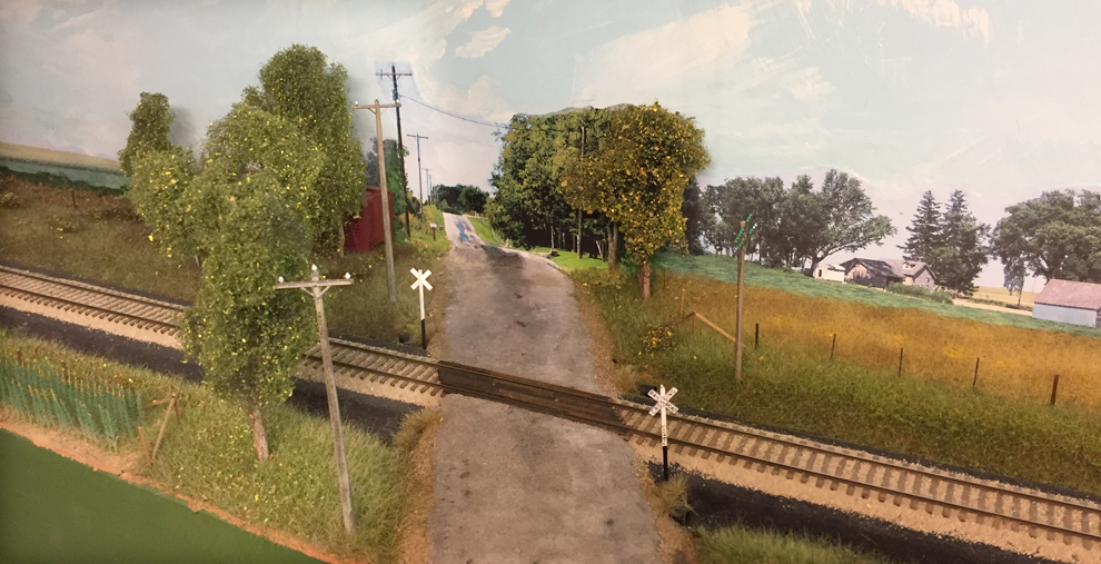
     One thing I really liked about Doug’s layout is the use of actual Colorado photos for backdrops, instead of the snowy Alps backdrops sometimes used for Colorado layouts. This photo at Idaho Springs is a good example.


My job at this session was to operate the local from Denver to Silver Plume. This train works through Idaho Springs and Georgetown to the end of track at Silver Plume, then return to Denver. But before reaching the local switching to be done, it is a long run from Denver to Idaho Springs, with gorgeous scenery along the way, as in this view of my train.


It is easy to understand Doug’s statement that this layout, the latest of several he has built, reflects his realization that his heart is in Colorado.
     The second layout I operated on is the remarkable Chesapeake & Ohio of Mike Burgett. Mike is a professional signal engineer for CN and that is reflected in his 1964-era layout depicting parts of the C&O Clifton Forge Division. It would take an awful lot of photographs to convey the superb appearance of this layout, so I will just show a few views. It is a double-deck layout, and the trackwork is everywhere impeccable and, naturally, fully and accurately signaled. The photo below at Alleghany shows this. The railroad here is double track and also has eastward and westward sidings on either side of the two main tracks. The sidings have darker ballast.


     A complex piece of trackwork a little east of Covington also is a good example, shown in the “aerial” view below. The train here is on the eastward main, if I recall correctly, and will continue to its right onto the lower track into Covington, en route to Clifton Forge.


The photo above shows how the main tracks divide here. From track level at the left of the photo above, one gets the view below, and you can see some examples of the signaling involved.


Operating trains on this layout is a real pleasure. I did the Covington yard job to start, a local switching job which is completed by returning to Clifton Forge yard. I then ran some through trains, and thus had a chance to run over the entire layout, staging to staging. A great experience.   
      I will come back to the other layouts I was able to operate, but these two are good examples of how high the standard is in this area. This was a great meet, fun to experience, and attended by many of the best-known operators in the nation – not that I am one of them. I just relished the chance to enjoy these fine layouts and the company of all the attendees.
Tony Thompson

Saturday, November 25, 2017

Unloading covered hoppers

Covered hoppers can be unloaded in a variety of ways, most relying on gravity to move the cargo through the bottom outlets. The outlets can dump into a bin below the tracks; into the receiving opening of a auger unloader; or into a receiving transfer arrangement into highway trucks or trackside bins. All these method may rely in part on auger components, simply a screw rotating inside a tube, as shown below. Naturally rotation of the screw moves material along the tube.


The choice among the unloading options just listed depends in part on the product being unloaded, and on the scale and frequency of the unloading to be managed.
     Car unloading can involve simply dumping into a pit below the tracks, and the mechanism for moving the cargo from the pit can be anything from an auger to a conveyor belt (below ground, of course). Thus a grid or array of bars between the rails can be a complete unloading arrangement if desired (and if the destination is into a structure). It might look like this:


     But there are also a variety of ways that an auger mechanism can be arranged and be evident from above. One of these is with a portable auger, than can be moved from car to car, for example unloading into trucks. These can be quite steep, more so than a conveyor belt:


     But what I want to do on my layout is indicate an unloading spot, and rather than just make a dump pit, I want to indicate directly that there is an auger mechanism. My idea to do this was inspired by a Clark Propst clinic about his own layout, in which he showed a photo of such an auger in a 1949 photo of a cement company, with the receiving bin visible above the auger in the track. Clark was kind enough to send me a copy of the photo, which looks like this:


     The unloading spot is quite narrow and the means of connecting the car unloading gate to the auger box is evident. Here is that area, expanded from the photo above:


Note that there is a flat top to the device, but that the round auger tube underneath can be seen, as can the shaft end of the auger itself.
     I am going to try and model this, and will take up that project in a following post.
Tony Thompson

Wednesday, November 22, 2017

Produce shipping boxes, Part 6

In the previous post in this series, I showed how I have modified various published labels for shipping boxes, and a few labels from my own collection, so that the product named on the label, along with the name of a packing house on my layout, fit their use on my layout. The most recent of those posts was the preceding one, Part 5 (you can find it at this link: http://modelingthesp.blogspot.com/2017/11/produce-shipping-boxes-part-5.html ). The subject of modifying existing labels from various sources was introduced at the very beginning of the series, in Part 1 (that post can be found here: http://modelingthesp.blogspot.com/2017/08/produce-shipping-boxes-in-ho-scale.html ).
     I have had several requests to expand on my box label modifications and show more examples. I have continued to work on these, in part because I am still not sure which ones will ultimately work best in HO scale. But I do know to focus on the ones with really bold lettering or graphics or both, so that they can stand out in a very small size. Here is one example, originally a box label for Valencia oranges:


The conversion involved removing the lettering for oranges, along with the “California Red Ball” emblem from Sunkist, and of course the packing house name, Canoga Citrus Association (the stated location, Owensmouth, later was renamed Canoga Park), and replacing with my Guadalupe Fruit name.

 
  This is a bright color and large graphic look, thus I expect it to work well in HO scale.
     Most of the label producing companies offered a label style which did not feature the packing house name, but simply showed a brand image. These could readily be overprinted with the packer’s name if desired. Here is one example of a bold graphic image, with the packer name hardly evident (it is along the label bottom; you can click on the image to enlarge it).


It is easy to simply remove the packer lettering and not replace it, since it would be too small to read under almost any circumstances. This label could then serve on shipping boxes for any of my packing houses, since it doesn’t identify either a house or a type of produce.
     There are some irresistibly handsome citrus labels in existence, and I just had to do another one of these for my lemon packing house, the Coastal Citrus Association. Here is the original label, which in fact was used for lemons:


Note, again, that this label has really bold lettering, and the large yellow moon image to make it even more distinctive. This one only required me to rearrange the letters in the existing name, San Fernando Heights Lemon Association, to make the name of my layout house, and then to do the same to the place name to convert it into the town name on my layout, Santa Rosalia. Here is the result.


     These are fun to do, not at all difficult, and will likely serve my needs on the layout. I will return to the use of these in HO scale in a following post.
Tony Thompson

Sunday, November 19, 2017

How’s your HVAC?

As most readers probably know, the HVAC of the title refers to Heating, Ventilation and Air Conditioning. And what does it have to do with modeling? I am simply thinking of the roofs of model buildings. Even before World War II, it was commonplace to have fan housings and other equipment atop buildings, but with increased use of more extensive ventilation schemes, not to mention air conditioning, these rooftop facilities increased in size and, often, in number. Most layouts provide us with quite an excellent view of the roofs of our model buildings, so we do need to be conscious of what ought to be there. This post is about deciding what and how to fix the glaring absence of HVAC on most of my roofs.
     A simple addition that is suitable for many industrial buildings is one or more ventilators. There are a variety of these in the prototype, and a corresponding variety in model form. An example from my layout is the shipping building for my lemon packing house, the Coastal Citrus Association. Located near the Pacific shore, the climate is usually mild and air conditioning would not be needed. Instead, ventilators can do the whole job. As shown below, I added a cylindrical fan-driven ventilator at left, and a traditional “wind turbine” at right. This may be enough for this industry.


Note the field boxes of lemons in the open doorway.
     But what most people envision for rooftop HVAC would be cabinets or enclosures of more significant size, usually containing motor-driven equipment for air filtration, air circulation, and air conditioning. For example, shown below is an image from the internet, showing a typical rooftop unit in the foreground.


Note also that there are a number of other units in the background, typical of many modern roofs. All visibly exhibit some of the typical characteristics: air intake opening, fans on the top surface, grilles on one or more sides, and painted a light gray or beige color. Some of these are doubtless manufactured packages, but custom units are common too.
     There are several ways to model such units. Obviously a simple styrene box can be the basis, and addition of fans, grilles and intakes is fairly simple. One source of good fans is diesel locomotive shells, but you don’t have to cut up a shell; Athearn sells a set of good-looking fans, their part ATH11692, which are 48-inch pan-top fans, with multiple sets of fans in the package. Of course, if you start by cutting up a shell, you also get grilles. Let me illustrate.
     I happened upon a cut-up shell for sale cheap at a hobby shop, and bought it, pretty much an impulse purchase, thinking of possible HVAC projects. I’m only vaguely familiar with more modern diesels, but this looks to me like it may have been an SD39 at one time (apparently a dynamic brake section was cut out). But the parentage doesn’t matter: this is just raw material for HVAC cnclosures!


There are two fans at left, grilles on the sides, and another grille toward the cab, under the air filter box. These can be easily cut apart and added to a plain styrene box, but more simply, can even stand on their own. I simply used a razor saw and cut oversize, then used a file to clean up the parts. With the cab cut off, all three salvaged segments at bottom, and other removed parts in the middle, here is the state of things at this point.


Shown below are the rear two fan sections, plus the air filtration box and grille from right behind the cab, cut apart and prepared for making into HVAC enclosures:


These are already a large enough size to be the foundation for an HVAC box of modest size. I simply close the open ends with pieces of 0.010-inch styrene sheet.


The resulting unit can be further detailed, as I will do presently.
     I will return to this project with some other HVAC enclosures, as well as the ones cut from the diesel shell above, along with detailing of them, in a future post.
Tony Thompson

Thursday, November 16, 2017

More about operating with “sure spots”

I introduced the topic of operating on a model railroad layout with “sure spots’ in a post last year, with the idea of showing some ways these spots can be identified (see this link: http://modelingthesp.blogspot.com/2016/08/operating-with-sure-spots.html ). To repeat the definition of a sure spot, it meant spotting the car at one particular location at an industry, such as on a particular track within an industrial complex, or at a particular loading dock, or alongside a particular loading door or unloading appliance.
     When I first had operating sessions on my layout, I didn’t worry much about this, intending only that switch crews get the right cars to the designated places. And of course I assumed that elementary logic would dictate that car doors kind of line up with loading docks or building doors, and that tank cars line up with unloading hoses, and so on. It didn’t take long to discover that “elementary logic” is sometimes in short supply, especially if crews feel rushed. I do tell my operators the widely-used mantra, “this operating session is not a race, so take your time,” but people often feel that they are expected to finish in minimum time, and thus rush ahead in spite of that mantra.
     When I researched how prototype sure spots are identified, I introduced both schematic maps of each town, including the sure spots (as you can see in the post cited in the first paragraph, above) and also began to put them on some waybills. I had learned from experienced railroaders that sure spots are sometimes called out on waybills, especially when a shipper repeatedly sends a particular cargo to a consignee; the consignee will notify the shipper how they want the cargo delivered. Also, a consignee may let the local railroad agent know what spot they want, and the agent can tell that to the local crew when they arrive (I use agent messages for such information; see: http://modelingthesp.blogspot.com/2015/06/operating-with-agent-messages.html  ).
     Barring the waybill designating a sure spot, or the agent transmitting that information, the crew may simply arrive at the industry and send a brakeman to talk to the dock foreman to find out where he wants the car. But this is a little harder to include on a model railroad. Finally, the crew ordinarily knows from experience what is going on at an industry, and knows, for example, that top-unloading tank cars always are spotted by the unloading equipment for such cars. But I wondered how to convey this kind of knowledge to my local switching crews,
     Before the VanRail operating event last September, a number of us en route to Vancouver, B.C. had a pre-event operating session on Al Frasch’s excellent layout on Whidbey Island. Al has a kind of information card for each industry or industrial area, which I found very helpful when operating, and inspiring as an idea for my own needs. With Al’s permission, I will show a couple of his cards.


I like this one because it is similar to a situation I have on my layout, where an industry has a plant switcher. That means that the branchline locals only pick up and set out cars on the lead into the plant, and switching within the plant is handled by the plant switcher. This is exactly what Al has described for his Cherry Point refinery.
     Another of his cards also mirrors a situation I have, in which particular unloading doors are assigned to particular products. His is a wholesale grocer, Pacific Fruit and Produce:


     I decided to try creating some cards along these lines for my own layout. Though with some reservations about the rather electric magenta header of the example above, I decided to try it out, with this result.


My Pacific Chemical Repackaging industry does have specific spots for certain kinds of loading and unloading, and the three spots are defined here. Note that only Spot 1 is at a building. But I am not quite satisfied with the language, and will continue to work on this one, as well as creating others.
     So although this idea still needs development for my layout use, as I see it, I am definitely grateful to Al for the stimulus to work on this problem. I hope to get some “information cards” like these into the hands of my operating crews one of these days. Further progress will be reported as it happens.
Tony Thompson

Monday, November 13, 2017

Small project: running boards for SP auto cars

Last summer, I showed the work I was doing to upgrade some of my existing freight cars, namely Red Caboose or Innovative Model Works 40-ft. Southern Pacific box cars. These model cars had wood running boards, though the prototypes in SP’s late-1930s box car classes in fact were built with steel grid running boards. I applied the Kadee parts instead, as I showed in a brief post (you can see it at: http://modelingthesp.blogspot.com/2017/06/small-project-upgrading-running-boards.html ). Now I need to do the same for some automobile cars. The idea to do so was stimulated in part by the comment to me by a couple of experienced modelers, that they didn’t know Kadee sells a 50-foot running board as a detail part.
     Here’s the background. In January and February of 1941, a class of 50-foot automobile cars, Class A-50-14,  was delivered to SP. These 500 cars had the recently-introduced W-corner-post Dreadnought ends, and 10-foot, 6-inch inside height. They were also the first SP automobile cars with steel-grid (Apex) running boards, and all were delivered with Equipco hand brakes.
     The nearest model to the SP cars is the Proto2000 automobile car. It has the right doors, roof and ends, and also the correct pattern of side panels (four panels to the left of the double doors, six panels to the right). Overall, this is a pretty accurate car for SP modelers. But the car does fall short in a couple of specifics. It has a wood running board and Ajax hand brakes, both of which are not accurate for the SP cars, though readily corrected. I will fix both those features in the project described here.
     The Proto2000 car also has single rivet rows securing each side panel, while in fact the SP cars had double rivet rows (one row with double the spacing of the other row). Such double rows are an indication of the use of hat-section internal posts instead of angle-iron posts; the hat-section posts made for a stiffer superstructure. As my models are painted and decorated, and in most cases already weathered as well, I will not be adding the additional rivet rows to make these cars more nearly correct.
     The first step in this project is to remove the incorrect “wood” running board and the brake wheel. This is easily done by sliding a razor blade underneath, and simply slicing off the attachment posts of both the board and the brake wheel. I use lots of these single-edge blades for a multitude of modeling tasks.


Once the old running board is removed, as you see below, the clean roof is ready to accept the Kadee Apex 50-ft. running board, part no. 2011 in boxcar red. The car below is not yet weathered.


The running board was attached with canopy glue.
     An omission from the Proto2000 auto car models is the route card board. You can see its location on the right-hand door in the prototype photo below, from the book, Southern Pacific Freight Cars, Volume 3: Automobile and Flat Cars (A.W. Thompson, Signature Press, 2004). This is a detail of a photo in the Steve Peery collection.(You can click on the image to enlarge it.)


I added one of these boards (shown in a prototype drawing at this link: http://modelingthesp.blogspot.com/2012/01/route-cards-7.html ), by simply gluing on short lengths of scale 1 x 6-inch styrene strip.
     The Proto2000 brake wheel, an Ajax type, is incorrect  for these cars, and was sliced off. It was replaced with the right brake wheel, an Equipco, Kadee part no. 2021, just one member of the excellent brake wheel selection from Kadee. (By the way, you can see the Kadee parts selection at their on-line store:  https://kadee.com/store/index.php?main_page=index&cPath=104_119_123 .
     With all those changes, and touching up the paint on the route card boards, my unweathered model looked like this:


     I am gradually correcting my various Red Caboose, IMWX and Proto2000 models which were produced with wood running boards but should have metal ones. For the cars that should have Apex running boards, whether 40-foot cars or 50-foot cars, the Kadee parts provide a very easy fix. I am also correcting hand brakes where necessary, along with other details like route card boards. In most cases, I also replace fragile plastic sill steps with metal ones. It’s all part of being consistent about freight car standards.
Tony Thompson

Friday, November 10, 2017

Layout visits during RPM Chicagoland

In a previous post, I described my impressions of this year’s RPM (Railroad Prototype Modelers) Chicagoland meeting. It was a very good meeting, a gratifying return to the excellence of the past, and most enjoyable to attend (see my commentary at this link: http://modelingthesp.blogspot.com/2017/11/this-years-rpm-chicagoland-meeting.html ). I often am able to add to the meeting itself with chances to operate at local layouts, as I did this year. The present post is about those visits.
     A highlight for me of the entire trip is a chance to operate on Bill Darnaby’s outstanding layout, the Maumee Route. The layout itself is one of the best anywhere, and the operations live up to the setting.This year I had the privilege to operate (with Paul Weiss) one of the two local freight trains in the schedule, No. 21. It was fun, as it always is. And it is always interesting to see the various additions and improvement Bill has made on the layout. One example I really liked was this treatment of a road heading straight into the backdrop. Good strategy: indicate a dip in the road, making the segment down in the dip invisible; that segment, of course, is right where the road and backdrop intersect.


I also enjoyed taking a close look at one of Bill’s many realistic details, the fire-equipment cabinets. There are at least two; the one shown below is near the roundhouse at Dacron yard.


I made something quite similar for my own layout,  originally inspired by Bill’s model. My own fire cabinet, scaled from an SP example at Dunsmuir, was shown in a recent “Getting Real” column I wrote for the August 2017 issue of Model Railroad Hobbyist (you can read on-line, or download, any issue of MRH, for free, at any time, from their website, www.mrhmag.com ).
     On the Thursday night of the meeting, I had a chance once again to operate on Bob Hanmer’s fine layout of the GN and DM&IR in the Iron Range country. My assignment this time was Gunn Yard, for which I’ve been yardmaster before, and again it was a fun and busy job. The yard is shown below. I must say there were times it was much more full than this!


     On Friday, I got the opportunity to visit Steve Cizek’s Marquette and Grand Marais layout, another layout strongly dominated by moving iron ore. The feature I really liked was the loading dock for ore boats, represented schematically, but with extensive switching required. The ore loads are all “live,” which means they are real granulated iron ore, and when ore cars are emptied, the ore goes into the buckets representing the boat. (A coffee scoop is the tool in the bucket.) Note the lines drawn on the wood track support. These represent the dump pockets in the ore dock, and are numbered.


But there is more to it than might appear in the photo above. Iron ore, back in the day, had different grades, and the ore had to be loaded into the boat so as to create the proper mix for the steel mills. Each car has a slip designating its grade, and the switcher working the ore dock has to arrange the cars to match a loading sheet. Shown below is the paperwork for the boat, with loads already dumped marked off on the loading sheet. There are quite a few to go, as can be seen by looking at the unmarked part of the sheets. (You can click to enlarge.)


This was a neat operation, as was the rest of Steve’s layout.
     I was lucky this year to be able to visit and operate on three layouts, all different and all quite good in different ways. As I said, this is very much a high point of the RPM trip for me.
Tony Thompson

Tuesday, November 7, 2017

Produce shipping boxes, Part 5

In previous posts in this series, I have shown some of the prototype produce labels I modified for the packing houses that are on my layout. Many packing houses shipped multiple brands, sometimes to distinguish different quality levels of the same type of fruit or vegetable, sometimes to distinguish among different vegetables.The most recent post, Part 2 (you can see it at this link: http://modelingthesp.blogspot.com/2017/08/produce-shipping-boxes-part-2.html ), showed one of the problems in reducing prototype labels to HO scale size: that even a moderately busy design becomes a blur at so small a size as HO. In the present post I want to take this farther. The labels I show here were all chosen to be simple designs.
     One example is a fairly generic label, used for more than one product. The original, from a published source, looks like this:


The attribution is to a distributor, American Fruit Growers, but that can be erased and one of my packing houses substituted. This label also has the virtue that it doesn’t identify a specific fruit or vegetable, so could be used for any product one would choose. Here is the same label, modified for a layout packing house that ships vegetables, using the commonly seen light blue lettering:


When reduced to HO size, these labels look all right. I show below an image of a stack of these, and though this image is not actually HO scale, it conveys how the strong and simple image in this label translates into smaller sizes.


     Another example is a label for my lemon packing house, Coastal Citrus Association. Browsing through published examples, I chose a somewhat old-fashioned but distinctive one, with large lettering, shown below. It is for a packer in Carpinteria, a small town east of Santa Barbara along the Santa Barbara Channel coast.


My first challenge with this label was that it is for the second-level fruit quality in the Sunkist pantheon, called “California Red Ball.” The top-level quality, called “Sunkist,” would be more desirable. So I looked through the labels in my collection, and chose the one below, from which it would be easy to extract the “Sunkist” tissue-wrapped lemon emblem on the black background.


     Cutting and pasting the Sunkist emblem in place of the Red Ball on the Sea Breeze label, and beginning the process of using the former lettering of the Carpinteria label owner to be rearranged to form my own packing house name, it looked like the image below. I did have to cobble together a few letters, such as the “O,” to make this work, since that letter is not in the original label.


But it still says “Santa Barbara County,” correct for the Carpinteria house, but not correct for my layout, which is located at the southern edge of San Luis Obispo County (just across the Santa Maria River from Santa Barbara County). Though I could have simply erased that, I wanted instead to have my layout town name included. So again, I worked to rearrange the existing lettering to get my desired result:


     I have illustrated these changes just to show that they are not very hard to do, merely requiring patience and a little experience with Photoshop or a comparable application. (I suppose a certain degree of enthusiasm for typography is an asset, too — I confess to suffering from such an enthusiasm.) All these labels will soon be attached to HO-scale shipping boxes, and can populate the loading docks of my packing houses! I’m looking forward to that.
Tony Thompson


Saturday, November 4, 2017

This year’s RPM Chicagoland meeting

The RPM (Railroad Prototype Modelers) meeting in the Chicago area was originated by Martin Lofton (of Sunshine Models) in 1994. Martin, with his wife Patricia, then hosted it for 16 years at the Holiday Inn in Naperville, Illinois. In 2010, with Martin having passed away, the meeting changed hosts, to Joe D’Elia of A-line Products. After that Holiday Inn closed for complete renovation, subsequent meetings have been held in Lisle, Illinois, a town adjoining Naperville, and located recently at the Sheraton Hotel.
     The final meeting run by Joe D’Elia was in 2015, and Mike Skibbe (and a number of members of the Midwest Mod-U-Trak club) took over. Mike has worked hard to bring back the successful past of this meeting, and it was especially evident this 24th year that he is succeeding brilliantly. Attendance was above 350 this year, the most in several years and only slightly below the best of the Lofton years. The name “Naperville” still is used occasionally for this meeting, but Mike, wisely I believe, is now using the regional name “Chicagoland,” and that seems to fit.
     This year’s meeting was very good across the board, in my estimation. The vendor space in the ballroom was generous, and there were a great many vendors, with many chances to have a look at products not in every hobby shop — and of course to purchase the irresistible ones. Below is a snapshot overview of the area.


Very noticeable this year, partly due to the significantly increased attendance, was the pronounced “buzz” in the ballroom.  Almost every time I walked in, I couldn’t help but notice it. It is, of course, a very good sign for any meeting.
     The remainder of the ballroom was given over to two large, high-quality modular layouts (HO and N scale Modutrak), and to model display, with room for perhaps two dozen display tables (I didn’t count them), containing a couple hundred outstanding models. I will return to those in a moment.
     One of the highlights for me at most model railroad meetings is the clinic program. And the top meetings such as RPM Chicagoland and RP Cocoa Beach have truly outstanding programs. I won’t try to describe or evaluate the whole program but will just mention one that I really enjoyed and that furnished some excellent information. It was Charles Hostetler’s talk entitled “Modeling Canadian Freight in a U.S. Setting: Data and Implementation.” The title is a mouthful but the content was great. Here is a photo of Charles gesturing at one of his slides.


The talk stimulated a lot of thought on my part, and I will likely return to Charles’s topic with some additional ideas of my own. You can download a PDF of his slide package by going to his blog site, which is located at: http://cnwmodeling1957.typepad.com/cnwmodeling/model-railroading/ and well worth reading. You can scroll down to this PDF link or use this one: Download Modeling Canadian Freight in a US Setting Handout .
    I always enjoy repeated visits to the model display area at these meetings, and usually take a lot of photos. This meeting was no exception. I will just show three entries I particularly liked, but of course there were dozens more worthy of attention.
     I will begin with an otherwise ordinary covered hopper, but thoroughly and convincingly weathered, in accord with a prototype photo. The model was by Tim VanMersbergen.


     Another very nice model represented one of the composite gondolas that Milwaukee Road converted for pulpwood service, removing the side sheathing and with heavy-duty floor and end lining. This fine model was built by Tom Baldner.


     Lastly, I always admire the modern modelers who strive to reproduce the colorful graffiti so prevalent today on railroad equipment. Like it or hate it, it is modern reality, and anyone neglecting it, in my opinion, is creating an unrealistic model. This one, which as you can see, is matched to a photo, is by Rick “Dakota” Kempf.


     As we know from some previous years, this can be a superb meeting, though we learned for a few years that excellence is by no means automatic. I felt that this year it was back where it had been at its best, and I very much hope and expect it to continue. If you haven’t attended RPM Chicagoland before, or not for a few years, I strongly recommend giving it a shot in 2018.
Tony Thompson 

Wednesday, November 1, 2017

Yet another correction of a Dispatcher’s Office article

It’s not news at this point, but for the third time, my article published in an issue of The Dispatcher’s Office, the magazine of the NMRA OpSIG group, was garbled in the publication process. I guess I am a slow learner, as the previous two articles I published there were also mixed up in publication. This time, a figure was entirely omitted, Figure 13, though it  is referenced in the text. And if you look through the figures in the published version, they jump from Figure 12 to Figure 14, which might be confusing to a reader. And one of the Empty Car Bills in Figure 6 was omitted too. The article was in the October 2016 issue.
     I mentioned the omission of Figure 13 in my original post about this article, and didn’t mention the missing part of Figure 6. You can read that post at this link: http://modelingthesp.blogspot.com/2016/11/waybills-part-55-article-in-dispatchers.html . But I have now had two requests for the complete article, so thought I would post a correct version. I didn’t do that with the earlier post because I didn’t want to be complaining too much, but with these requests, I will now do so.
     I should hasten to mention I have no objection to an editor modifying a submission, including making the decision to omit something. In fact, those decisions are an editor’s job. But when the text and figure sequence isn’t corrected when the omission is made, that’s just incompetent editing. Perhaps I can be excused for doubting that I will be submitting to that magazine again, at least with its current editorial approach.
     Here is a link to the correct article, with all figure materials including the omitted Figure 13, in the layout I prepared myself, on Google Docs:

https://drive.google.com/open?id=0Bz_ctrHrDz4wQ3A5M0hxN2ZEdnM

For all who may have been puzzled, there’s the complete piece. And for anyone without access to a print copy of the magazine, here is something to read.
Tony Thompson