Thursday, October 29, 2020

Waybills, Part 76: more on cross-border freight

 In a prior post, I addressed some of the issues associated with railroad freight cars moving across international borders, specifically the Canadian and Mexican borders of the United States. I was concerned with how such movements would show up on the waybills for those shipments, and the various appearances that those waybills might have (you can read the post here: https://modelingthesp.blogspot.com/2020/10/waybills-part-75-non-us-freight-cars.html ).  Now I want to continue with more on the topic. 

One aspect of the topic is further variety in waybills. In the previous post, I showed a Canadian shipment of paper, along with a Mexican shipment of kerosene, the latter re-billed at the U.S. border crossing in Nogales, Arizona. Here are a couple more Canadian shipments, which happen to indicate two different locations for the shipment to clear customs.

The Mexican side is not necessarily more complex (I have not endeavored to create a Spanish-language waybill), but there are some interesting variations possible in details. One that is important to keep in mind is that just as foreign-owned freight cars carried cargoes into the U.S. and could return home loaded, American freight cars that had been unloaded abroad could be loaded back to the U.S. 

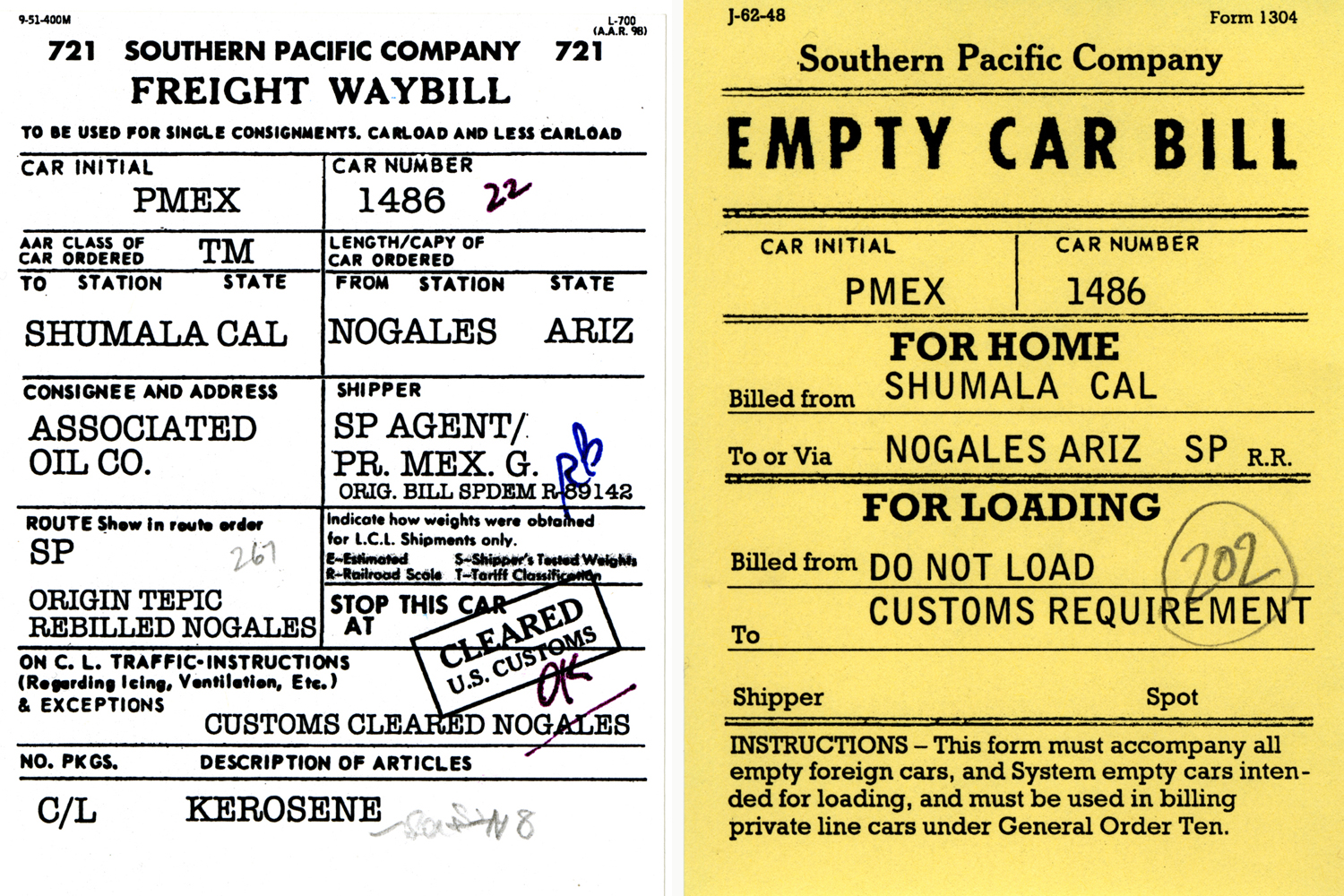
Shown below are a pair of re-billed shipments from the border crossing at Nogales, Arizona, one of which is a Pacific Fruit Express car returning to the U.S. under load. (It’s known that hundreds of carloads of Mexican perishables entered the U.S. at Nogales every year.) The other car, a box car from Ferrocarril del Pacifico, is a model I described last month (see the post at: https://modelingthesp.blogspot.com/2020/09/resin-box-car-build-part-3.html ).

I mentioned in the previous post (see first paragraph, at top of this post) that some Mexican railroads provided English-language waybill forms to shippers who wanted to use them. I have not seen one, but decided to make what I thought would be a reasonable facsimile. An example is shown below, again with an American freight car being reloaded back to the U.S. in a T&NO box car.

Perhaps even more interesting is the situation immediately after the sale by SP of its Southern Pacific de Mexico subsidiary to the Mexican government in December, 1951, becoming the Ferrocarril del Pacifico. (FCP). If English-language FCP waybills had not been available immediately, the simplest solution would be to use an existing English-language SPdeM waybill, and type over the road name (there are lots of examples of this kind of thing being done in U.S.). 

Then you might produce a waybill something like this one. It’s known, by the way, that the smelter at Cananea produced both sulfuric acid and muriatic acid as by-products, though I don’t know if any of it was shipped to the U.S.

The tank car in question, GATX 64674, was in fact a lease to Mexico national petroleum company Petroleos Mexicano (Pemex), and was so decorated by Tangent Scale Models in their release of this acid tank car model. I did have to declare a modest time warp to use this later paint scheme on my 1953 layout.

Incidentally, for anyone wishing to know more about the Southern Pacific of Mexico, a fascinating railroad looking much like a time-machine reversion to an earlier day on the SP, I highly recommend the book by John R. Signor and John A. Kirchner, The Southern Pacific of Mexico and the West Coast Route (Golden West Books, San Marino, CA, 1987). Copies are readily available on-line, but don’t be sucked in with prices over $100. Be patient, Prices of $50 to $70 often appear, probably less than the book would cost if it were new.

There are some additional matters arising from this topic of cross-border freight car movement, and I will return to the topic in future posts.

Tony Thompson

Monday, October 26, 2020

Modeling highway trucks, Part 9: another tank

I have posted a whole series of descriptions of my efforts to model highway trucks in HO scale, as part of the scenery on my layout. Many of these are the old cast-metal Ulrich models, not because they are great models, but because they suit my 1953 modeling year. {You can find these posts by using the search box at right, with the search term “modeling highway trucks.”) One of those posts was about creating a tank trailer for Signal Oil (read that post at: https://modelingthesp.blogspot.com/2019/07/modeling-highway-trucks-part-5.html ). 

I wanted to make more of these highway tank trailers, and for a time regularly watched eBay and other sites for a reasonably priced example. The problem is that Ulrich produced the tank trailer for some years decorated for Cities Service, with raised lettering and emblem cast onto the tank. Here’s a box photo. The lettering in white on the tank is the raised part.

The Mack cab-over tractor makes a nice change too, though the Cities Service company was really not suitable for my West Coast modeling locale. But finally, failing to find another Ulrich tank without the raised lettering, as I had been able to do when I made the trailer that became Signal Oil, I gave up and acquired one of these Cities Service trailers.

“How bad could it be,” I asked myself, “just file off the raised lettering.” Well, I found out. The white metal Ulrich casting isn’t too hard a metal, but soon you are filing on an almost flat surface. It was a long and tedious process, but finally I did get the lettering removed and the tank surface smooth. 

I then sprayed on a coat of light gray, partly as a “witness coat,” which would show up any flaws in my file work, and partly as a primer coat for subsequent paint. The trailer looked pretty good and only required a little touch-up, so I added a final coat of medium gray.

To letter the tank, I once again turned to the fine products of Graphics on Demand. This is a source I have really valued for truck graphics (you can visit them at: http://store.graphicsdemand.com/ ). As with all my highway trucks, I like to select suitable regional truck owners. In the case of an oil company, there were certainly a variety of West Coast companies to choose from, like Signal Oil, that I chose for the trailer I have already done. 

This new trailer I decided to letter for Standard Oil of California, a major retailer, marketing under the “Chevron” name (today the corporate name is even changed to “Chevron,” but in my modeling era, the company was still called Standard). I also have a Standard bulk oil dealer in my layout town of Ballard.

Having purchased Chevron lettering from Graphics on Demand, I applied the lettering to the trailer. These are not water-slide decals, as we are accustomed to use for model railroading, but are a vinyl adhesive peel-and-stick product. This sounds inferior, but certainly is not. They are glossy and stick down well, and when given a coat of flat finish, look quite good.

The finished tank trailer is shown below on the layout behind an Ulrich Kenworth tractor. It’s just passing another Ulrich tractor-trailer, powered by the Mack COE, with an original Ulrich Illinois-California (ICX) trailer, on busy Pismo Dunes Road in east Shumala.

Another semi-trailer I have lettered with Graphics on Demand is a trailer for Lucky Lager beer. A familiar “Western” beer of the 1950s in California, it seemed like a good choice for a passing truck. Here the trailer is from Classic Metal Works, but this 32-foot “Aerovan” trailer, as CMW produces it, is odd in having only a single rear axle. I replaced that axle with a double-axle bogie from an Athearn trailer, as I showed in an earlier post (it can be found at:  https://modelingthesp.blogspot.com/2015/07/modeling-highway-trucks-part-3-more.html ). Here is the the trailer, with its side delivery door.

In this photo at my layout town of Santa Rosalia, the rig is on Willow Lake Road, just crossing the SP’s Santa Rosalia branch, which ends here at the ocean. The depot is at left. In the distance is the usual marine fog bank out over the Pacific.

I continue to enjoy researching and modeling highway trucks that are appropriate for my era and locale, and no doubt will find opportuinties to do more of them in the future.

Tony Thompson


Friday, October 23, 2020

David Leider’s new book on B&OCT

A brand-new book of impressive heft and depth has been published without much fanfare. It is David J. Leider’s history of the Baltimore & Ohio Chicago Terminal (B&OCT). The B&OCT was one of the largest switching and terminal railroads in Chicago, the hub of American railroading. I show the cover below, but let me begin by saying that this is an excellent book. I go into more detail below. (The cover painting is by C.L. Smith.)

The book, designed as well as written by David Leider, is self-published and can be purchased from the author at: http://boctbook.dhke.com/ for a price of $50.00, which includes shipping. It is a 324-page softbound book with 8.5 x 11-inch pages, nicely printed on glossy paper. It contains over 280 photos, 128 maps, and more than 20 other drawings. 

Probably in an effort to keep down the page count, the author has chosen to use narrow page margins and fit text tightly against illustrations, but the book is quite readable and easy to appreciate — with one caveat: it’s heavy! a little over two and a half pounds. You’ll need to get comfortable to read it.

The immense infrastructure of this (and other) Chicago connecting railroads is most impressive to a non-Chicagoan like myself. And this book describes (and better yet, portrays) a great deal of this landscape. The author has done an excellent job of acquiring photos and drawings from a great variety of sources, including old newspapers and magazines, and as I know well myself, getting a decent-quality image in many such cases is most difficult. Author Leider has done a great job. Here’s one example, having to do with the new railroad bridge across the Sanitary Canal, from page 148. It’s an advertisement from the Chicago Record Herald of May 22, 1906. You can click on the image to enlarge it, if you wish.

The book’s history begins with early Chicago railroads, but concentrates on the role of the Baltimore & Ohio, from its entry into Chicago in 1873, to the formation of CSX in 1980. One might expect a book with this title to address only this one Chicago-area terminal and transfer railroad. But it is far more than that. It not only addresses (relevant) railroad history of many connecting railroads, but contains a great deal of history of the city of Chicago and environs. It is generously illustrated, including a number of interesting maps. I reproduce just one of them below (its caption is at the bottom), from page 209.

For the many of us not intimately familiar with the Chicago area, the maps are absolutely essential in understanding the descriptions of lines and connections.

I continue to really enjoy browsing the book and finding nuggets (of my own). This is definitely one of those books that repeatedly brings the eye down to the page. Many of the images repay careful study, whatever one’s own interests. To show a single example, this 1957 Burt Mall photo shows an 0-8-0 switcher, lettered with the complete company name, switching at Barr Yard. The view is from the Halsted Street overpass, which crosses the east end of the yard.

I highly recommend this book to any railroad enthusiast, even if you aren’t personally interested in Chicago or its railroads. It’s an impressively rich and thorough history, and I am sure almost anyone will learn interesting things, whatever their interests.

Tony Thompson

Tuesday, October 20, 2020

Waybills, Part 75: non-U.S. freight cars

In a previous post, I mentioned that there are interesting complications in handling freight cars in the United States that are owned by railroad outside the U.S., obviously meaning Canada and Mexico and awfully few others. The core of these complications is tax laws in all three countries, as I explain below, though there are also customs issues. That prior post that raised the subject was about modeling a Mexican-owned box car; see the post at: https://modelingthesp.blogspot.com/2020/09/resin-box-car-build-part-3.html ).

Tax laws, the core issue, led to rules that essentially provided that freight cars owned by a non-U.S. railroad could cross the border in either direction, but only for a single destination, As an example, a Canadian car could deliver a load into the United States, and could then be re-loaded to deliver a load back in Canada, or could be sent home empty, but was not supposed to be reloaded for a destination in the U.S. before going home. 

In other words, that Canadian car could not enter normal freight car usage within the U.S., and likewise for cars of any of the three countries when across their respective borders. Otherwise that foreign car could be considered “imported,” and a considerable tax bill could in principle be rendered for violations.

(It is essential to observe here that although the above description may have been the rules, it is well known that in many instances, Canadian cars were in fact re-loaded within the U.S., as documented in conductor’s time books and other sources. Still, the rules likely represent the general case.)

Customs formalities are also significant. The paperwork associated with international shipments can be extensive, practically none of which modelers would wish to use. Much of my understanding of all this comes from The Freight Traffic Red Book (Traffic Publishing Co., New York), 1940 edition. 

In many cases, an “export bill of lading” would be prepared in addition to the domestic bill of lading, and would accompany the shipment to the border, where it would be handed over to the receiving customs broker or railroad agent for use in the continuing journey. In addition, export invoices or customs declarations, of varying kinds, may also be involved, along with arrangements for cargo inspection by bonded appraisers, and payment of customs duties.

It’s essential to realize that anything carried in a freight car is subject to customs inspection at the border, and cannot enter the destination country without customs clearance (or movement “In Bond,” another subject). Sometimes a customs document of some kind would be attached to the onward waybill for the car (or mailed to consignee), but in many cases the only evidence on the waybill itself would be a customs stamp. Often a shipper would have prepaid any customs duties (and of course would have billed the consignee for same), and that might be noted on a waybill too.

For rail shipments, a single waybill from origin to destination may serve, since railroads of all three countries used the AAR waybill form. However, in some cases it may be necessary to re-waybill the shipment in recognition of customs issues, especially if the shipment had been held awhile at the border.

Finally, there was a practice sometimes followed for cars coming into the U.S. from Mexico, which might well have a Spanish-language waybill. (Some Mexican railroads also provided English-language forms, for the use of shippers with a lot of traffic to the U.S. or Canada). The border junction practice I refer to was to re-bill the load on a U.S. waybill, and then staple it atop the original waybill, or in some cases, simply retain the original Spanish waybill at the office doing the re-billing, and forward the car with the English-language bill only. This might be done by a broker, or by the U.S. railroad’s agent.

I should quickly mention here that I am by no means an expert on these matters, and base the above on what I have read, what I have been told by people who have experienced some of these issues, and by examples of prototype waybills I have seen. I hope that if there are errors in the foregoing remarks, that a comment to this blog post will be submitted to correct the mistake(s). 

Just to suggest the opportunities offered by movement of Canadian or Mexican cars on a U.S.-themed layout, I want to show some examples that I have created in the spirit of the descriptions above. First is a bulk load of kerosene, in a car belonging to the Mexican national oil company, Petroleos Mexicanos (P.M.E.X. reporting mark), from a shipping point at Tepic, Nayarit. Shown below are a waybill reflecting re-billing at the port of entry, Nogales, Arizona, by a broker, and the Empty Car Bill, returning it to Nogales with instructions not to reload.

Note that I have applied a stamp for having cleared customs (I have described in a previous post how these stamps were created and applied; if interested, you can read it at this link: https://modelingthesp.blogspot.com/2020/10/waybills-part-74-more-stamps.html ). Both these bills are distinctive in that they contain indications of the cross-border character of the car movement, and thus are not like the average freight waybill or Empty Car Bill. In addition, both bills have handwritten notes of various kinds on them, as was true of almost every waybill in service.

In 1953, PMEX had almost 1500 tank cars, a considerable fleet. My long-serving model, lettered with an old Walthers decal set with Spanish capacity and other data, is below.


As one more example, here is the paperwork for a Canadian shipment of paper into the U.S., and return of the car to Canada. As I am told was sometimes done, the returning empty car moves on a regular freight waybill, much as privately owned empty cars usually did. There is also a round weight-agreement stamp, and handwritten bits.

These two pairs of waybills are not the full extent of what I have experimented with, and I intend to return to the topic in a future post to illustrate further. And I hope if I have misstated any of the prototype complexities of cross-border shipment, or omitted anything important, that knowledgeable individuals will comment and clear up the record.

Tony Thompson

Saturday, October 17, 2020

An appreciation: Linda Niemann

I have made mention of Linda Niemann’s books in previous posts, and will provide links in a moment. But in recommending her writing to a friend, it occurred to me that I should say some more general things. That is the purpose of this post. 

I might begin by observing that even before beginning her employment with Southern Pacific, she received a Ph.D. in English from the University of California, Berkeley — not exactly your average brakeman or conductor — but she signed on with Southern Pacific as a beginning switchman.

Her first book, Boomer: Railroad Memoirs, is the volume I have described and recommended before. (Earlier comments about this and other books of railroad stories are at: https://modelingthesp.blogspot.com/2016/06/more-railroad-stories.html .) Here is the original  hardcover book jacket (left) and at right, one of the many trade paperback editions (it was even re-released once under the title On the Rails):


This book (University of California Press, 1990), is a gritty and honest presentation about learning to be a brakeman in the late days of the SP (shouldn’t I say brakeperson? — but Niemann refers to herself as a brakeman). She once mentioned in a interview that she never told anyone on the railroad about that Ph.D.

It also happens to be a pretty rough-edged story about her battle with alcohol, male harassment, inept management, and personal self-esteem while doing the railroad’s jobs. Some may not care for the personal parts, but the railroad content is direct and realistic, and for me, that makes it a great read. I definitely recommend it for those who would like to know more about what the work was like.

Boomer was followed by a book entitled Railroad Voices (Stanford University Press, 1998), co-authored with photographs by Milwaukee Road veteran conductor Lina Bertucci. This is an atmospheric book, with the photos lending a feeling that meshes nicely with Niemann’s stories and the stories of other railroaders that she had interviewed. Again, this is not the “romance of the rails,” but working people’s account of what that work was like.


Niemann eventually left her last railroad job, as an Amtrak conductor, and took up a faculty position in 1999 at Kennesaw State University in Georgia, teaching writing (she has said that publishing that second book was pivotal in her getting an academic job). Since then, she added her maiden name, and has signed herself as Linda Grant Niemann. 

During the first decade of the present century, she published a number of her stories in Trains and Railfan and Railroad magazines, and even in Railroad History. There is now also a third book, Railroad Noir, subtitled “The American West at the end of the 20th Century,” with photographs by Joel Jensen, published by Indiana University Press (2010). Once again, the photographs enhance very well the moods of her stories.

These are really great accounts of real-world railroading. Niemann’s writing is first-rate, and I believe that anyone interested in actual railroading will not only be intrigued with her many insights into railroaders’ work, but will also learn the things working people loved and hated about the work. I can’t recommend these books highly enough.

Tony Thompson

Wednesday, October 14, 2020

Ice refrigerator models: a correction

A recent post of  mine was on the topic of ice refrigerator cars, and how ice service was handled, at least in the case of Pacific Fruit Express, with which I’m familiar. Included in that post was a model of a Santa Fe ice service car, built from a Westerfield kit (the post showing the model and explaining is presence in PFE territory is here: https://modelingthesp.blogspot.com/2020/10/ice-service-refrigerator-cars.html ). 

Several readers promptly noticed that the Santa Fe ice car had its coupler boxes protruding in a way that is not familiar in the transition era. Below is a close-up of the car end shown in that post.

I had wondered myself about this, and obviously there was a problem, as soon shown by Ian MacKellar, who sent me a photo of the underside of his model, built from this same kit. (Thanks to Ian, both for providing the information, and for permission to use his photo here.)

The kit center sill, outboard of the bolster, should have been trimmed back so that the coupler box fits flush to the car end. Easy fix, right? just cut back the sill. But my coupler boxes, though having lids attached with 2-56 screws, had the box securely glued to the frame with CA — very securely. I had to largely destroy them to remove them. The simplest fix then was to use the conventional Kadee box with the same #158 whisker couplers. Here is a close-up.

With this change, the couplers now are positioned properly at the end of the car, and the model now looks all right. The boxes and screw heads were painted light gray.

The view below shows the modified Santa Fe ice car, being spotted at Western Ice Company’s loading door. Today Ten-Wheeler SP 2344 is assigned to the switching at my town of Shumala.

I am glad to have received expert help in resolving this coupler position issue, one I wondered about but didn’t have the personal knowledge to confidently correct. But now it’s done, and the car can start delivering some of those “traded” ice loads between PFE and SFRD.

Tony Thompson

Sunday, October 11, 2020

Ice Service refrigerator cars

Most modelers are familiar with the concept of refrigerator cars being used in ice service, that is, used to deliver ice to icing stations. This was sometimes done with revenue-service cars, with ice simply piled inside, but usually ice service utilized older cars, usually with ice bunkers removed and ice hatches sealed or plated over. Such cars were usually lettered “ice service” or equivalent, to keep them in that service.

Some years ago I described the general background of this topic, including references to Pacific Fruit Express practice in this regard. That post, if you would like to consult it, is at this link: https://modelingthesp.blogspot.com/2013/06/ice-service-refrigerator-cars.html . That post was followed up a few weeks later with further details, including a little about my modeling of PFE ice service cars (see the post at: https://modelingthesp.blogspot.com/2013/07/more-on-ice-service-reefers.html ). 

To briefly illustrate, repeating photos from that post, shown below is my ice deck and its storage house, representing a small local company (called Western Ice) that doesn’t have the capacity to produce 300-pound ice blocks for reefer icing. That means that such ice is shipped in. You can see the loading door on the side of the ice house.

Most of the ice arrives in PFE cars, lettered for Ice Service, some with blanked openings where the ice hatches had been, as in the case of the Red Caboose product shown below (you can click on the image to enlarge it if you wish). Note also the paint patch where the “Ice Service” legend is lettered, presumably reflecting a conversion to ice service since the last paint job. The white paint patch contains a “return to” notice.

But there can be more to the story. One revealing part of my interview with Pete Holst, retired PFE Car Service manager, who worked many years with ice cars, was on this topic. An especially interesting part of the interview is his comments about trading ice with the Santa Fe. Of course Santa Fe’s SFRD operation was a vigorous competitor of PFE and vice versa, and on many fronts the two would not have dreamed of cooperating. But Pete describes trading ice when either he or his SFRD counterpart, John Daly, found themselves short, and of course replacing it later. You can read that interview with Pete at: https://modelingthesp.blogspot.com/2012/09/pfe-operations-from-pete-holst.html .

It was because of this interesting detail that I wanted to model a Santa Fe ice service car, so that I could occasionally deliver Santa Fe ice on my layout. There is a Westerfield kit for such a car, kit no. 10864, for a rebuilt Class RR-T or RR-U truss-rod reefer, rebuilt to carry ice, without ice bunkers or hatches, and reclassified IE-T or IE-U. 

The Santa Fe’s truss-rod 40-foot reefers of this type had originally all been built between 1909 and 1918, and most were out of service by 1935, either scrapped, rebuilt into more modern reefers, or converted to ice cars. Some of these ice cars did run into the mid-1950s, as shown in the Official Railway Equipment Register (ORER).

Accordingly, I acquired such a kit, and decided it should have the post-1938 all-gray paint scheme, along with the Santa Fe reporting marks of the 1938–1943 era, namely with periods in the initials. Here is a view of the completed car, standing at Western Ice Company’s loading door.

These inbound ice loads, of course, are waybilled appropriately. If from a private ice company (as in the example below), the shipment would likely be billed like any other freight shipment. But some shipments could be from a PFE ice house, and then the load would be regarded as company property and there would be no freight charge. (Although PFE would not then be charged for the ice used in icing cars at Shumala.) Waybills should reflect this. Here is an example of commercial ice, being moved to Western Ice in Shumala.

And yes, it’s a freight waybill, not a perishable waybill; this is not a perishable shipment, with perishable protective services, it’s just freight — a load of ice blocks.

A load of Santa Fe ice would be handled similarly, though if it were a trade with PFE (as would be expected), likely some arrangement would be made, where neither half of the trade would be billed for transportation. That is how I have made out this waybill.

Handling ice service cars and shipments adds interest and variety to ice deck operations, and I have enjoyed inserting an ice car movement every several operating sessions. And now I can vary it with a Santa Fe ice service car.

Tony Thompson

Thursday, October 8, 2020

Waybills, Part 74: more stamps

I recently posted a description of how I have created images that look like rubber stamps, to apply to waybills. These images were taken from actual prototype waybill scans and converted into Photoshop tiff images with transparent backgrounds, so that they could be added to my waybill tiff images. (That post can be found here: https://modelingthesp.blogspot.com/2020/10/waybills-part-73-creating-rubber-stamps.html .)

The stamp I showed in the post just cited was a weight agreement stamp, for the Western Weighing and Inspection Bureau or WWIB. As I stated in that prior post, I don’t know for sure how many WIBs there were, but have seen stamps for two others: the Eastern WIB and the Central WIB. Here again, I made versions of these from prototype waybill scans by cleaning up the stamp area, then giving them a transparent background.

[As I should have mentioned in the previous post, most of my best waybill scans have come from Andy Laurent’s collection. a selection of which can be viewed at the following link he supplied: http://www.greenbayroute.com/1962ahwwaybills2.htm . Andy has been very generous in sharing his resources, and these are most helpful.]

I show below two of the stamps just mentioned, for the Eastern and Central WIBs. First, the EWIB stamp in its original state, as seen on a Laurent waybill, and as I cleaned it up. As I mentioned before, an image like this is a little ragged, but so are real stamp images. And what you see below is larger than how it will appear on a model waybill.


Next, here is the cleaned-up stamp for CWIB. It evidently wasn’t well inked when applied, so has a somewhat faint look. This is of course perfectly realistic. I should add that an image like this, or any stamp, is easily rotated varying amounts, so that all stamps aren’t aligned exactly alike.

Another stamp of interest is the “Dangerous” stamp applied to tank car and other cargoes that had to be placarded. This stamp on the waybill was presumably intended to give crews that moved such a car additional warning. Again, one of Andy Laurent’s waybills (for a carload of gasoline) contained such a stamp, as you see below.

 The waybill above is a black and white image. But in fact this stamp was often inked on a red ink pad, so the word should show up in red. In Photoshop, you can just convert the cleaned-up image from grayscale to RGB color and fill the letters with the shade of red you like. Below is an example of this stamp used on a waybill for a model carload of gasoline.

Finally, I wanted to include a Customs stamp, for any load that enters the U.S. en route to my layout, from either Canada or Mexico. Such waybills are not always so stamped, but some certainly were, so I wanted one of those stamps too. I didn’t have to create it, as a Canadian modeler supplied one. I will have further comments about the use of such stamps in a future post.

Creating these various stamps for use in layout operation has been fun, and they will definitely add to the visual quality I am trying to achieve with my model waybills. I will come back to the uses of some of these stamps in a subsequent post or two.

Tony Thompson

Monday, October 5, 2020

Waybills, Part 73: creating “rubber stamps”

Real waybills, after moving in transit accompanying the load they describe, accumulate a variety of markings, as I have often pointed out in published articles and in oral presentations. Many of these markings are handwritten by clerks or conductors, but there are also rubber stamps applied to waybills. There are a number of kinds of these, and in this post I want to suggest how one can reproduce them on model waybills.

But first let me show an example. This is a black-and-white image of a Chicago Great Western bill from 1962, courtesy Andy Laurent, The stamps across the bottom of the bill are those of each inter-line junction through which the car passed on its journey. But there are other stamps here too. More on them in a moment. (You can click on the image to enlarge it, if you wish.)

A bill like this can be a starting point to make stamp reproductions. For another good example of a well-traveled waybill, you can visit an earlier blog post of mine, which is at: https://modelingthesp.blogspot.com/2017/02/waybills-part-57-waybills-in-service.html .

An important stamp on the CGW bill above is the round stamp about mid-height on the bill. This is a weight agreement stamp. Around the outside, the legend reads “Western Weighing and Inspection Bureau,” often abbreviated WWIB. My understanding, though not my certain knowledge, is that there were two such bureaus, Western and Eastern. (I don’t know the boundary but might guess Chicago or the Mississipi River.) Loads originating in Western territory would have this stamp, if they had one at all.

What’s a weight agreement? It’s an agreement with the regional WIB, either that the shipper has an accredited scale, or can compute cargo weights by counting items loaded and knowing unit weight. I discussed this at some length in a prior post (see it at: https://modelingthesp.blogspot.com/2016/11/sps-instruction-to-station-agents-part-2.html ). An agent from the WIB would occasionally visit each shipper to check their unit weights and (if any) scales.

How do we make such a stamp for model use? One could of course go to a store that makes rubber stamps and get one made. That would have the advantage that you could use a purple or red or blue ink pad and reproduce yet another feature of real waybills. The disadvantage is that you thus create only a single agreement stamp. Note in the example above that there is a number in the center. That is the number of the individual agreement. We don’t want every stamp with the same number.

Instead, I wanted to make a digital version, so I could add it to my own waybills as part of the image file (all my waybills are tiffs). The way I did this is to take the image you see above of the CGW waybill, and clean up the area of the scan that includes the stamp (that is, erase the non-stamp areas of that image). Here is the result. You will note it is a little ragged in places, which at first I wanted to fix, but then realized, this is just how real, well-used rubber stamps look!

This could also be easily rendered, via Photoshop, in purple or other colors. But by itself this doesn’t work too well, because adding such an image to a waybill will not show the underlying lines or text, as a rubber stamp would. In other words, it’s opaque.

What is needed is to make the stamp image have a transparent background. This is easy to do in Photoshop (I don’t know if it is feasible in Photoshop Elements, because I only have the full version.) This is accomplished in the Layers feature. You need a bottom layer that is empty, then an upper layer that is the stamp image, with the white background deleted. This is easy too, by using Photoshop’s “Magic Wand” tool to select only the black parts of the image (the stamp itself), and deleting everything else, which is the white parts.

Then this two-layer image is saved to maintain transparency, not flattened. Whenever you want to add this image to your new waybill, just copy and paste from the stamp image. You can also readily change out the center numbers, and can rotate the various stamps you make by different amounts, giving them a hand-stamped look. Then you can make waybills like this one:

Of course I have also made stamps with other agreement numbers in the center and other WIB legends, but I just wanted to show a single example of the use of the stamp discussed in this post.

Incidentally, those who read this blog frequently will know how it happens that an SP box car is being loaded in Wisconsin, but for any other readers, it’s because that is how the GB&W is supposed to deal with an empty car like this SP car: load it homeward. That’s the Car Service Rules in action.

It has been an interesting challenge to create and use weight agreement stamps for waybills. There are other stamps visible on real waybills, and I want to make some of them too, but that’s a topic for another day.

Tony Thompson

Friday, October 2, 2020

More PFE lettering corrections

Readers of this blog will be aware of a number of my past projects to correct and improve lettering on models of Pacific Fruit Express refrigerator cars, since this aspect of commercial models can be quite lacking. (For example, please see this post: https://modelingthesp.blogspot.com/2019/04/small-rant-manufacturer-lettering.html .) The present post is a continuation of these projects. 
     I should also confess that, as a semi-closeted “typeface geek,” I am probably more sensitive to lettering than many modelers would be. Thus many readers may wish to take this post with, perhaps, a grain of salt.
     This same kind of PFE lettering correction was also featured in my  “Hindsight 20/20”talk, the handout for which was supplied as a blog post, containing numerous links to prior lettering correction posts (you can see the post of the handout at: https://modelingthesp.blogspot.com/2020/09/handout-pfe-models.html ).
     One source of poor PFE lettering has been, in past years, Microscale decal sets. Back in the 1980s and 1990s, their PFE decals were, frankly, not close to the prototype. Indeed, their reputation in those days was that they just selected commercial typefaces that more or less resembled railroad lettering. Today, thankfully, that is ancient history and many Microscale sets are superb, particularly the PFE revisions using Dick Harley’s research and digital artwork.
     I will show one example, from a 1990s version of Microscale set 87-414. (Side note: Microscale unfortunately continues to use the original set numbers, through revision after revision, so you need to examine a particular set to see if it’s the newest version.) Here it’s the numerals in the car number that are most glaringly wrong.


The model is an upgraded Athearn “Blue Box” steel reefer, with all Microscale lettering.
     For comparison, below is a detail from a prototype photo. The numerals, as stated, are the biggest issue, though you may note that the PFE initials are also too thin in the model example above. The numerals are distinctly more condensed in the prototype lettering.


     For such a problem, I simply paint over the numerals with Daylight Orange (an exact match for PFE orange), and re-letter. For this, I prefer Star Brand Paint’s STR-27, “S.P./P.F.E. Daylight Orange.” You can go so far as to use a very fine brush and carefully paint out only the numerals themselves, though often a rectangular paint patch works just fine, especially when seen at layout viewing distances.
     Shown below is the same car as in the top photo in this post (though the other side of the car), with the current Microscale 414 numerals substituted. Comparing to the prototype numerals shown just above, you can see that this is a considerable improvement.


     Another offender in the incorrect-lettering derby has been Red Caboose. Of course, they were absorbed some time back by InterMountain, but evidently their old artwork survives, because you can still readily find such examples as the following, again focusing on the numerals:

See the prototype example two photos above to see the condensed appearance that these digits should have. Again, one can simply paint out numerals, or the entire capacity data block can be painted out, like this: (You can click on the image to enlarge it if you wish.)

Then of course one replaces both the data block and car number, again, Microscale set 87-414, producing this improved appearance (that’s a route card at the right of the image):

     Yes, I realize this is real “lettering geekery” and I confess to some typographic fixations on my part. But correct lettering is correct lettering, and if you care, getting “sorta close” is not going to be good enough. Every older modeler has at one time used the older Champ sets and winced a bit at the lettering, but it was all we had. Today, thank goodness, that is less true all the time.

Tony Thompson