Wednesday, March 11, 2020

Building the AL&W power house, Part 2

The first part of this discussion was about the AL&W Lines kit for a Southern Pacific power house (kit SP 21). I prepainted the building parts and did the basic assembly of the structure in that segment (you can read the post at: https://modelingthesp.blogspot.com/2020/02/building-al-sp-power-house.html ). Now I want to complete the structure.
     With the basic building completed, the rooftop cupola needed to be built. It is put together much like the rest of the main structure, with peel-and-stick trim added to the bare cupola. I used the slots in the main roof as guides in assembling the cupola, but didn’t glue the cupola to the roof at this point.


     The kit has an interesting roofing material, styrene sheet scribed to suggest individual roofing sheets, and has a peel-and-stick backing. I prepainted this material with Testor’s Gray Primer as a good starting point. (At the same time, I painted the Roof Caps, parts #9 and #10, the same gray.) After a coat of flat finish to enable me to use acrylic washes, I added some slight streaking and dirt to the roof. I wanted to do this before the roof sheets are part of the structure.
     The cupola assembly was now glued to the roof. Then the peel-and-stick roof sheets were carefully applied, as were the roof cap strips.I first put them in place gently, so that I could adjust the exact placement if necessary. Then the smokestack was inserted with canopy glue, squared up, and supported from below at the desired height.


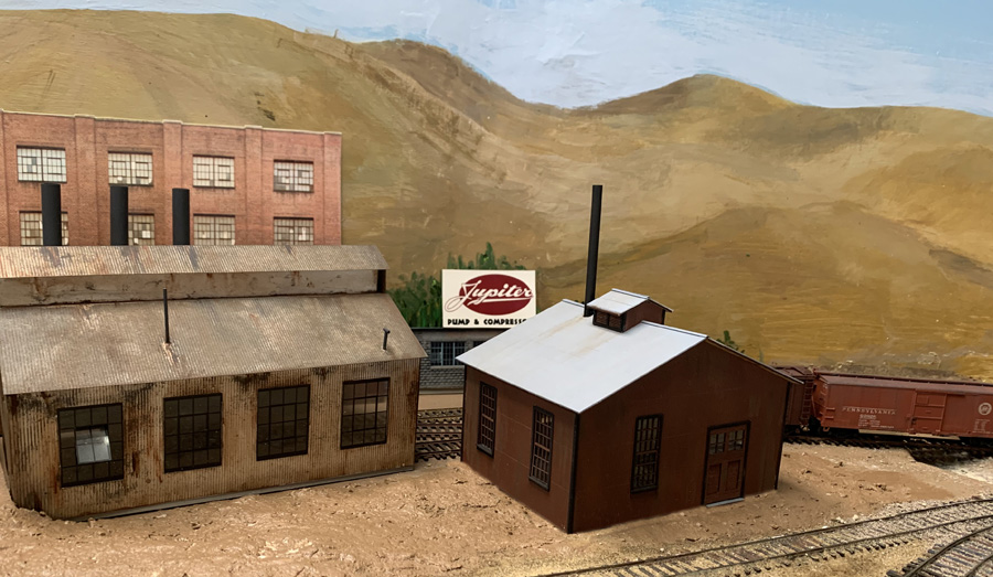
     Next came a check of the building in  its intended site. Of course soil and vegetation remain to be added, as does a sidewalk to connect the powerhouse doors to the rest of the complex.


     This building is a considerable improvement over the house with the green roof, as was shown in the first post in this series. This will help complete the scene at the Jupiter Pump & Compressor site, and I will report further when the scene approaches completion.
Tony Thompson

Sunday, March 8, 2020

A “tribute” industry for the layout

What might I mean by a “tribute” industry? I suppose it could mean a lot of things, but in the present case it turns out to be an opportunity for a tribute for my late and very good friend, Richard Hendrickson. (If you don’t know or don’t remember who he was, you might like to read the post I wrote after he passed away, which I entitled “In memoriam,” and can be found here: https://modelingthesp.blogspot.com/2014/07/in-memoriam-richard-hendrickson.html .)
     This all arose at the recent Cocoa Beach meeting last January, where, among other attractions, the Bob’s Photos sales room is always active. I hadn’t actually visited the room yet, when my friend Jeff Cauthen told me there was a Santa Fe passenger photo there that I really ought to see. So I went around to the room, and sure enough, here it was:


It may not be immediately obvious, but the point of interest was the lower right foreground sign, which I enlarge here:


These are even Richard’s initials, R.H., which really stood out when glancing at this photo. And those who didn’t know Richard likely wouldn’t realize he was a skilled woodworker, but he enjoyed that kind of task, and in fact did all the window and door trim when his new house was being built in Ashland, Oregon, so this lumber and millwork company is quite appropriate.
     An important point to make about this sign is that it is obviously the product of a sign painter. There are inconsistencies in some letters and in the shading. I made the same point about signs in my recent clinic about using typography in model railroading (you can read the handout for the talk at this link: https://modelingthesp.blogspot.com/2020/01/handout-for-typography-talk.html ).
    My layout doesn’t have space for a lumber yard, but I can readily imagine that such an industry is located off the railroad, thus picking up its shipments of lumber at a team track. Then the sign would be used on a truck which might show up at that team track to receive a load.
     Now the “& Son” part of the sign is unnecessary (though Richard did have a son), and as it happens, the last two letters of his name are not “EN” but “ON.” Both changes are easily made while adjusting the sign for model use, and removing the wires which cross the image. The “skew” tool in Photoshop allows the sign to be squared up. I also moved the words beneath the name so they would be close to centered. Here is a rough intermediate stage:


     With further squaring up and contrast adjustment, I printed this out in a suitable size for use on HO scale vehicles. I tried it out on two trucks. One was a flat-bed trailer being used for receiving lumber at a team track (you can click on the image to enlarge it if you wish):


I also tried applying the sign to a delivery-type box van, suggesting the reach of the business beyond its own premises.


     Whether these or other trucks may end up with the Hendrickson Lumber signs, remains to be seen, but I am pleased to add this industry to those that are visible on my layout.
Tony Thompson

Thursday, March 5, 2020

Adding a Union Oil tank car

I have had in my car fleet two Proto2000 tank cars, lettered for Union Oil Company, for some years, and these routinely serve the Union Oil dealer in my layout town of Ballard. They are both conventional 8000-gallon tanks, which is fine, but I wanted to add some variety. I decided to make some decals for additional cars.
     The photo below of UOCX 10345 is an good, clear illustration of Union’s lettering in the 1930s, but was taken at a sufficient angle as to make it difficult to square up. Moreover, the lettering shown did get simplified in later years (this is a photo from the Arnold Menke collection).


This is a 10,000-gallon car, thus numbered in the 10000 number series; Union’s 8000-gallon cars were numbered in the 8000 series.
     Another photo of one of Union’s 10,000-gallon cars is shown below (a Chet McCoid photo from the Bob’s Photo collection, taken at Mexicali, B.C. on January 15, 1955). It not only shows later lettering, but is almost a dead-on side view. I used this image to create most of my decal lettering. Note that the word “CALIFORNIA” under “LOS ANGELES,” seen in the photo above, has been omitted.


It appears from a range of photographs that Union Oil at some periods used aluminum lettering, at other times clearly white lettering. But when weathered, the distinction may be moot.
     Both the cars shown above are un-insulated cars, part of Union’s series numbered 10000–10370 (about 100 cars in that series in 1953). The underframes of both cars exhibit their General American-built heritage. But Union also rostered 75 or so insulated cars, AAR class TMI, in the 10379–10543 series. An example is shown below (Wilbur C. Whittaker photo, taken on November 19, 1938 at Santa Rosa, California), UOCX 10389. As it happens, this car is an AC&F product. You can also see that the lettering to the right of the dome is obscured by spillage.


This particular car is in asphalt service, though many of the Union TMI cars were not. Incidentally, by the time I model, 1953, the Union Oil fleet of tank cars had been sold to and operated by General American, though the cars at that time retained their original UOCX numbers, and are so listed in issues of the Official Railway Equipment Register (ORER).
          An avenue to model such cars is the AC&F Type 21 insulated tank car sold ready-to-run (RTR) by Walthers from time to time (originally a Proto2000 model). This is a good representation of an older Class ICC 104 tank car, with relatively short, stubby tanks like UOCX 10389 above (for more on such cars, see my column in Model Railroad Hobbyist, MRH, in the issue for February 2016; you can download this or any issue for free at their website, www.mrhmag.com ). I used one of these cars and simply painted the entire car glossy black, then applied my decal lettering.
     My sheet of decal lettering was printed by Richard Brennan of TT West, and it was a simple matter to apply these in the usual way. Here is the model, UOCX 10396, as lettered.


     I decided to weather the car to a somewhat gray color to reflect a few years since it had been painted. This is commonplace for tank cars; many photos suggest that long times occurred between repainting. Here is the completed model, spotted on the layout.


     I am glad to have another Union Oil car to deliver to my layout’s on-line Union dealer, and also to have a different paint scheme from the 8000-gallon cars I already had from Proto2000. And it’s an insulated car, another difference. Perhaps an overdue project, but one I’m happy to complete.
Tony Thompson

Monday, March 2, 2020

Freight car graffiti, Part 7: weathering

In my various posts about graffiti for post-1980 freight cars, and in my article in Model Railroad Hobbyist (MRH) for January 2020, I have touched on weathering of the “graffiti-d” cars. I showed some extent of heavy weathering on an ACFX covered hopper in Part 2 of this series (see it at: https://modelingthesp.blogspot.com/2020/01/freight-car-graffiti-part-2.html ). In this post I want to return to specifics.
     First, that ACFX car, that I heavily weathered and rust-streaked (using Weathering Solutions decals in part). I will repeat a photo of the car, with three graffiti on it and plenty of rust and dirt. This somewhat overhead view allows you to see the dirt on the roof and around hatches, while the rust seems to be erupting at the top seam of the car side. This of course is not a cement car.


     But cement cars primarily show streaks and stains of cement, and of course some cement cars show not only heavy staining but buildup of cement around hatches. I have tried to represent this with acrylic tube paints, mixing Neutral Gray and White. On the typical cement-gray covered hoppers( a color chosen of course to not show cement stains), I often use white, or the gray-white mixture. Here’s an example of some heavy cement effects, along with a dirty roof (the car was first described in Part 4 of this series, at: https://modelingthesp.blogspot.com/2020/02/freight-car-graffiti-part-4-further.html ).


This is another example, shown before, of a car painted a really unsuitable color to resist showing cement stains, and weathered accordingly:


     Next is an example of a paper overlay, subsequently weathered. This car was first described in Part 4 of this series (you may wish to see that post at: https://modelingthesp.blogspot.com/2020/02/freight-car-graffiti-part-4-further.html ). I would call this a moderate amount of weathering, as cement cars go.


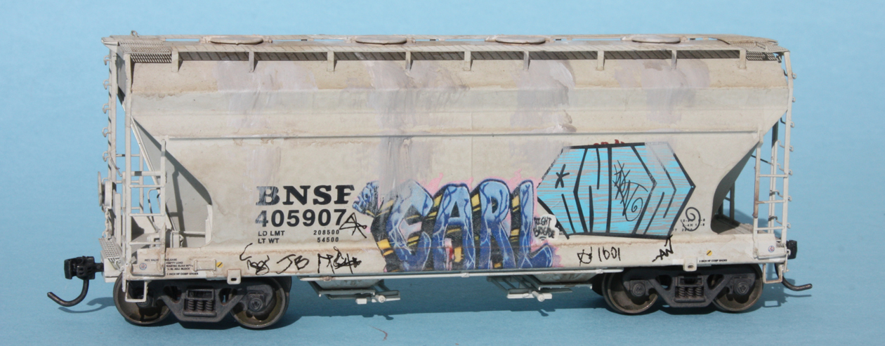
     Some cars that are newer, or have been lucky enough to escape the worst dirt and graffiti, also need to be represented. I have experimented with representing light but visible weathering on cement cars, since these almost always show at least some evidence of cement staining. An example is below, on a BNSF car that carries a paint scheme not long before the 1999 date of the model owner’s layout’s  (first shown at earlier stages in Part 6, at: https://modelingthesp.blogspot.com/2020/02/freight-car-graffiti-part-6-more-still.html ). You can click on the image to enlarge it if you wish.


You may note that, although there is only a single graffiti element on this car, there are a number of tags along the lower part of the car (you can click on the image to enlarge it if you wish). I will return to the topic of tagging in a future post.
     I continue to find freight car graffiti interesting, not least because of the sheer variety. Vandalism it may be, but it certainly transforms what freight cars look like. Then, of course, suitable weathering needs to be applied, hopefully over a  broad range of effects, as shown above.
Tony Thompson

Friday, February 28, 2020

Building AL&W’s SP power house

I have been putting off building an AL&W Lines kit for a Southern Pacific power house (kit no. SP 21), until I was sure it would fit where I have a kind of blank place on the layout. That space has been occupied for awhile by a cardboard model of a house with a green roof, one that I bought at a swap meet years ago (for more about improvement of this area, see the earlier post: https://modelingthesp.blogspot.com/2020/02/completing-jupiter-pump-compressor.html ). As that post explains, the area is now prepared for a new structure. Here’s a repeat of the original area view.


     This AL&W structure kit is for a building roughly 4 by 6 inches in footprint, and of a simple design, though with lots of window and large doors. Below is a photo of a finished kit (built and photographed by Bill Baker), to show what will be completed. It is in the usual SP paint scheme for such structures, of boxcar red walls, black trim, and white window frames and mullions.


     The kit has laser-cut styrene walls (Evergreen corrugated) and a variety of peel-and-stick wood detail and trim pieces. I began by choosing the paint scheme for the building (which will not be presented as an SP building), with brown walls and black trim. I chose Tamiya “NATO Brown” (TS-62) for the brown, and used a flat black for all the trim parts.
     The recommended first kit assembly step is to assemble the walls to the floor. I chose instead to assemble the walls to each other, using a piece of 1/8-inch square styrene inside each corner. Once the four walls were assembled, I also stiffened the walls with a strip of 1/8 x 1/4-inch styrene above or below the doors and windows. You can see these internal additions below, along with the exterior color.


     Next came application of the peel-stick windows and doors, and their frames, and the corner trim. This brings the building sides to a pretty complete look. Note also how different this version of the kit looks, compared to the “official kit photo” above, with its white SP window treatment.


     As I mentioned,  I chose not to use the floor provided in the kit at this point. I like to leave either the floor area or a separate roof on structures so that if I want to go back and add interior detail or lights, it will be easy to do so.
     At this point I added some weathering to the structure, largely a dark gray Pan Pastel vertical streaking in a few areas, and small streaks below the corners of window sills. I went ahead with the kit sequence and added glazing at this point. It is kind of a fussy job to get the clear plastic aligned perfectly with the backs of window assemblies, but if one is off a small amount, decal scissors can be used to remove whatever sticks out. You will not be able to re-insert window assemblies with projecting glazing.
     The last step in this first phase is to attach the sub-roof pieces (called “Roof Backing” in the kit). I chose to use canopy glue for this, an excellent adhesive for dissimilar materials (in this case, the styrene walls and plywood sub-roof). I attached each half separately, using small weights to keep them in place.


On the wall segments at left, you can see the “tabs” that fit into slots in the roof pieces (you can click on the image to enlarge it if you wish). Making sure that each of these is engaged in the corresponding slots in the sub-roof ensures that the building will be square. 
     The concluding steps are to attach the cupola and the outer roof surfaces. I will return to this project in a future post.
Tony Thompson

Tuesday, February 25, 2020

PrairieRail 2020

One of the big operating weekends in the calendar is the biennial PrairieRail event held in Kansas City in even-numbered years. It’s not only big in the sense that Kansas City is one of the hotbeds nationally of model railroading, but also big in the sense that with so many excellent layouts, they can host over 100 operators, more than most such events. I’ve just returned from this year’s get-together.
     The usual schedule is four operating sessions, Friday afternoon, two on Saturday, and Sunday morning. With a group of Westerners, I was able to participate in two additional sessions, Thursday night and Friday morning. I won’t attempt to document all the layouts here, and in any event, many excellent operating layouts are not visually striking. But I want to show a few highlights, and mention others.
     Certainly one of the most visually stunning layouts was Jim Eudaly’s Hinton Division of the C&O in O scale. Located in a large purpose-built structure, it is remarkably complete and really repays photography. Perhaps more important, it operated flawlessly everywhere I saw. My job was as one of two hostlers at Hinton, a very busy job since every steam-powered train changed power here, many of them double-headers. We two hostlers were occupied every moment! Here is a view of the coal dock and service tracks, where locomotives rarely stood still for long.


     Another visually impressive layout was Doug Taylor’s East Broad Top, in HOn3. (He also has a rather large standard-gauge layout in the same basement, the Pennsylvania from Altoona to Pittsburgh (!), but my session was on the EBT.) My job was yardmaster at Mt. Union, the interchange between the PRR and EBT, thus with lots of dual-gauge track. Here is Doug’s rendition of the famous transfer crane, by which narrow-gauge trucks were fitted to standard-gauge cars so they could be moved over the EBT.


Another fine piece of modeling on this EBT layout is the famous EBT shops complex at Orbisonia. Still preserved, the prototype buildings are a remarkable peek into the 19th century, the interiors looking today much as if the workmen had just put down tools and gone to lunch. Doug’s model is excellent.


     I don’t want to exclude mention of the really good operating layouts I experienced, from Kevin Leyerle’s OKT portion of the MKT, and Mark Steenwyk’s Milwaukee Beer Line (at the latter, I had the pleasure of using a ProtoThrottle; see: https://www.iascaled.com/store/ProtoThrottle ). I had been to both layouts before, and again greatly enjoyed them both.
     A further layout of special note for me was Bob Willer’s Spokane, Portland and Seattle, a superb layout for timetable and train order (T&TO) operation, something I greatly enjoy, and a layout on which I’ve wanted to operate for years. And now I’ve been there, and it was great!
     The last layout I operated on was Joe Kasper’s immense Marais Division of the BN, an N-scale layout that operated absolutely perfectly. My job was the Elevator Yard, located across from the main Murray Yard, and from my operating aisle, this was the view into that remarkably large yard. And as you might expect, all three Murray Yard personnel were pretty busy, for the whole session, not that I had much time to watch, with my own busy workload. And there is far more to the layout than this one view can show.


     This was a great event, as it has been in past years, and there are still all kinds of layouts in Kansas City I have not been to. I guess I will have to keep on going to PrairieRail and discovering more of these great examples of model railroad accomplishment.
Tony Thompson

Saturday, February 22, 2020

Freight car graffiti, Part 6: more still

This post continues a series on the graffiti topic, and the predecessor posts are readily found by using “freight car graffiti” as the search term in the search box to the right. The most recent in the series is Part 5, about the process of re-lettering, in which a railroad or lessee worker recreates car initials and number after they have been obscured by graffiti, which is here: https://modelingthesp.blogspot.com/2020/02/freight-car-graffiti-part-5-relettering.html .
     Continuing with the cement cars provided by Seth Neumann (his layout models Union Pacific in the Bay Area in 1999), I began with this BNSF car, an AC&F Center Flow design: 


A second car in this series is an older Santa Fe cement hopper, of ribbed-side design, which already had a light haze of weathering:


This car, as an older car with long service, was planned to have heavier cement build-up and staining than the newer Center Flow car. I’ll begin with it. Here is the left side of the car, with a decal from Microscale set 87-1535.


Next is the right side, also using another Microscale decal (set 87-1534) to be able to work over the ribs, which are sharply rectangular on this model.


     The other car, with a much newer paint scheme, should be more lightly weathered. But it will still carry graffiti. Here is the left side, with yet another Microscale decal (set 87-1534):


The right side of this model received two decals. At left is one from Blair Line set 2261, at right one from Microscale set 87-1536. This latter set from Microscale might not seem interesting, as it’s named “Irish and Scottish Graffiti,” but many of its contents are quite useful and not really different from American graffiti. I show the car below with some light cement staining. This car is a much later repaint, not long before the 1999 year of the layout for which these cars are intended, so only light staining is shown.


The other side of the car, shown one photo above, has now been similarly weathered. 
     Of these two cars, the boxcar-red Santa Fe car is obviously much the older paint scheme, so I gave it heavier cement staining. I will say more in a separate post about weathering for cement cars like these, but this car was originally a color which really shows the cement spillage.


      These cement cars have been an interesting challenge, both to apply graffiti and also to weather to varying degrees, appropriate to the age of the various paint schemes. It is a continuing project, so I will have more to say in future posts.
Tony Thompson