Friday, March 20, 2020

Publication of L&N Shipper Guide

I have commented several times on this blog about Shipper Guides published by railroads (and you can find the previous posts by using that term in the search box at right). For a general discussion, this post may be best: https://modelingthesp.blogspot.com/2015/11/waybills-part-44-shipper-guides.html . For more recent comments about one of the better guides available so far, there is this post about a Northern Pacific guide: https://modelingthesp.blogspot.com/2018/12/an-excellent-np-shippers-guide.html .
     One of the big geographical gaps in the growing collection of these Guides available from Rails Unlimited (see their listing, now up to 21 Guides, at: http://railsunlimited.ribbonrail.com/Books/shippers.html ) is the entire Southeastern United States. Just released recently is a break in that gap, an excellent guide for the Louisville & Nashville. It served nine of the southeastern states and accordingly is a very interesting railroad for which to have a Shipper Guide. Here’s the cover; note the title is actually “Directory of Industries,” which may be a more informative name:


As are almost all these guides, the page size is 8.5 x 11 inches; page count is 163. Though the book is not dated, internal evidence points to a date in the vicinity of 1940 or 1941.
     This Guide is especially valuable (at least for non-L&N fans) because it has included in it 34 or so pages of “front matter” about the railroad and its primary on-line industries, as well as information about location of track scales, interchange points, livestock markets, and LCL stations.
     You may be saying, “Yeah, but I don’t model the L&N,” or words in that direction. Well, like all these guides, this book contains a phenomenal amount of information about where the loads arriving on your layout may have come from — or where the loads shipped from your on-line industries may be going. Included are a huge number of coal mines and coal brokers, if your interests run in that direction. If you care at all about realistic waybills, this information is pure gold.
     To choose just one very typical regional industry, this Directory lists brokers, producers and shippers of “Naval Stores:” turpentine, rosin and other substances that are obtained from the resin of living trees (primarily pines). Here is part of the listing, omitting a few Alabama locations (you can click on the image to enlarge it, if you wish):


     I really treasure the small shelf of Shipper Guides that I have, and am especially glad now to finally have one from the Southeast. And I have to thank once again the marvelous service provided by Ted Schnepf, proprietor of Rails Unlimited, for searching out originals of these Guides and getting them reproduced for sale. They are simply a great resource. If you don’t have one yet, go to the Rails Unlimited site, pick one out to buy, and see if you’re not impressed — and going back for more.
Tony Thompson

Tuesday, March 17, 2020

Big locomotives on small layouts

My topic for this post could apply to any era and type of layout. Many of us naturally have added large locomotives to our rosters because we like them. What my topic refers to, then, is the question of how to make a large locomotive look reasonable when operating with a short train or otherwise obviously not suitable for its environment, such as a branch line.  In fact, one can question if such locomotives can reasonably be operated on small layouts at all.
     The photo below compares a Southern Pacific 2-10-2, no. 3688 (Class F-4) in the foreground, with the standard power for most duties on my layout, a Class C-9 Consolidation behind it. You can readily appreciate the considerable size difference. Short trains behind no. 3688 simply look wrong.


(The brass F-4 model is from Westside, painted and weathered by Al Massi.)
     There are some ways to circumvent this problem. I remember once visiting a layout that was primarily a major backshop for steam power, so locomotives of all types and sizes, in everything from brand-new paint to very tired and dirty appearances, were all appropriate. This is perfect for the locomotive collector! . . . but is operationally limited for most modelers.
     My own layout mostly depicts a branch line, and has only a small segment of SP’s Coast Division main line. Moreover, its staging capacity is quite limited for length, only handling trains of modest size (ten freight cars, plus engine and caboose). This is fine for small steam power or single diesel road-switchers. But clearly something like a cab-forward or a 2-10-2,  truly large locomotives and common power in late steam days on Coast Division, is quite a different matter. I for one don’t want to operate, say, nine freight cars behind a cab-forward.
     So what to do? Speaking now just for my own modeling year of 1953, this was pretty late in the steam era for Southern Pacific, and certainly it’s true that locomotives sometimes filled assignments they would never have had in earlier years (passenger power on freight trains, for example). But this situation only extends so far.
     Perhaps the best possibility is something that did happen throughout the late steam era, namely power balancing between terminals, or return of locomotives to their home divisions. These were sometimes made as light locomotive moves, sometimes as caboose hops. Such a locomotive being moved was simply operated as an extra train. Here’s how it might look on my layout (in the background for scale is a Ten-wheeler on the turntable).


     Another possibility is a “high-wide” movement, in which an oversize load of some kind is moved with just the load (or loads), a locomotive, and a caboose.  Photos of such movements often show a far larger locomotive than would really be needed for the load. Even for a load not exceptionally high or wide, but needing careful handling en route, a special train might be called. As an example, it might be something like the photo below, showing a really large depressed-center flat car with a load. Such a train might well be severely restricted in speed, perhaps a plus in an operating session!


     Finally, most railroads operated dynamometer cars, to measure locomotive performance. This was of course usually with a train behind the locomotive, but locomotives were also measured without a trailing load. So a dynamometer car behind almost any large locomotive, and sometimes a caboose also, make up another possible movement.


The dynamometer here is a Custom Brass model of a Nickel Plate car, very similar in every detail to SP no. 137, which is how it has been decaled.
     I would only occasionally want to include special movements like any of the above in operating sessions, but they can  provide interesting variety when they do appear in the line-up. And of course they permit some larger locomotives to enjoy a little exercise.
Tony Thompson

Saturday, March 14, 2020

Freight car graffiti, Part 8: a couple more

This post is to present more examples of the graffiti applications I am doing on the freight cars from Seth Neumann’s layout, modeling the UP in the Bay Area in 1999. These are of varying ages, as indeed is often seen with cement cars, and they will be finished with varying degrees of dirt and graffiti. (To find the previous parts of this series, you can use “freight car graffiti” as the search term in the search box at right.)
     I will begin with a model of classic American Car & Foundry two-bay “Center Flow” car, this one lettered for D&RGW.


On the left side of this car, I applied a medium-size graffiti piece from Microscale set 87-1534:


    For the right side, I wanted to add one of my paper overlays, this one taken from a wall seen here locally. It spells the word “NESTA,” the middle name of musician Bob Marley, and a widely seen word in this area. Here is the original photo, obviously fitted around a window in this particular wall. and reaching right down to the dirt. You may also notice that it was applied over an older, green piece, a common sight on highly visible wall areas, which are irresistible to many “writers” (as they call themselves).


Sized in Photoshop, printed out on a color laser printer, and trimmed to size, then sanded on the back and applied with canopy glue, here is how it looked (to see my description of how I carry out this technique, you can visit this post: https://modelingthesp.blogspot.com/2020/01/my-latest-column-in-mrh.html ).


Since this is an older car with a fairly old paint scheme, I dirtied it a fair amount, but on this car, kept the cement staining down to a modest amount (for more about weathering these cars, see the previous post in this series: https://modelingthesp.blogspot.com/2020/03/freight-car-graffiti-part-7-weathering.html ). You can also see along the lower part of the car that I added some “tags” also, a topic to which I will return in a future post.


     The second car I want to briefly illustrate is a model of an outside-post cement car, lettered for Burlington Northern. I began by applying various decals. Shown below is its left side, with the graffiti from Microscale set 87-1534. As with many graffiti, this was applied to reflect the “writer” having avoided covering the reporting marks and car number, so they wouldn’t be “patched” and renumbered (you can see more on that topic in this post: https://modelingthesp.blogspot.com/2020/02/freight-car-graffiti-part-5-relettering.html ).


The other side received a graffiti piece from Microscale set 87-1535 (the word “CORKY”), and is shown here after the car was somewhat heavily weathered and cement stained.


     These two cars illustrate the range of work I am doing in adding graffiti to 1999-era freight cars. I am continuing with this series of cement cars, as I will report presently.
Tony Thompson

Wednesday, March 11, 2020

Building the AL&W power house, Part 2

The first part of this discussion was about the AL&W Lines kit for a Southern Pacific power house (kit SP 21). I prepainted the building parts and did the basic assembly of the structure in that segment (you can read the post at: https://modelingthesp.blogspot.com/2020/02/building-al-sp-power-house.html ). Now I want to complete the structure.
     With the basic building completed, the rooftop cupola needed to be built. It is put together much like the rest of the main structure, with peel-and-stick trim added to the bare cupola. I used the slots in the main roof as guides in assembling the cupola, but didn’t glue the cupola to the roof at this point.


     The kit has an interesting roofing material, styrene sheet scribed to suggest individual roofing sheets, and has a peel-and-stick backing. I prepainted this material with Testor’s Gray Primer as a good starting point. (At the same time, I painted the Roof Caps, parts #9 and #10, the same gray.) After a coat of flat finish to enable me to use acrylic washes, I added some slight streaking and dirt to the roof. I wanted to do this before the roof sheets are part of the structure.
     The cupola assembly was now glued to the roof. Then the peel-and-stick roof sheets were carefully applied, as were the roof cap strips.I first put them in place gently, so that I could adjust the exact placement if necessary. Then the smokestack was inserted with canopy glue, squared up, and supported from below at the desired height.


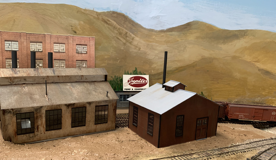
     Next came a check of the building in  its intended site. Of course soil and vegetation remain to be added, as does a sidewalk to connect the powerhouse doors to the rest of the complex.


     This building is a considerable improvement over the house with the green roof, as was shown in the first post in this series. This will help complete the scene at the Jupiter Pump & Compressor site, and I will report further when the scene approaches completion.
Tony Thompson

Sunday, March 8, 2020

A “tribute” industry for the layout

What might I mean by a “tribute” industry? I suppose it could mean a lot of things, but in the present case it turns out to be an opportunity for a tribute for my late and very good friend, Richard Hendrickson. (If you don’t know or don’t remember who he was, you might like to read the post I wrote after he passed away, which I entitled “In memoriam,” and can be found here: https://modelingthesp.blogspot.com/2014/07/in-memoriam-richard-hendrickson.html .)
     This all arose at the recent Cocoa Beach meeting last January, where, among other attractions, the Bob’s Photos sales room is always active. I hadn’t actually visited the room yet, when my friend Jeff Cauthen told me there was a Santa Fe passenger photo there that I really ought to see. So I went around to the room, and sure enough, here it was:


It may not be immediately obvious, but the point of interest was the lower right foreground sign, which I enlarge here:


These are even Richard’s initials, R.H., which really stood out when glancing at this photo. And those who didn’t know Richard likely wouldn’t realize he was a skilled woodworker, but he enjoyed that kind of task, and in fact did all the window and door trim when his new house was being built in Ashland, Oregon, so this lumber and millwork company is quite appropriate.
     An important point to make about this sign is that it is obviously the product of a sign painter. There are inconsistencies in some letters and in the shading. I made the same point about signs in my recent clinic about using typography in model railroading (you can read the handout for the talk at this link: https://modelingthesp.blogspot.com/2020/01/handout-for-typography-talk.html ).
    My layout doesn’t have space for a lumber yard, but I can readily imagine that such an industry is located off the railroad, thus picking up its shipments of lumber at a team track. Then the sign would be used on a truck which might show up at that team track to receive a load.
     Now the “& Son” part of the sign is unnecessary (though Richard did have a son), and as it happens, the last two letters of his name are not “EN” but “ON.” Both changes are easily made while adjusting the sign for model use, and removing the wires which cross the image. The “skew” tool in Photoshop allows the sign to be squared up. I also moved the words beneath the name so they would be close to centered. Here is a rough intermediate stage:


     With further squaring up and contrast adjustment, I printed this out in a suitable size for use on HO scale vehicles. I tried it out on two trucks. One was a flat-bed trailer being used for receiving lumber at a team track (you can click on the image to enlarge it if you wish):


I also tried applying the sign to a delivery-type box van, suggesting the reach of the business beyond its own premises.


     Whether these or other trucks may end up with the Hendrickson Lumber signs, remains to be seen, but I am pleased to add this industry to those that are visible on my layout.
Tony Thompson

Thursday, March 5, 2020

Adding a Union Oil tank car

I have had in my car fleet two Proto2000 tank cars, lettered for Union Oil Company, for some years, and these routinely serve the Union Oil dealer in my layout town of Ballard. They are both conventional 8000-gallon tanks, which is fine, but I wanted to add some variety. I decided to make some decals for additional cars.
     The photo below of UOCX 10345 is an good, clear illustration of Union’s lettering in the 1930s, but was taken at a sufficient angle as to make it difficult to square up. Moreover, the lettering shown did get simplified in later years (this is a photo from the Arnold Menke collection).


This is a 10,000-gallon car, thus numbered in the 10000 number series; Union’s 8000-gallon cars were numbered in the 8000 series.
     Another photo of one of Union’s 10,000-gallon cars is shown below (a Chet McCoid photo from the Bob’s Photo collection, taken at Mexicali, B.C. on January 15, 1955). It not only shows later lettering, but is almost a dead-on side view. I used this image to create most of my decal lettering. Note that the word “CALIFORNIA” under “LOS ANGELES,” seen in the photo above, has been omitted.


It appears from a range of photographs that Union Oil at some periods used aluminum lettering, at other times clearly white lettering. But when weathered, the distinction may be moot.
     Both the cars shown above are un-insulated cars, part of Union’s series numbered 10000–10370 (about 100 cars in that series in 1953). The underframes of both cars exhibit their General American-built heritage. But Union also rostered 75 or so insulated cars, AAR class TMI, in the 10379–10543 series. An example is shown below (Wilbur C. Whittaker photo, taken on November 19, 1938 at Santa Rosa, California), UOCX 10389. As it happens, this car is an AC&F product. You can also see that the lettering to the right of the dome is obscured by spillage.


This particular car is in asphalt service, though many of the Union TMI cars were not. Incidentally, by the time I model, 1953, the Union Oil fleet of tank cars had been sold to and operated by General American, though the cars at that time retained their original UOCX numbers, and are so listed in issues of the Official Railway Equipment Register (ORER).
          An avenue to model such cars is the AC&F Type 21 insulated tank car sold ready-to-run (RTR) by Walthers from time to time (originally a Proto2000 model). This is a good representation of an older Class ICC 104 tank car, with relatively short, stubby tanks like UOCX 10389 above (for more on such cars, see my column in Model Railroad Hobbyist, MRH, in the issue for February 2016; you can download this or any issue for free at their website, www.mrhmag.com ). I used one of these cars and simply painted the entire car glossy black, then applied my decal lettering.
     My sheet of decal lettering was printed by Richard Brennan of TT West, and it was a simple matter to apply these in the usual way. Here is the model, UOCX 10396, as lettered.


     I decided to weather the car to a somewhat gray color to reflect a few years since it had been painted. This is commonplace for tank cars; many photos suggest that long times occurred between repainting. Here is the completed model, spotted on the layout.


     I am glad to have another Union Oil car to deliver to my layout’s on-line Union dealer, and also to have a different paint scheme from the 8000-gallon cars I already had from Proto2000. And it’s an insulated car, another difference. Perhaps an overdue project, but one I’m happy to complete.
Tony Thompson

Monday, March 2, 2020

Freight car graffiti, Part 7: weathering

In my various posts about graffiti for post-1980 freight cars, and in my article in Model Railroad Hobbyist (MRH) for January 2020, I have touched on weathering of the “graffiti-d” cars. I showed some extent of heavy weathering on an ACFX covered hopper in Part 2 of this series (see it at: https://modelingthesp.blogspot.com/2020/01/freight-car-graffiti-part-2.html ). In this post I want to return to specifics.
     First, that ACFX car, that I heavily weathered and rust-streaked (using Weathering Solutions decals in part). I will repeat a photo of the car, with three graffiti on it and plenty of rust and dirt. This somewhat overhead view allows you to see the dirt on the roof and around hatches, while the rust seems to be erupting at the top seam of the car side. This of course is not a cement car.


     But cement cars primarily show streaks and stains of cement, and of course some cement cars show not only heavy staining but buildup of cement around hatches. I have tried to represent this with acrylic tube paints, mixing Neutral Gray and White. On the typical cement-gray covered hoppers( a color chosen of course to not show cement stains), I often use white, or the gray-white mixture. Here’s an example of some heavy cement effects, along with a dirty roof (the car was first described in Part 4 of this series, at: https://modelingthesp.blogspot.com/2020/02/freight-car-graffiti-part-4-further.html ).


This is another example, shown before, of a car painted a really unsuitable color to resist showing cement stains, and weathered accordingly:


     Next is an example of a paper overlay, subsequently weathered. This car was first described in Part 4 of this series (you may wish to see that post at: https://modelingthesp.blogspot.com/2020/02/freight-car-graffiti-part-4-further.html ). I would call this a moderate amount of weathering, as cement cars go.


     Some cars that are newer, or have been lucky enough to escape the worst dirt and graffiti, also need to be represented. I have experimented with representing light but visible weathering on cement cars, since these almost always show at least some evidence of cement staining. An example is below, on a BNSF car that carries a paint scheme not long before the 1999 date of the model owner’s layout’s  (first shown at earlier stages in Part 6, at: https://modelingthesp.blogspot.com/2020/02/freight-car-graffiti-part-6-more-still.html ). You can click on the image to enlarge it if you wish.


You may note that, although there is only a single graffiti element on this car, there are a number of tags along the lower part of the car (you can click on the image to enlarge it if you wish). I will return to the topic of tagging in a future post.
     I continue to find freight car graffiti interesting, not least because of the sheer variety. Vandalism it may be, but it certainly transforms what freight cars look like. Then, of course, suitable weathering needs to be applied, hopefully over a  broad range of effects, as shown above.
Tony Thompson