Most recently, I showed the Northern Pacific reefer that is part of a group I am repainting and relettering for Paul Weiss’s Central Vermont layout, replacing some ancient paint schemes that could not have existed in his modeling year of 1956 (that post is at: https://modelingthesp.blogspot.com/2020/07/freight-car-guy-stuff-part-4.html ).
As I mentioned in that Part 4 post, the remaining four of the five total reefers being refinished were to be two each of American Refrigerator Transit (ART) and Pacific Fruit Express (PFE). For PFE, the post-1953 scheme with all-orange sides was chosen. For the ART cars, it seemed reasonable to letter both in the post-1951 scheme that had the emblems of both railroad owners, Wabash and Missouri Pacific, on each side.
As was shown in the recent book about ART (American Refrigerator Transit, S.T. Maher, G.J. Michels and Gene Semon, Signature Press, 2017), this scheme was supposed to have the MoPac emblem toward the B end of the car on both sides of wood-sheathed cars, but many photographs show the reverse.Here’s one example (Gene Semon collection):
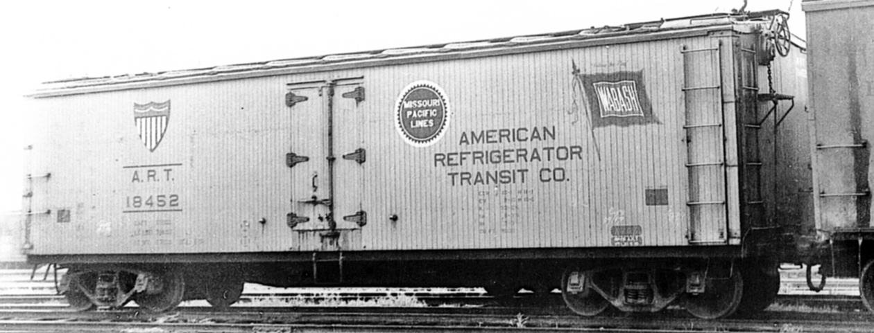
Note that grab irons and ladders are yellow, but door hardware is still black. In the middle 1950s, the door hardware became yellow, and stripes around reporting marks were discontinued.
Many of the older ART cars were rebuilt during 1953–58 and renumbered into the 50000 series, such as this car, with “correct” emblem placement (John Maxwell photo at Denver, 1958, Dick Kuelbs collection); note that the deep center sill was retained. Side sills and steps are black.

With that prototype background, here are the two models I painted and lettered. I chose two slightly different lettering schemes (you can click on the image to enlarge it if you wish), with the newer one being a little less weathered. Decals were the Mask Island product sold by the Missouri Pacific Historical Society.

For the PFE cars, I chose the post-1953 scheme. The prototype photo below of a Class R-30-9 car (Charles Winters collection) clearly shows the body appearance of this class, which I was choosing to represent on the Accurail body. Note that side hardware is all orange.
The photo , however, actually shows the 1950 paint scheme, with the emblems identically placed on both sides. In 1953, the SP emblem moved so that it was always placed toward the B end, and stripes and periods in reporting marks were dropped. In addition, side sills and steps became orange.
(For extensive information on PFE paint schemes, see the Dick Harley’s PFE section of the Southern Pacific Freight Car Painting and Lettering Guide, Dick Harley and Anthony W. Thompson, SP Historical & Technical Society, Upland, CA, 2016.)

The changes to the original Accurail models were to replace the fishbelly center sills with straight styrene strips, and to add geared vertical-wheel handbrakes in place of the original staff handbrakes. The cars were then lettered with the modern version of Microscale 87-501, incorporating Dick Harley’s artwork (do not use old versions of this set!). Shown below are the left side of the car at left, and the right side of the car at right.

This has been a fun and interesting project, making useful layout freight cars out of models that were totally unsuitable for a 1956 layout. (And I’ll admit it, I do enjoy applying decals.) May these cars have long and glorious careers on the Central Vermont!
Tony Thompson
No comments:
Post a Comment